10 top UI trends for 2017
Discover the most important UI trends you should be implementing in 2017 – and why.
06. Parallax
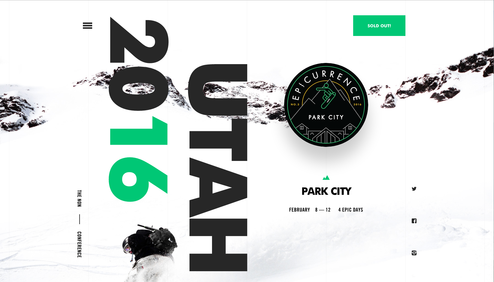
Following on nicely from breaking the grid and long-scrolling, is the use of parallax, something which often works great in conjunction with less traditional layouts. In a nutshell, parallax is the effect where the background moves at a slower rate than the foreground, giving a sense of depth and dynamism as users scroll. It isn’t a new mechanic, but something that is being implemented more and more as brands experiment with its functionality.
Why use them?
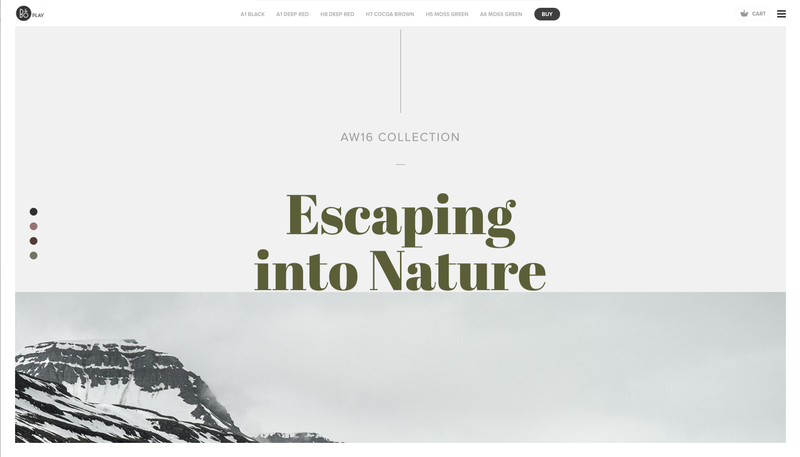
Parallax is something that must be used carefully as it can quickly become overbearing for users. But, when implemented thoughtfully, it provides a great sense of dynamism to help lift content off the page and engage users. Use it in conjunction with imagery, text and a less rigid layout to create fluid, layered content.
07. More cards!
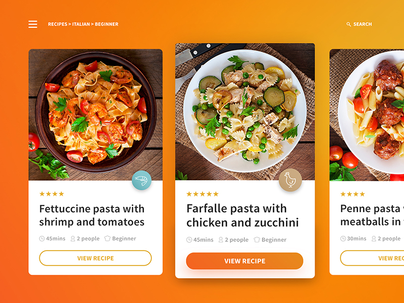
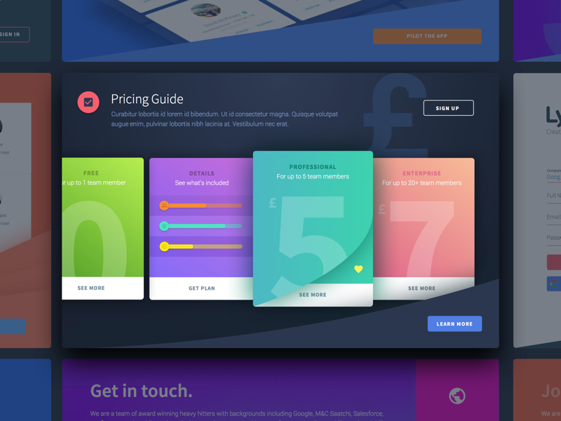
Cards, again, aren’t a breakthrough trend, but they’re a functional UI option that has consistently gained prominence in web design following its success in mobile UI design and inclusion in Google’s Material Design.
According to Google, 2015 officially saw mobile devices overtake desktops as the most popular platform for browsing the web, so more designers are blurring the lines between mobile and desktop UIs to create a more seamless user experience.
Cards are a super-versatile UI that works across the board, from smaller-screened devices all the way up to the bigger ones. They’re a great way to organise and display large amounts of data on screen at a single time, allowing users to quickly glance through what’s available and make their choice of what to view. Facebook, Twitter, Netflix and Pinterest are all powerhouse digital platforms that utilise cards for this very purpose.
Why use them?
Daily design news, reviews, how-tos and more, as picked by the editors.
Cards are a great way of organising small bursts of information and their flexibility is invaluable for organising and consuming content on smaller screens. They’re a solution that can show text, imagery, video and everything in between, scaling up from the smallest screened devices to the biggest. Cards offer endless versatility, allowing designers to flip, spin, stack and filter them for all manner of UX functionalities – more of which will be explained with micro-interactions.
08. Micro-interactions
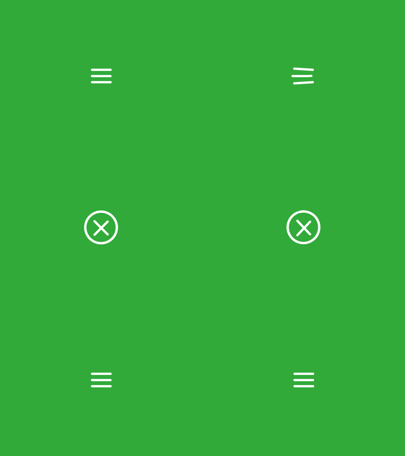
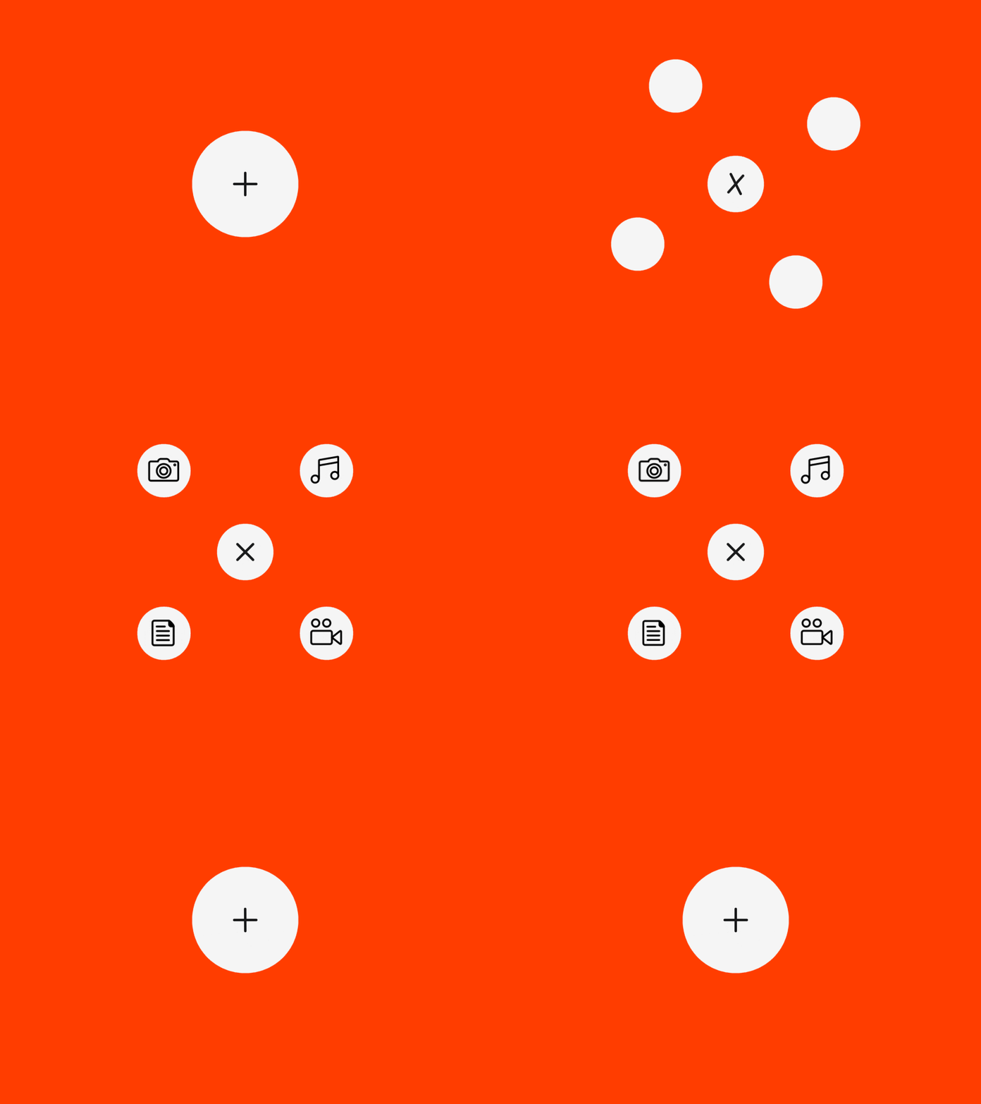
Micro-interactions, typically in the form of small, on-screen animations, are playing a vital role in UI and UX design today, especially on mobile and smaller screen devices.
From a user experience perspective, micro-interactions are not only small, entertaining on-screen animations or transitions, but are forms of visual feedback for the user and their actions. Micro-interactions let users know what is happening, what has happened, and what will happen next as they interact with the UI.
Using Facebook’s famous ‘Like’ as an example: when a user clicks the thumbs-up icon to like something, it increases in size and turns blue before returning to its original size, all in one fluid animation, informing the user that their action (Like) has been completed.
Clever designers are able to put the 'fun' into 'functional' too, by entertaining users as well as informing them. From playful loading animations to slick icon transitions, effective micro-interactions engage and inform at the same time.
Why use them?
Micro-interactions provide useful, humanised feedback to let users know what to do and what's happening, in a thoughtful and entertaining way. They can help make simple, mundane processes fun, as well as providing crucial feedback.
09. Typography
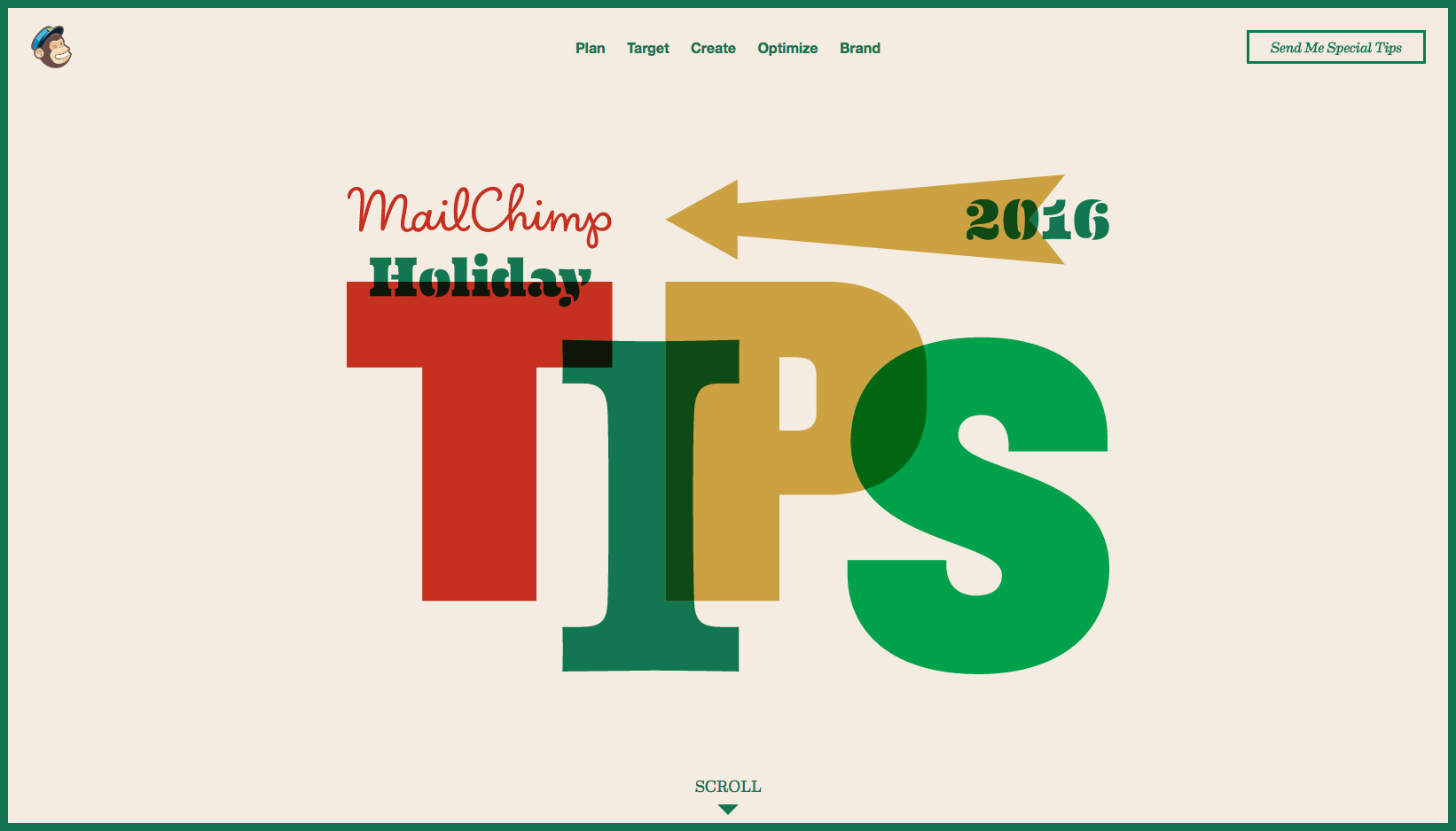
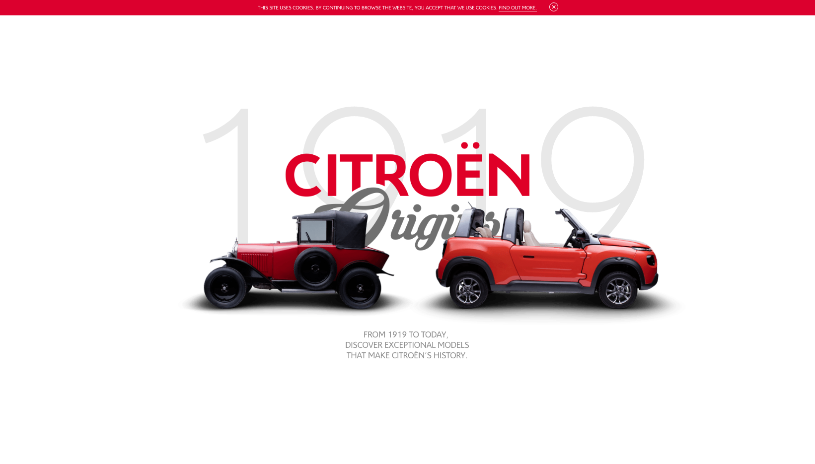
With an ever-increasing range of web font services (Google Fonts, Typekit) offering free or cost-effective font families, expect to see more brands embrace big, bold and beautiful typography in place of system fonts and done-to-death, trendy sans-serifs.
As we’ve seen throughout 2016, and with predictably more to come, web typography will draw from traditional graphic and editorial design, experimenting with more creative typefaces that are big, bold statement pieces, taking centre stage in the design.
Why use them?
Typography is another creative medium for brands and designers to experiment with when creating content that is full of personality. As discussed throughout this article, many of these trends work hand-in-hand together, and creative typography is definitely a prime example of this. Use typography in conjunction with imagery, video, illustrations, colours and unconventional layouts to create unique experiences.
10. Experimental navigation
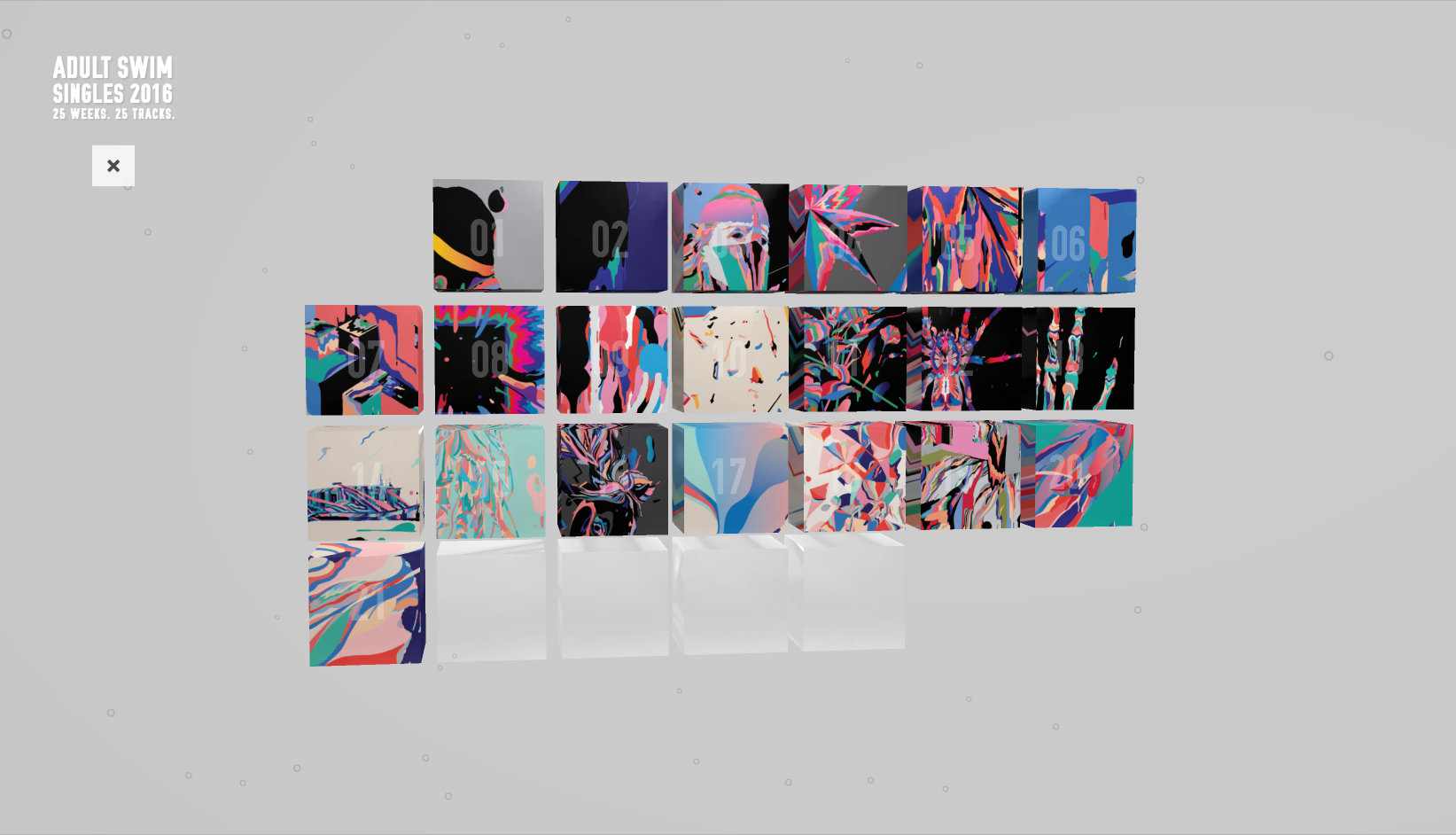
Navigation and menus have long been a hotly contested topic for designers. With the lines between mobile and desktop UIs starting to blur, and the increasing use of hamburger menus on larger-screened UIs, there is a lot more creative scope for designing menus and navigations.
Sticking with hamburgers as an example, what they do provide is consistency when designing and building responsive sites, as you can (in essence) design a single navigational structure that scales and works across all devices. What’s more interesting here though, is the amount of creative freedom afforded by using a hamburger.
With the menu hidden off-canvas, designers can give themselves the entire viewport window to craft a creative solution. The sky’s the limit for possibilities, but as always, navigation serves an important role within UX so be sure that it’s never form over function – users need to be able to quickly find your content!
Not all designers agree with the use of hamburgers for desktop application (or at all). It’s a topic itself that is worthy of its own blog post, but 2017 and beyond is sure to see more experimentation with navigation options and menus, for better or worse!
Why use them?
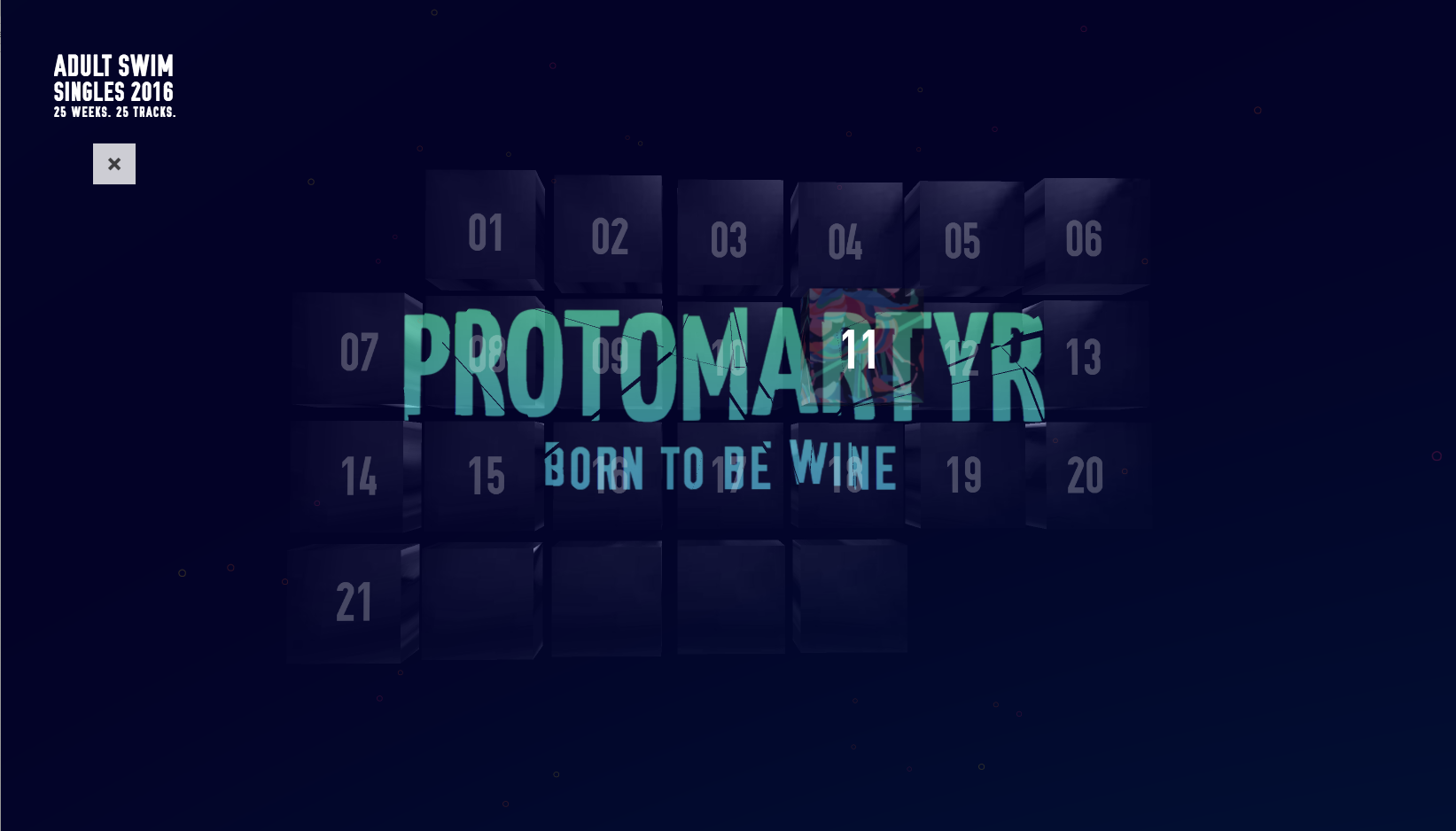
Navigations are no longer restricted to a single row of links stuck to the top of the viewport, and there are definitely more creative solutions available to help users find their way. Although aesthetics are important, designers should always prioritise usability, ensuring users are able to quickly and easily find the content they require, rather than be confused by over-engineered or gimmicky solutions.
Conclusion
As with trends of any nature, some come and go, whereas others stay the course and become fundamentals. Not all of the trends or predictions I’ve discussed here may be relevant to the project you’re working on; as a designer, it’s down to your own judgement to decide what is right and what isn’t, and it’s something that will change by client and project.
However, change happens at lightning pace in this industry and it’s important to keep up to speed with what’s happening to stay relevant. UI choices should always be fuelled by achieving a great UX, and achieving a great UX will always shift as new technologies emerge and develop. It’s an ever-changing landscape that requires constant learning and innovation.
I hope that from this post you’ve learnt a little about how things have progressed during 2016, and more importantly, how these changes will influence digital design in 2017 and beyond. If you’re looking for inspiration in the new year, why not check out our Digital Marketing Toolbox, a comprehensive resource we created here at Zazzle Media, which has all the tools and resources we use on a daily basis to create digital content.
Aaron Gustafson will explore adaptive interfaces at Generate San Francisco on 9 June, which will also feature exclusive insights into the product design work of Netflix, Uber, Salesforce, Airbnb and even what we can learn from design and user research conducted at NASA! Get your ticket now!
Generate will also return to London in September for three days filled with fantastic talks and workshops covering web animations, UX strategy, conversational interfaces, accessibility and more. Take advantage of the early bird saving now.
