How Matt Ferguson made movie posters interesting again
The artist tells us about his career journey and process for creating movie poster art.
Sign up to Creative Bloq's daily newsletter, which brings you the latest news and inspiration from the worlds of art, design and technology.
You are now subscribed
Your newsletter sign-up was successful
Want to add more newsletters?
Some of the best movie posters have been illustrated, and that rich heritage has been enjoying a resurgence and renewal in recent years. Matt Ferguson is a leading exponent of this renaissance.
Over the past decade and a half, Matt’s work has played its part in reinvigorating the poster-art tradition for science fiction, fantasy and horror movies – both new titles and anniversary re-releases. We caught up with him to learn how he started illustrating movie posters, how he got his break, and how he approaches his work today.
Matt, how did your fascination with movie posters begin?
I’ve always liked movie posters. I can remember looking at movie posters in the cinema when I was a kid. I’ve always had a thing for quad movie posters.
I was nine or 10 when the Steven Spielberg film Hook came out and I remember liking it. My local Odeon cinema had a big mural of the Hook artwork blown up, and I can remember getting close to it and seeing all of the brush strokes on it. And that was when I had my first thought of, “Oh… somebody painted this.”
As a teenager, I got heavily into video games and taught myself Photoshop and a bit of 3D so that I could start editing and adding to video games, like Quake. That almost turned into a career when I got a job offer from a games studio when I was 17.
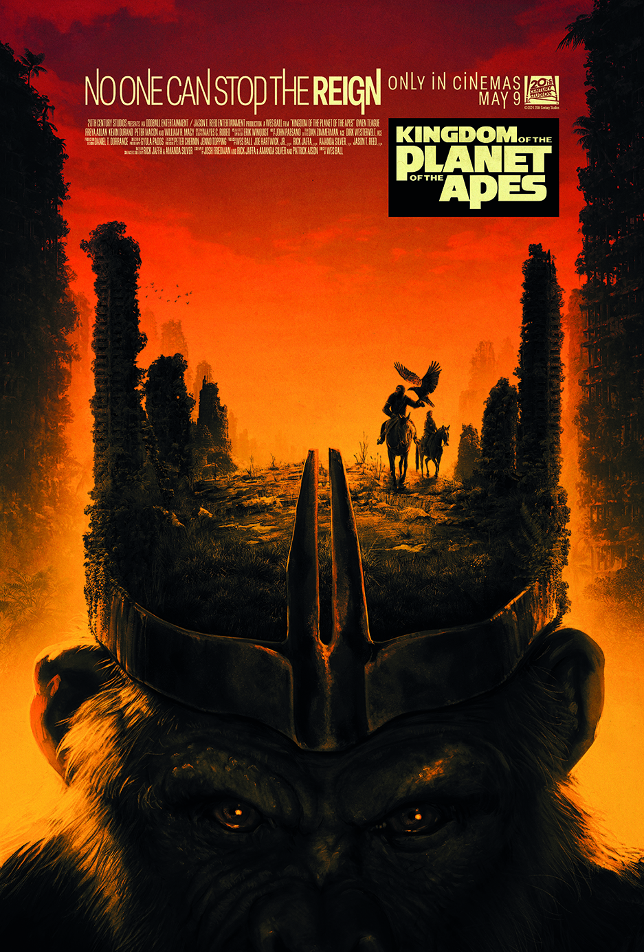
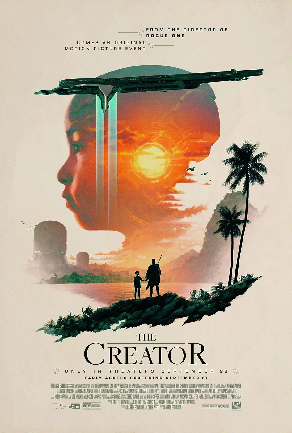
I did that on and off and I got some credits on a few games, including a Star Wars game. I then decided to go to university, and I did a film degree. Film was a big passion in my life and it was my girlfriend – she’s now my wife – who said to me that, “You can combine illustration and film.”
Article continues belowThis was around 2009 or 2010, and back then there was this undercurrent of fan art and alternative art coming up with artists like Olly Moss. I saw his work and thought, “Yeah, I want to do that.”
So, I did that and then, very quickly, in 2010 or 2011, I did an Avengers piece and that got noticed online and led to my first actual job doing this kind of work for Marvel. My first real job doing film art was for The Avengers.
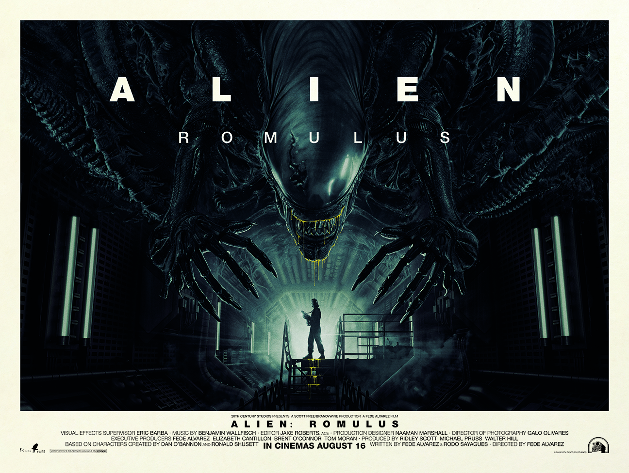
What was it like getting established during the illustrated poster renaissance a decade or so ago?
There’s been a pushback against the rise of photo manipulation in the 1990s. It can be a great tool, but if done in a lazy way, or in a quick way, you can get boring results. There were a lot of what I would call boring movie posters being produced that would be just a photo of an actor. But then there were artists who started doing their own thing.
The film studios noticed that, and they started hiring people because a piece of artwork online had got a positive response. It’s even more important now with the rise of generative AI, I think, for people to say, “Somebody made this.” So, I’m more than happy to have my name attached to work that I’ve done that’s online.
What's your favourite poster you've done for a 'legacy’ movie release?
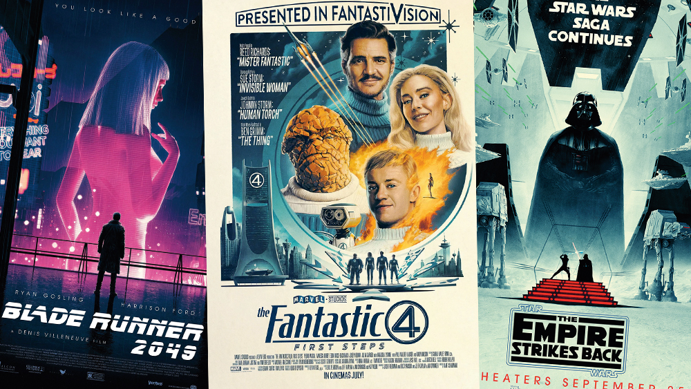
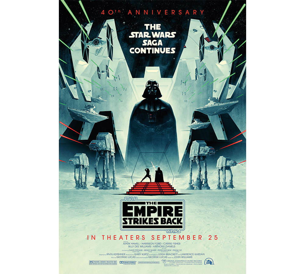
One poster that I’d like to talk about is the anniversary poster that I did for The Empire Strikes Back. I feel like it was a turning point in my career. And it came at the right time, just when Covid was kicking off and I remember thinking, “This is going to distract me from all of this horrible stuff.”
Because it’s such a classic film, and for a lot of people it’s the number one film of all time, and probably the best Star Wars film, there was this huge, daunting task ahead of me. When there’s a definitive piece of artwork, especially for a film, I don’t rip it off, but I try to evoke it. Especially if I’m doing an old film – like an anniversary poster such as the Star Wars one.
I want to evoke the memories of the films, but also the artwork because, for lots of people that’s their access point for the films, whether it’s the posters or the book covers. I know that with the original Star Wars, I had the book and that was my access point because the film wasn’t available: we didn’t have VHS, we didn’t have streaming.
There were photos in the middle of the book and then there was this amazing artwork on the front cover. They trigger the imagination.
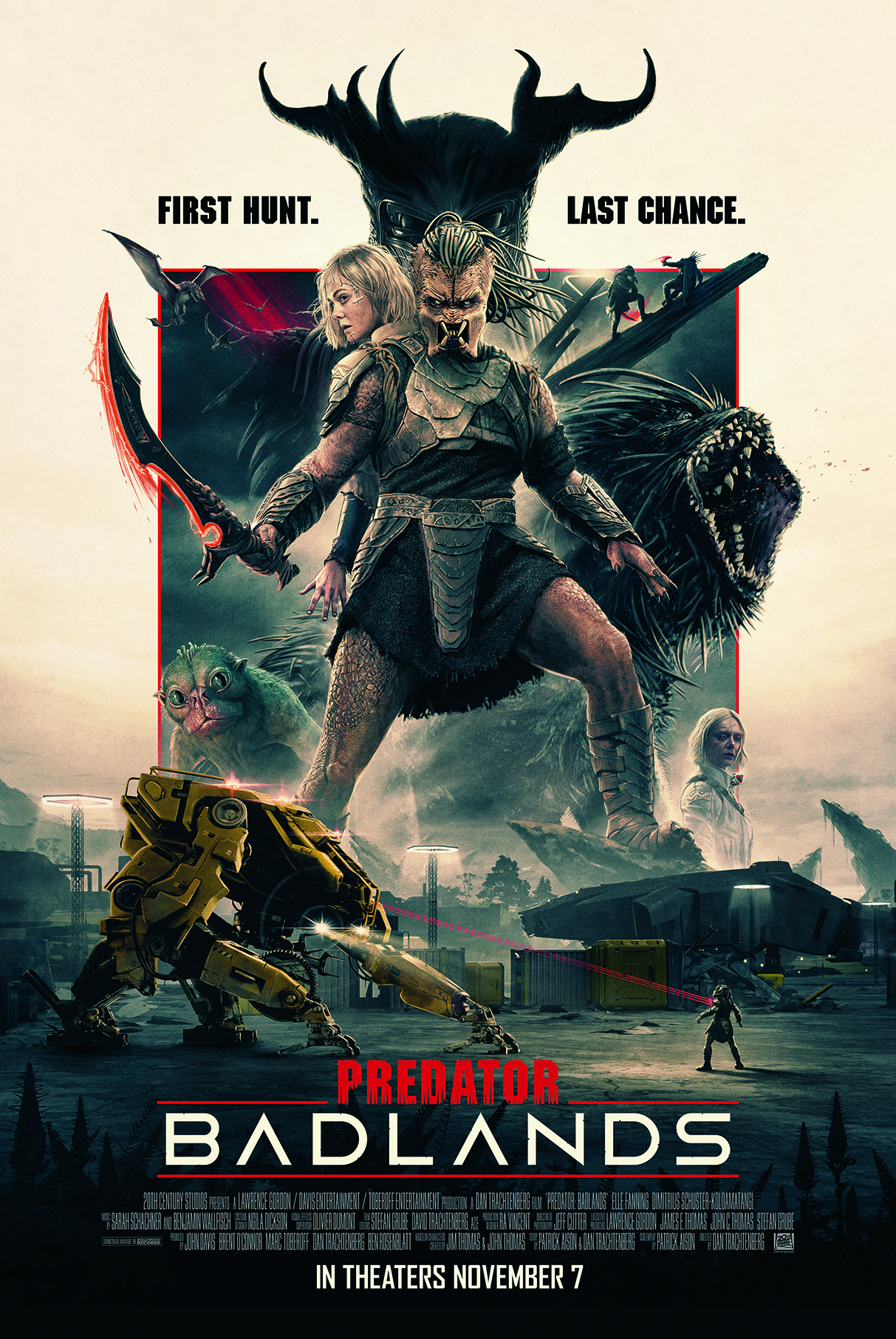
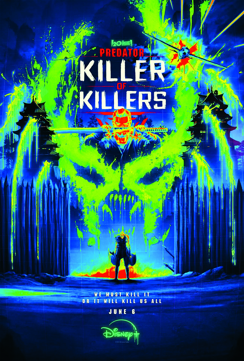
One of your latest movie posters is Predator: Badlands. What was the process for that?
Because Predator Badlands is a new film, it’s a little bit different to working on an anniversary film [poster] where there’s a vast amount of material available online to refer to and you can watch the finished film.
When I was working on Predator: Badlands, the film wasn’t finished. But, because I’m working directly with the studio, they can send me reference material. It’s a back and forth and then once we get a concept that’s good and everyone’s like, “We’re excited about this!” then I’ll take it to final.
There might be tweaks or requests to change this and change that. Tiny things, really.
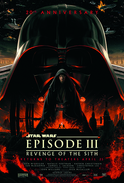
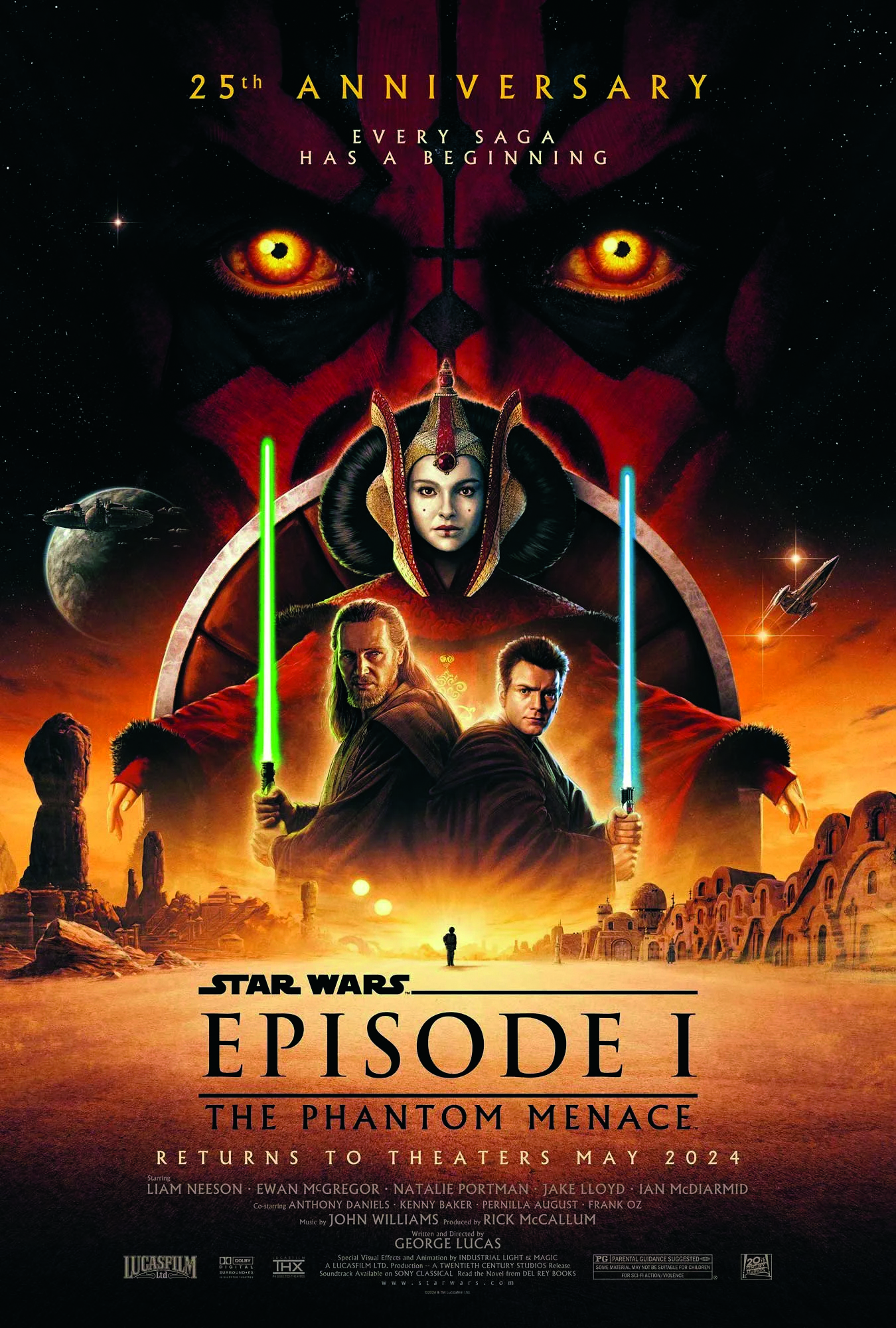
You make a lot of use of circles, semi-circles and silhouettes. What’s the aesthetic idea with that?
At one point on my Star Wars: Revenge of the Sith anniversary poster, Anakin Skywalker was almost more a part of the mask. The idea was that it was enveloping him, but then I pulled back and made it a little bit less strange.
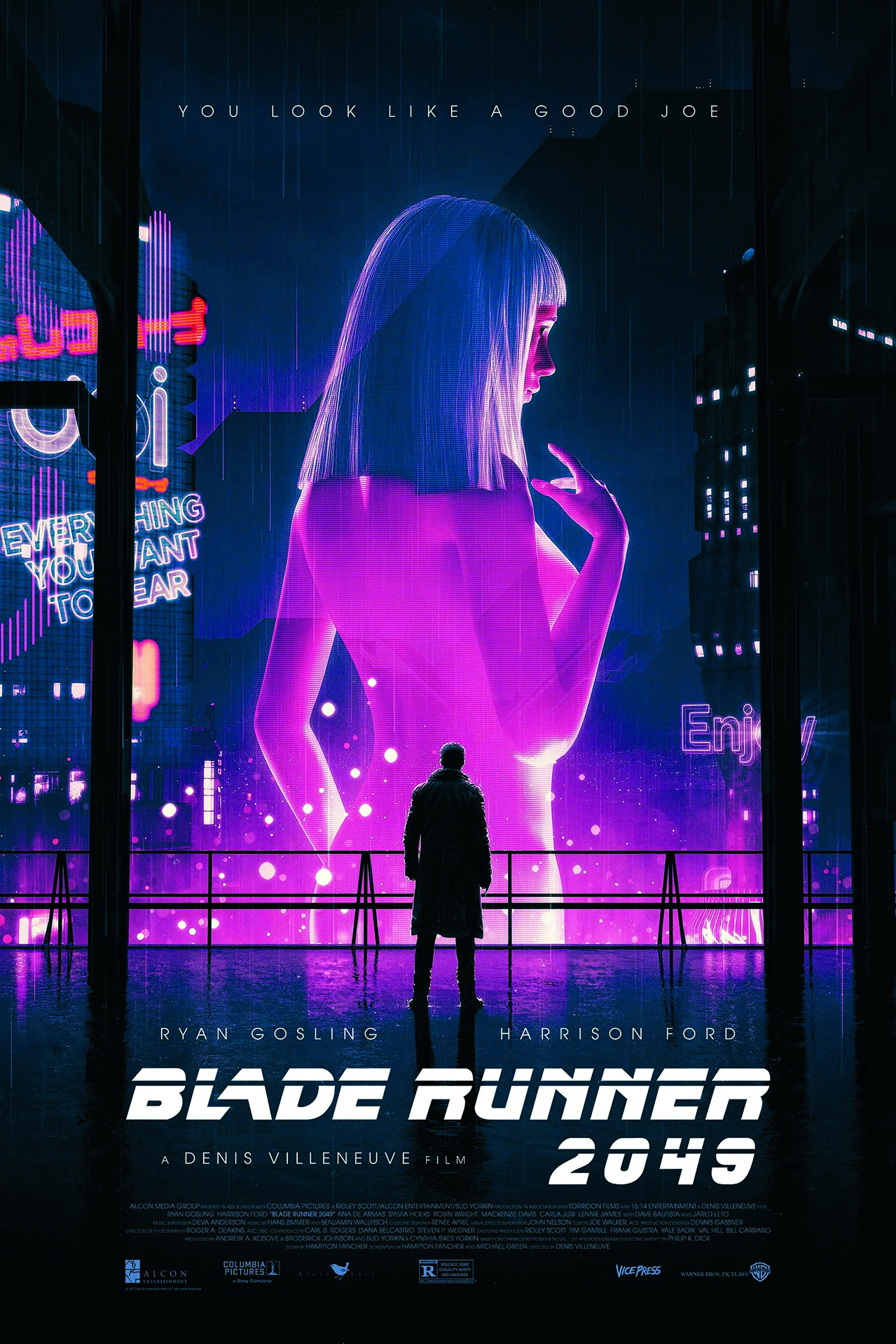
It was a bit strange for a while, to be honest. Initially, I used to do lots of silhouettes. It’s easier than drawing somebody. With Indiana Jones it’s easy, because you’ve got his hat and you’re there. Sometimes, for technical reasons, and sometimes because you can’t get the likeness right, and you can’t get the approval of the actors, you’ll decide to just do it as a silhouette.
But then, it’s about how you put that together in an interesting way. Superheroes have a shape to them that work well as silhouettes. I do like using silhouettes!
What should illustrators be mindful of when creating movie posters for a smartphone-using audience?
Another thing that’s different about movie posters now is that old fashioned movie posters were designed to be seen in a cinema foyer and so they were large.
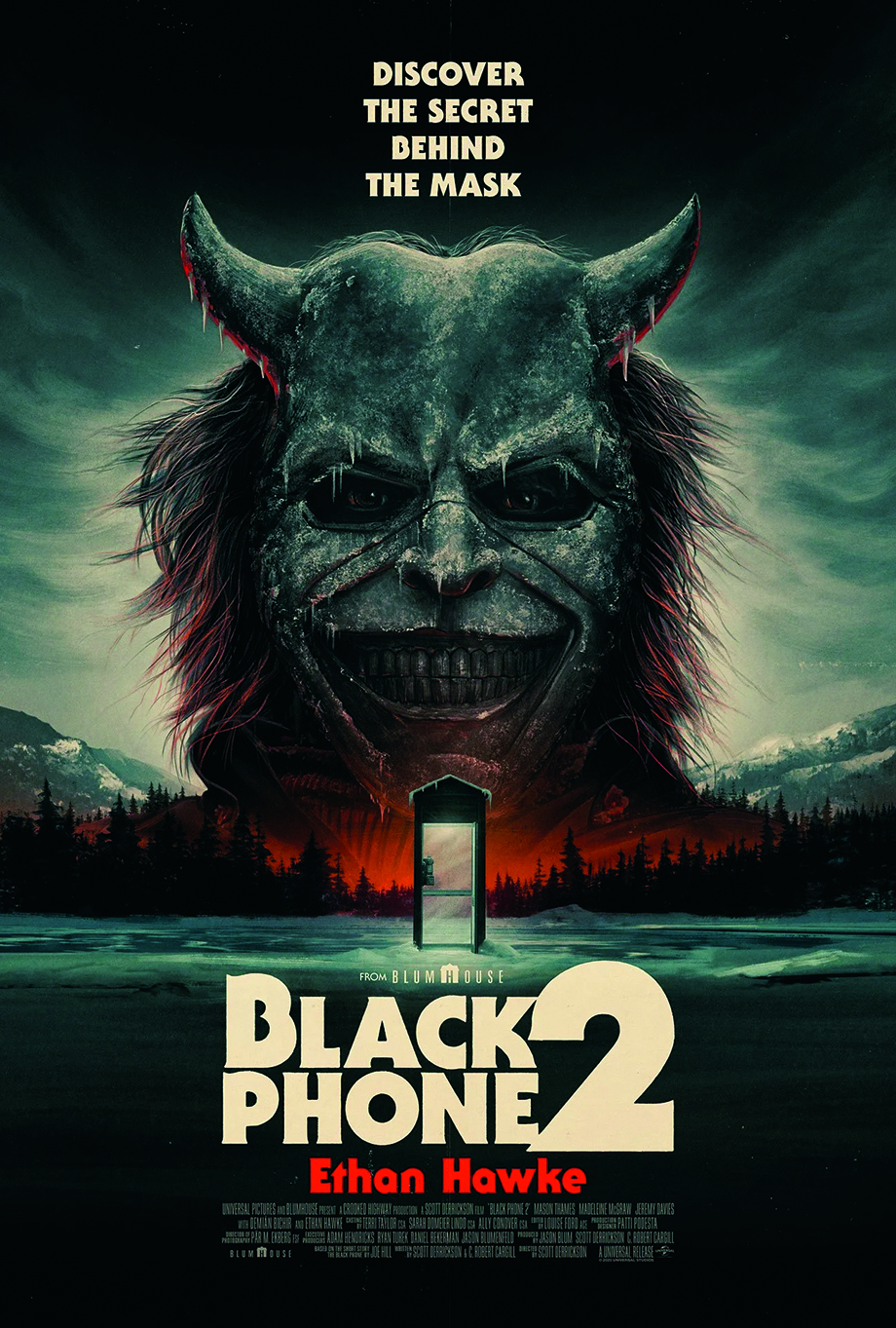
But now, people are seeing posters on their phone, and so I say to artists who I work with: “Make sure you do the standard test: make sure your composition is small, like the size of a business card, because that’s how most people are going to see it.”
Simpler compositions with fewer elements go down well online.
Do posters allow you to express your enthusiasm for movies?
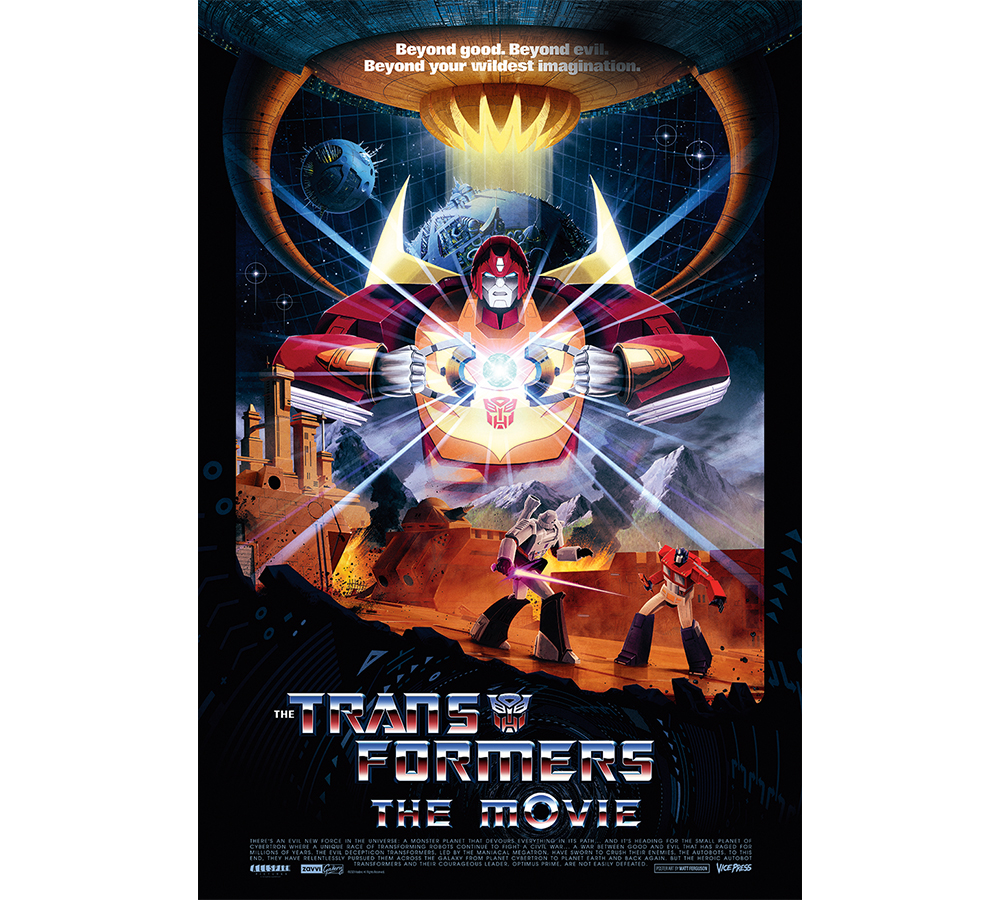
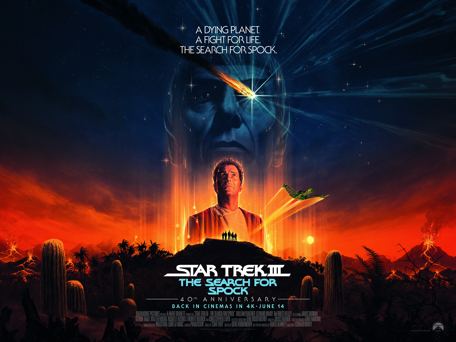
I’m a massive fan of everything that I do. I’ll say no to jobs where I don’t care about it. Star Trek is pretty much my favourite and I like Transformers, too, because of the toys.
The Star Trek films have always been a big thing for me. So doing those is like a passion project, in a way. I love Star Wars, and it’s been a really big and important job for me. People have been so positive about my work on the Star Wars movies, and so I feel a lot of responsibility to make each new one that I do as good as it can be.
You can see more of Matt's work on his website.
This article originally appeared in ImagineFX. Subscribe to ImagineFX to never miss an issue. Print and digital subscriptions are available.
Sign up to Creative Bloq's daily newsletter, which brings you the latest news and inspiration from the worlds of art, design and technology.

James has written about movies and popular culture since 2001. His books include Blue Eyed Cool: Paul Newman, Bodies in Heroic Motion: The Cinema of James Cameron, The Virgin Film Guide: Animated Films and The Year of the Geek. In addition to his books, James has written for magazines including 3D World and Imagine FX.
You must confirm your public display name before commenting
Please logout and then login again, you will then be prompted to enter your display name.
