11 superb examples of Drupal websites
WordPress is not the only CMS! Be inspired by these brilliant examples of websites built on the Drupal platform.
Sign up to Creative Bloq's daily newsletter, which brings you the latest news and inspiration from the worlds of art, design and technology.
You are now subscribed
Your newsletter sign-up was successful
Want to add more newsletters?
08. 82nd & Fifth
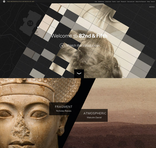
82nd & Fifth is an offshoot of the The Metropolitan Museum of Art website and it is a beautiful thing. Designed and built by agency CHIPS it was set up to showcase 100 works of art over the course of a year. Backing up this ambitious project is Drupal.
"The main focus of the site is weekly 'episodes'," CHIPS co-founder Dan Shields explains. "These play as video but are actually timed audio slideshows. We had editors entering timecodes into fields in Drupal, choosing transitions, and uploading images themselves.
"Drupal was a really good candidate for us," continues Shields, "because we were able to group together a set of fields (using the Field Collections module), and repeat it an unlimited number of times, depending on the number of images in each episode. "For the rest of the site, Drupal is easy to set up in an intuitive way for editors, so there wasn’t much of a learning curve for the team members who were entering content."
Article continues below"We love Drupal because it can take on so many forms. When we work on a project like 82nd & Fifth, which takes a few months to take shape, it’s great to know that the CMS can adapt with us."
09. Palantir
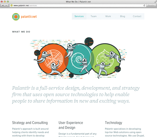
Palantir is a full-service design and strategy agency based in Chicago, which specialises in Drupal-powered development. It’s hard not to fall immediately in love with its own site, with its charming retro space-themed illustrations, gorgeous colour palette and beautiful typography. The spacious layout is a welcome feature too, though it could be tightened up on smaller screens.
"We definitely wanted to make sure that the site wouldn’t be too heavy for mobile users," explains Palantir’s founder and CEO George DeMet, "so we did everything that we could to optimise images, CSS and JavaScript. In our experience, responsive Drupal sites are not significantly larger than other responsive sites as long as best practices are being followed."
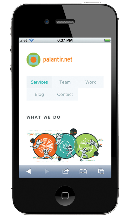
That said, with a homepage size of 1MB there’s still room for improvement. HTTP requests could be reduced by concatenating CSS and JavaScript files, and the overall size of pages could be trimmed by optimising image assets.
Sign up to Creative Bloq's daily newsletter, which brings you the latest news and inspiration from the worlds of art, design and technology.
10. Chris Seddon
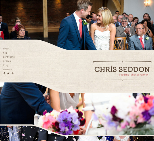
Most wedding-related websites follow a standard cookie-cutter layout, but the portfolio site of wedding photographer Chris Seddon is something a bit different. To make his stunning photography stand out amongst the competition, Katherine Cory has created an eye-popping effect that keeps the images on the page longer as you scroll than you'd expect. It's subtle but very effective.

To create the site, Cory had no doubt about which content management system to use. "Drupal 7 is my weapon of choice," she says. "I’ve been using Drupal since 2008 and once I overcame the learning curve, I fell in love with the system. The possibilities are almost infinite due to the flexibility of content types, views, theming, taxonomies and user roles."
Drupal has a very rich repository of plug-ins, as Cory explains: "Chris’s original website used WordPress, so I used the Migrate module to ensure all content and comments were saved.
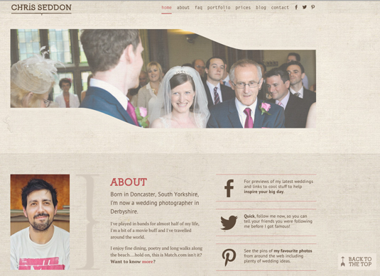
"I used Views to query and display information in a series of blocks and pages, which I themed and manipulated to use plug-ins like FlexSlider and Stellar.js. One of the most useful plug-ins was TVI (Taxonomy Views Integrator) which enabled multiple view pages for taxonomy terms and vocabularies."
Cory is frank about Drupal’s weaknesses and says: "I’ll be the first to admit Drupal has a steep learning curve, but I do think it’s an overlooked option as a cost-effective, open source CMS with a large, supportive and active community."
11. Prince of Wales
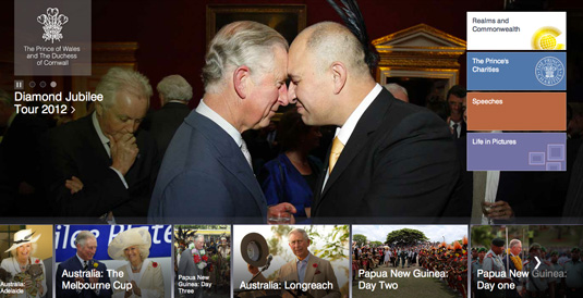
International digital agency Reading Room redesigned the official website for Britain's Prince Charles, using Drupal, following a ‘mobile first’ approach and based upon the principles of responsive web design.
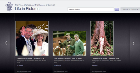
Aiming to create a rich, immersive user experience across mobile, tablet and desktop platforms, Reading Room worked with the Digital Communications Team in the Clarence House Press Office to build the site, which is structured to function as a 'family' of three individual websites - Prince of Wales, Duke And Duchess of Cambridge and Prince Henry.
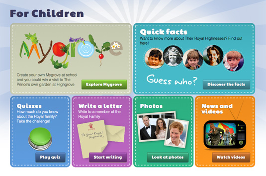
Key features introducing in the redesign include the integration of social media, including YouTube, Sound Cloud and Storify; a greater emphasis on high quality photographic and video content; a dedicated section for The Prince’s Charities; and a new, highly interactive area for children.
This is an updated and extended version of an article that previously appeared on Creative Bloq.

The Creative Bloq team is made up of a group of art and design enthusiasts, and has changed and evolved since Creative Bloq began back in 2012. The current website team consists of eight full-time members of staff: Editor Georgia Coggan, Deputy Editor Rosie Hilder, Ecommerce Editor Beren Neale, Senior News Editor Daniel Piper, Editor, Digital Art and 3D Ian Dean, Tech Reviews Editor Erlingur Einarsson, Ecommerce Writer Beth Nicholls and Staff Writer Natalie Fear, as well as a roster of freelancers from around the world. The ImagineFX magazine team also pitch in, ensuring that content from leading digital art publication ImagineFX is represented on Creative Bloq.
