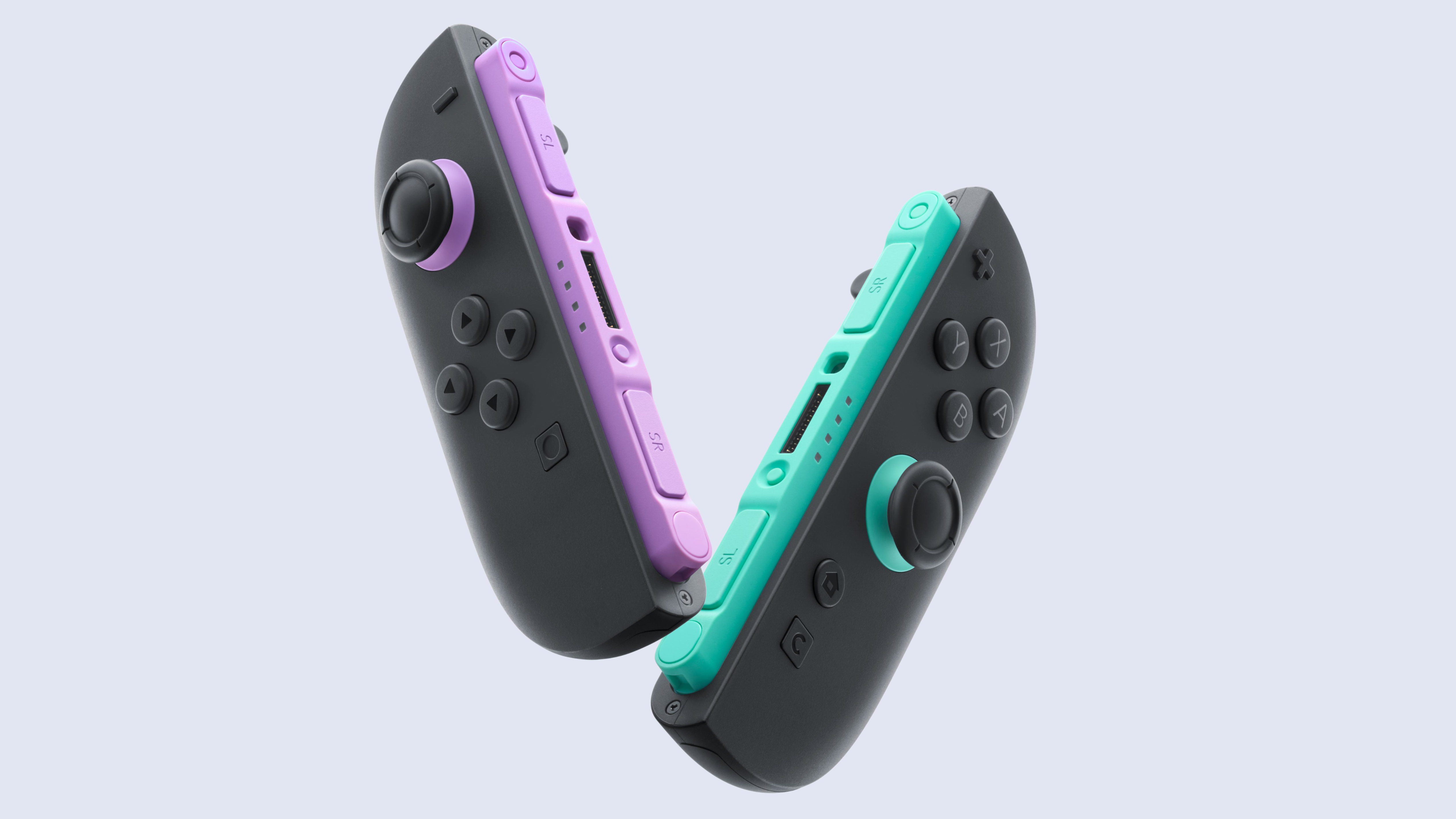
People are calling Nintendo lazy for its new Joy-Con colour designs
Why didn't it colour the full controller?

Sign up to Creative Bloq's daily newsletter, which brings you the latest news and inspiration from the worlds of art, design and technology.
You are now subscribed
Your newsletter sign-up was successful
Want to add more newsletters?
The Nintendo Switch 2 is getting some brand new Joy-Con colour variants for the first time since launch, but fans are really not happy. The newly introduced Joy-Con colours for the Nintendo Switch 2 console are 'Light Purple' and Light Green', but despite the pretty aesthetic, the only areas where you'll see these accents are underneath the thumbstick (when both Joy-Cons are attached to the console).
Overall, the response from gamers to the new design has been pretty brutal, with some outright calling Nintendo lazy over the design and others calling it extremely underwhelming, while suggesting that Nintendo isn't even trying.
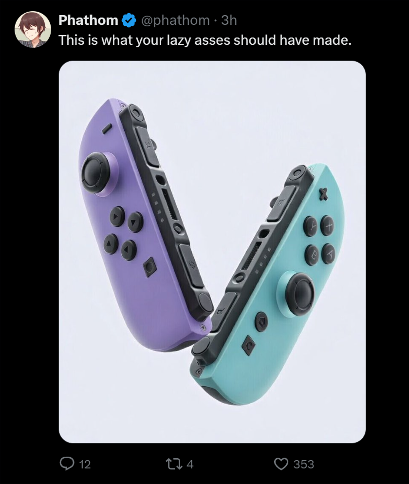
The general consensus is 'why didn't they colour the entire Joy-Con?'. I have to agree with the points made here, as given that the shell is still mostly dark grey, you'll need to squint to notice any colour difference when playing the console handheld.
Article continues belowThe new controllers are available to preorder now for $99.99 (the same price as the standard grey Joy-Cons) and will ship starting 12 February, with wrist straps included.

Some users on X have mocked up what they believe the new Joy-Cons should have looked like (see above), while a company called dbrand has taken it a step further and created some colour-matched Joy-Con skins for only $19.95, to give the people what they want. Or as dbrand says, it 'does what Nintendon't'.
Some commentators on Reddit have proposed that simply having coloured text and arrows on the controller buttons could have solved the issue, and resulted in a much less plain and boring Joy-Con 2 design. Another Redditor has pointed out that the console itself will still be red and blue at the connection points where the Joy-Cons magnetically attach, which could bother some from a matching design perspective.
Personally, I think the Joy-Con colours look nice, but an upgrade would be abolutely pointless given the minimal amount of colour you actually see. I prefer to use some of the best Nintendo Switch Joy-Con alternatives anyway, and I can't see anyone rushing out to buy these new Joy-Cons given the minor tweaks.
Sign up to Creative Bloq's daily newsletter, which brings you the latest news and inspiration from the worlds of art, design and technology.
Maybe it was a strategic choice from Nintendo to keep its Joy-Con 2 pads visually distinct from the Switch 1 series, or perhaps we'll see a future Switch 2 OLED model introduce new shell colours. In either case, it's still pretty disappointing.
Would you buy these new Joy-Con colours? Let us know below.

Beth is Creative Bloq’s Ecommerce Writer and has the fun job of finding you the very best prices and deals on creative tech. Beth kicked off her journalistic career writing for Digital Camera World and has since earned bylines on TechRadar and PetsRadar too. With a Master's degree in Photography, Beth loves getting to tinker with new cameras, especially camera phones, as the resident Samsung fan on the team.
You must confirm your public display name before commenting
Please logout and then login again, you will then be prompted to enter your display name.
