Learning the rules for creating a logo isn't always straightforward as there are such varied applications of any 'rule'. But with the right design skills, theoretical knowledge and a healthy dose of patience you can learn to create timeless designs that stand the test of time. The best logos are instantly recognisable (think McDonald's golden arches or the Nike swoosh), and as long as they have a balance of originality, scalability and style they can become a priceless asset.
Below we've listed 10 golden rules to consider when you're looking to design a logo – if you apply these tips you'll be off to a great start (just one of these is originality – as sports brand Umbro well knows right now due to its neverending logo design dispute – read about that case here). For the perfect platform to create your new logo, check out our picks for the best logo designer.
The golden rules for logo design: Our top tips for success
With hundreds, even thousands of brands competing for our attention, brands need to differentiate themselves visually. This is achieved through brand identity design – a range of elements that work together to create a distinctive picture of the brand in our minds. Brand identity design can include everything from uniforms, vehicle graphics, business cards, product packaging, billboard advertising and coffee mugs and other collaterals to photographic style and the choice of fonts.
When we look at something, we don’t read first. Before anything else we see shape, we see colour, and if that’s enough to hold our attention, then we’ll read
David Airey
When you think about a person who’s made some kind of impact on your life, you can probably picture what they look like. The same thing happens with brands. And a logo acts as a brand's face, allowing people to connect with it and remember it. The aim of logo design should therefore be to create something that people can easily picture when they think about their experiences with a product, company or service.
When we look at something, we see shape and colour before we read. Only if that’s enough to hold our attention do we start to read. The job of designers is to distil the essence of a brand into the shape and colour that’s most likely to endure. Below designer David Airey offers his 10 golden rules of logo design to help you do just that.
01. Do your research

Logo design should begin with some groundwork. Getting to know the client and their product will help you choose the strongest design direction and make it easier to get a consensus on your logo design further down the line. One of the most interesting parts of being a designer is that you get to learn new things with each project. Every client is different, and even in the same profession, people do their jobs in different ways.
Make sure you ask your client why they exist, what they do and how they do it. What makes them different from other brands? Who are they there for and what do they most value? Some of these questions might seem so straightforward as to be unnecessary, but they can be challenging to answer and will lead to more questions about the business. What you discover in this initial phase of a project can help ensure that you don't miss the market when you start developing your logo design.
02. Start with a sketchpad

With the many digital tools available today, you might consider going straight to your computer to create a logo design, but using a sketchpad gives you a chance to rest your eyes from the glare of brightly lit pixels and, more importantly, record design ideas much more quickly and freely. With no digital interface in the way, you have complete freedom to explore, and if you wake up in the night with an idea you don’t want to lose, a pen and paper by your bedside is still the best way to get it down.
Sketching makes it easier to put shapes exactly where you want them – there will always be time to digitise your marks later (see our sketching tips for more advice). It can also be useful to share some sketches when you’re describing design ideas to clients prior to digitising a mark. This can make it easier for them to visualise the result without the distraction of typefaces and colours, which can sometimes cause clients to dismiss a whole idea. Don’t share too much though; only your best ideas.
03. Begin your logo design in black and white

Colour is an important part of branding, but it can sometimes be a distraction, and one that can make it difficult for a client to consider the basic concept of the logo. Leaving colour until later on in the process can allow you to focus on the idea of your logo design itself rather than on an element that’s usually much easier to change.
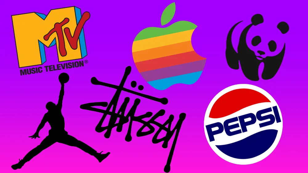
It's impossible to rescue a poor idea with an interesting palette, but a good idea will still be good irrespective of colour. If you picture any well-known symbol, in most cases you'll think of the form first before the palette. It’s the lines, shapes and the idea itself that is most important, whether it's a bite from an apple, three parallel stripes, four linked circles in a horizontal line, or anything else.
04. Make sure your logo design is relevant

A logo design needs to be relevant to the ideas, values and activities it represents. An elegant typeface will suit a high-end restaurant better than it will a children’s nursery. Likewise, a palette of fluorescent pink and yellow probably won't help your message engage with male pensioners. And crafting a mark that bears any resemblance to a swastika, regardless of the industry, just isn’t going to work.
You know these things, and they may seem fairly obvious, but appropriateness goes deeper than this. The more appropriate your rationale behind a particular design, the easier it will be to sell the idea to a client (and this can be the most challenging part of a project. Remember, designers don’t just design. They sell, too).
05. Create a logo design that's easy to remember

A good logo design is memorable, allowing a brand to stay in a potential customer's mind despite other brands competition for their attention. How can that be achieved? Simplicity should be your watchword here. A really simple logo can often be recalled after as little as brief glance, something that’s not possible with an overly detailed design.
A trademark has to be focused on a concept; on a single ‘story’. In most cases, this means it should have an uncomplicated form so that it can work at different sizes and in a range of applications, from a website icon in a browser bar to signage on a building.
06. Strive to be different

If a brand's competitors are all using the same typographic style, the same kind of palette, or a symbol placed to the left of the brand name, this is the perfect opportunity to set your client apart rather than have them blend in. Doing something different can really help your logo design stand out.
So much similarity in the marketplace doesn’t necessarily mean your job has become easier, though. It often takes a brave client to buck a trend that they see all around them. However, showing imagination in your design portfolio is one good way to attract the kind of client you want, and demonstrating the appropriateness of your concept can help see off any qualms.
07. Consider the wider brand identity

We don't usually see a logo in absolute isolation. It's usually presented in the context of a website, a poster, a business card, an app icon, or all manner of other supports and applications. A client presentation should include relevant touchpoints to show how the logo appears when seen by potential customers. It’s a little like when you’re stuck in a rut – it can help to step back, to look at the bigger picture, to see where you are and what you’re surrounded by.
In design terms, the bigger picture is every potential item on which your logo design might appear. Always consider how the identity works when the logo isn’t there too. While it's hugely important, a symbol can only take an identity so far. One way to achieve cohesive visuals is to craft a bespoke typeface for your logo. That typeface can then also be used in marketing headlines.
08. Don’t be too literal

A logo doesn’t have to show what a company does; in fact, it’s often better if it doesn’t. More abstract marks are often more enduring. Historically you’d show your factory, or maybe a heraldic crest if it was a family-run business, but symbols don’t show what you do. Instead, they make it clear who you are. The meaning of the mark in the eyes of the public gets added afterwards, when associations can be formed between what the company does and the shape and colour of its mark.
09. Remember that symbols aren’t essential

A logo doesn't always need to be a symbol. Often a bespoke wordmark can work well, especially when the company name is unique – just think of Google, Mobil, or Pirelli. Don’t be tempted to overdo the design flair just because the focus is on the letters. Legibility is key with any wordmark, and your presentations should demonstrate how your designs work at all sizes, large and small.
Of course, words sometimes just won't work in very small applications, so variations may be needed. This might be as simple as lifting a letter from the logomark and using the same colour, or it might incorporate a symbol that can be used as a secondary design element (wordmark first, symbol second) instead of as a logo lockup where both pieces are shown alongside one another.
10. Make people smile

Finally, injecting a little wit into your logo design not only makes your job more fun; it can also help your client to become more successful. It's not appropriate for every brand or every industry (it certainly doesn't make sense for weapons manufacturers and tobacco firms, but whether you choose to work with such companies is another thing). However, the somewhat less contentious law and financial sectors are filled with companies identified by stuffy and sterile branding. Adding a little humour into such clients' identities can help set them apart.
There’s a balance to be achieved. Take it too far and you risk alienating potential customers. However, regardless of the company, people do business with people, so a human, emotional side to your work will always have a level of relevance.
What are the 5 basic types of logo?
As you've likely learned by now, there are a diverse range of logo types to consider when creating your own design. Most will fit into one of five categories as listed below.
Wordmark: The wordmark or logotype is a fairly common example that features a simple design with the brand's name. Famous examples include Coca-Cola, Visa and Disney.
Lettermark: These logos are similar to wordmarks, but often only feature the initials of the brand. These are good for companies with long names that can be hard to remember. Famous examples include The National Aeronautics and Space Administration (NASA) and Cable News Network (CNN).
Brandmark: A brandmark (or pictorial mark) is one of the more recognisable logo type examples. These are good for creating a less literal psychological connection with your audience – think the Apple logo and Snapchat ghost.
Combination Mark: As the name suggests, this is a blend of the symbol and wordmark. This allows you to translate the brand identity clearly, but it can be more difficult to scale down, so consider this when creating your design. Famous examples include the Lacoste logo, Xbox and Microsoft.
Emblem: Emblems are an integrated blend of symbol and wordmark that appear more like a badge or seal. When used efficiently, emblem logos can be a classy way to represent your brand. They have a timeless appeal that gives your brand identity a stylish authority, but they can be difficult to separate and scale. Some of the best examples are the Starbucks logo and the Ford logo which are instantly recognisable.

You must confirm your public display name before commenting
Please logout and then login again, you will then be prompted to enter your display name.