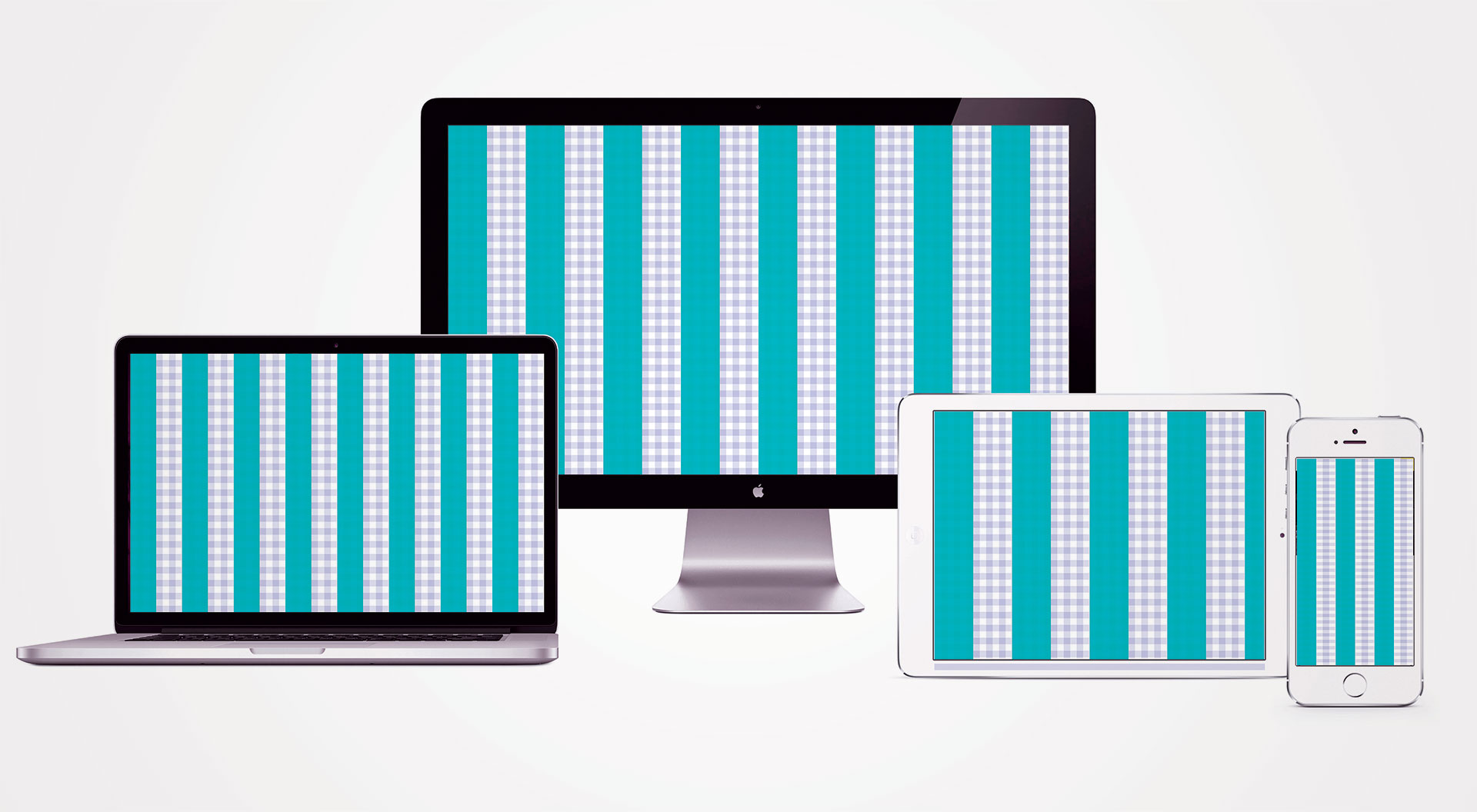
Nail your responsive layouts with this device cheat sheet
Ensure your layouts scale across devices and resolutions with this handy reference.

Sign up to Creative Bloq's daily newsletter, which brings you the latest news and inspiration from the worlds of art, design and technology.
You are now subscribed
Your newsletter sign-up was successful
Want to add more newsletters?

Five times a week
CreativeBloq
Sign up to Creative Bloq's daily newsletter, which brings you the latest news and inspiration from the worlds of art, design and technology.

Once a week
By Design
Sign up to Creative Bloq's daily newsletter, which brings you the latest news and inspiration from the worlds of art, design and technology.

Once a week
State of the Art
Sign up to Creative Bloq's daily newsletter, which brings you the latest news and inspiration from the worlds of art, design and technology.

Seasonal (around events)
Brand Impact Awards
Sign up to Creative Bloq's daily newsletter, which brings you the latest news and inspiration from the worlds of art, design and technology.
No-one ever said that responsive web design was easy, but there's plenty that you can do to smooth out the process. If you can go into a responsive project without having to worry about the size of your grids then that'll save you at least one headache along the way.
Here is a quick breakdown of the standard measurements you can use across devices, depending on the width you choose to make the columns. Remember, the column widths should remain the same across device sizes, but you can adjust the initial width to fit your needs. I'll typically design a mobile website at 360px wide to work in this system.
120px-wide columns
Television
1,024 x 576 (1080p aspect ratio): 8 columns, 32px margin
Desktop
1,440 x 840: 12 columns, 0px margin
1,280 x 800: 10 columns, 40px margin left and right
Tablet
Sign up to Creative Bloq's daily newsletter, which brings you the latest news and inspiration from the worlds of art, design and technology.
1,024 x 768: 8 columns, 32px margin left and right
960 x – : 8 columns, 0px margin
Mobile
320 x – : 3 columns, 0px margin
100px-wide columns
Television
1,024 x 576 (1080p ratio): 10 columns, 12px margin left and right
Desktop
1,440 x 840: 14 columns, 20px margin left and right
1,280 x 800: 12 columns, 40px margin left and right
Tablet
1,024 x 768: 10 columns, 12px margin left and right
960 x – : 9 columns, 30px margin left and right
Mobile
320 x – : 3 columns, 10px margin left and right
80px-wide columns
Television
1,024 x 576 (1080p ratio): 12 columns, 32px margin left and right
Desktop
1,440 x 840: 18 columns, 0px margin
1,280 x 800: 16 columns, 0px margin
Tablet
1,024 x 768: 12 columns, 32px margin left and right
960 x – : 12 columns, 0px margin
Mobile
320 x – : 4 columns, 0px margin
This article originally appeared in net magazine issue 281; buy it here!
