Why we should be wary of the retro trend
Computer Arts editor Nick Carson argues that restoring a brand’s heritage should be done for the right reasons.
Sign up to Creative Bloq's daily newsletter, which brings you the latest news and inspiration from the worlds of art, design and technology.
You are now subscribed
Your newsletter sign-up was successful
Want to add more newsletters?
A great deal has been written over the last few weeks about the apparent ’retro’ branding craze, brought into the limelight by North’s much-lauded overhaul of Co-op. It was lauded by us also: not only did the beautifully executed project win a coveted Brand Impact Award this year, but it also helped North top CA’s UK Studio Rankings.
And as all of those ‘retro trend’ articles are at pains to point out, North’s Co-op rebrand, Futurebrand’s overhaul of NatWest and Work-Order’s most recent revamp of Kodak share one noteworthy similarity – they have breathed new life into an identity last seen in the late 60s and, in Kodak’s case, early 70s.

A fitting metaphor would be a piece of antique wooden furniture that has been scratched, battered, perhaps buried beneath many layers of garish paint. The smart money would be on stripping those layers off to reveal the beauty beneath; restoring the wood and oiling it back to its former glory.
But before design studios the world over start falling over themselves to wind back the clock on their more long-established clients’ brand identities, we need to consider when, and why, it’s worthwhile to do so. Have all these examples been equally successful? Have they done it for the right reasons?
Does consistency make for a stronger brand heritage?
The question, of course, is whether a company’s design archives actually contain priceless antiques that have been unjustly put in storage, or whether rose-tinted nostalgia is at play, and stripping them down reveals little more than chipboard.
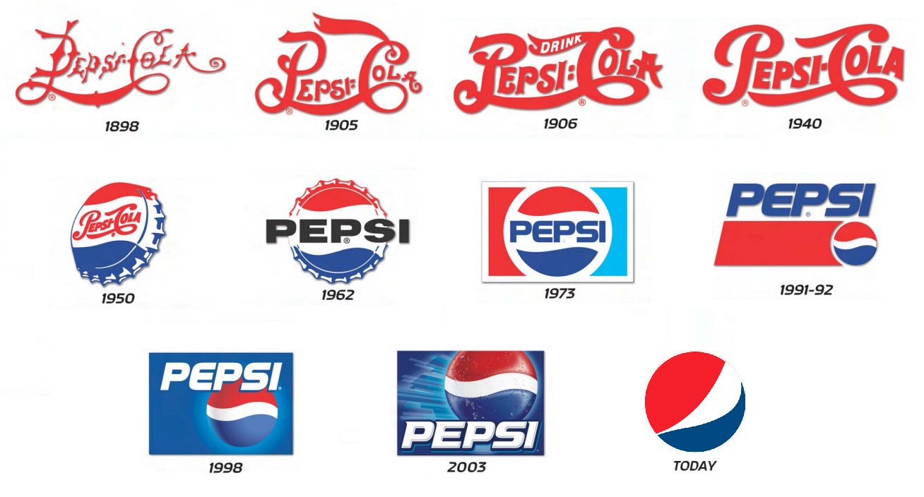
Ask yourself, which has a more iconic identity – Coca-Cola, or Pepsi? Consider the longevity, and consistency, of each logo. Pepsi has been through at least seven major iterations, while its market-leading rival sports much the same logo, bar some tweaks, as it did in the 1960s – or, indeed, the late 1800s.
Does consistency make for a stronger brand heritage? If Coca-Cola had ditched that familiar scrawling script for a sans-serif, or diluted its primary red to salmon pink, there would likely have been uproar. (Pepsi once had a scrawling script also, but it was ditched for a sans-serif, coincidentally also in the 1960s.)
Sign up to Creative Bloq's daily newsletter, which brings you the latest news and inspiration from the worlds of art, design and technology.

Co-op, NatWest and Kodak all represent very different market sectors, and they all developed in different ways before their respective rebrands this year. Co-op had changed quite radically – with the help of Pentagram, almost a decade ago it swapped its once iconic cloverleaf for a lowercase Helvetica word mark.
Co-op had hit the rocks in terms of customer satisfaction, and the cloverleaf brand – representative of a network of independent organisations collaborating as one, and last redesigned in 1993 - had become tarnished. Pentagram’s rebrand tested well in stores between 2005 and 2007, and was rolled out nationwide accordingly.
What North has done so successfully is restored and reawakened the original spirit of the Co-op, not simply by reinstating the cloverleaf but by leapfrogging its previous, tarnished incarnation and breathing new life into its 1960s heritage. It feels like a vibrant, co-operative organisation that’s gone back to basics and embraced its founding values, and the branding is a manifestation of that.
By contrast, NatWest’s brand mark has stayed broadly consistent, albeit simplified over the years to become a clean, flat-colour shape that only hinted at the original three interlocking cubes using negative space – cubes that originally represented National Provincial Bank, Westminster Bank and District Bank.

Futurebrand has brought the cubes dramatically back to the fore. The execution is beautiful, with the purple-and-red gradient giving the mark a subtle three-dimensional feel without becoming distracting. The branding comes alive in animation, and the cube motif carries through custom type, marketing illustrations and more.
With a view to the retro trend, though – let’s compare that to Co-op to get to the heart of why a 1960s revival makes sense. Co-op’s cloverleaf mark symbolises co-operation; it’s about the whole being greater than the sum of its parts. There’s a compelling reason, in the modern retail marketplace, why the organisation might want to rewaken that ethos.
NatWest’s interlocking cubes represent a corporate merger between three banks that many modern customers may not even remember as individual entities. It was a beautiful mark back in the 1960s and it stands the test of time, but no one could argue that reminding anyone of that merger makes good business sense. It’s an aesthetic choice, not a strategic choice.
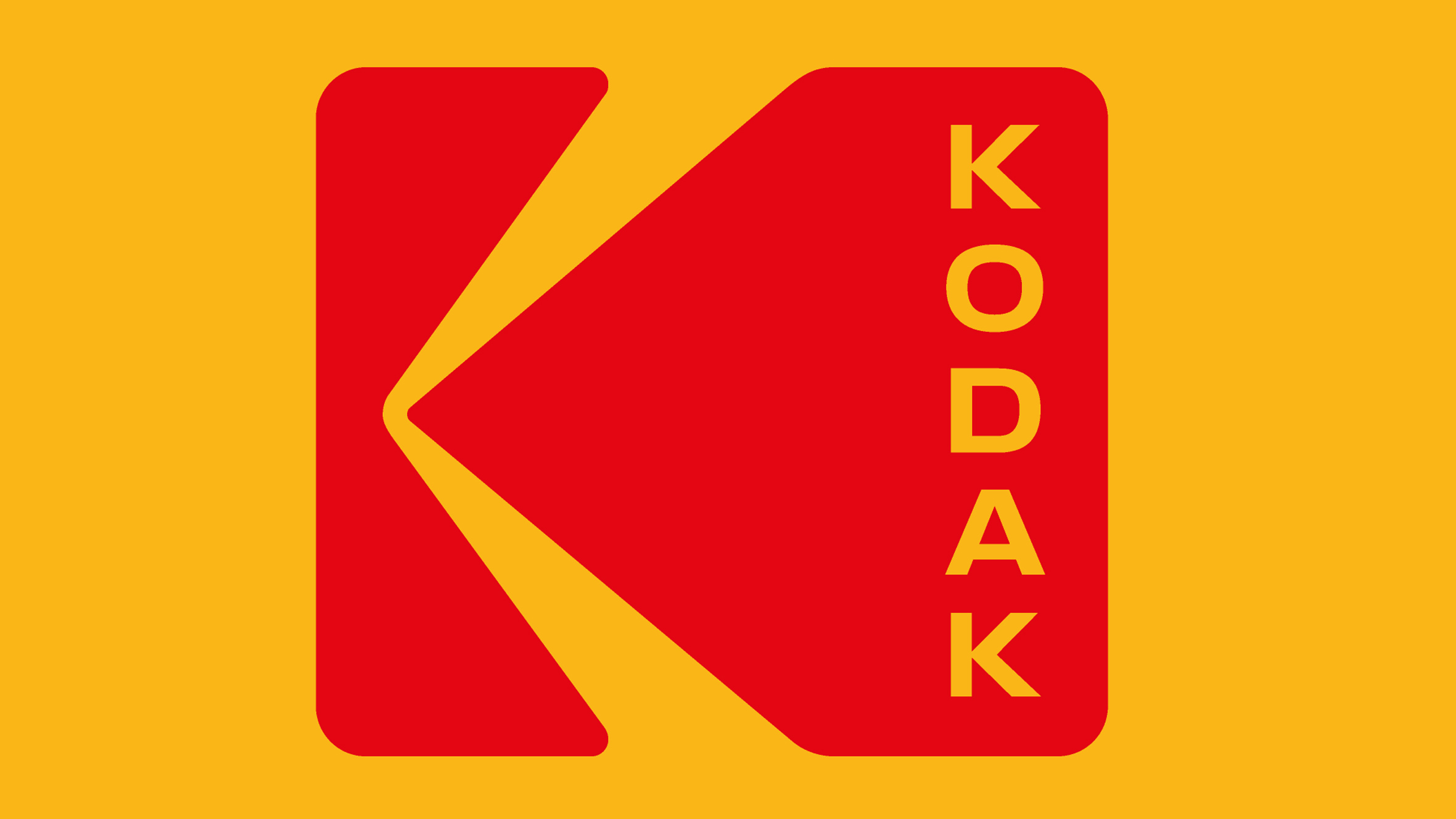
Finally, let’s look at Kodak. Its chunky red K on distinctive ochre yellow is in some ways equivalent of Co-op’s cloverleaf, in that it’s an instantly recognisable graphic symbol, that was ditched in favour of a typographical mark that only hinted at those original brand touchpoints. Work-Order restored it, and by stacking the type vertically, gave the K even more dominance and standout.

Kodak had hit the rocks far more comprehensively than Co-op before its last rebrand, having underestimated the impact of the digital camera revolution and been slow to adapt, invested unsuccessfully in the inkjet printing market, and ultimately come to the verge of bankruptcy, laying off thousands of staff, and then rebranding in 2006 with a view to positioning itself as a 21st-century innovator.
What does this new ‘retro’ trend mean for brand designers? The simple answer: it depends on your client
Turning back the clock to reinvigorate and develop its old logo, remembered fondly by many from its heyday, is quite a statement in that regard. Rather than emerging from the storm, shaking off a damaged reputation and consciously trying to look modern and cutting-edge as it prepares to launch a smartphone targeting digital photographers, Kodak has effectively catapulted its visual identity back to its market-leading analogue heyday.
What does this new ‘retro’ trend mean for brand designers? The simple answer: it depends on your client. All three of the stories above may have a logo from the late 60s or early 70s at their core, but therein the similarities end. To be truly authentic about a retro rebrand, the organisation needs a reason to reawaken that era of its history and not just play visual lipservice to it.

Nick has worked with world-class agencies including Wolff Olins, Taxi Studio and Vault49 on brand storytelling, tone of voice and verbal strategy for global brands such as Virgin, TikTok, and Bite Back 2030. Nick launched the Brand Impact Awards in 2013 while editor of Computer Arts, and remains chair of judges. He's written for Creative Bloq on design and branding matters since the site's launch.
