How to paint Greek mythology with drama (and accuracy)
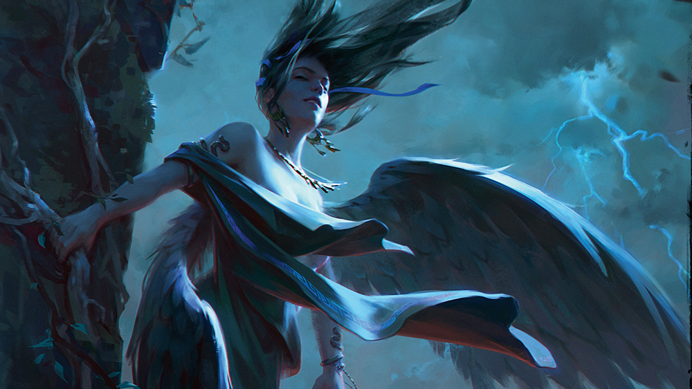
Alexander Leskinen shows how he paints a stormy environment featuring harpies, the winged messengers of Zeus.

Sign up to Creative Bloq's daily newsletter, which brings you the latest news and inspiration from the worlds of art, design and technology.
You are now subscribed
Your newsletter sign-up was successful
Want to add more newsletters?
This illustration was created for a zine on ancient Greek mythology, so it was important to adhere to the canonical depiction of harpies in Greek art and ensure the image aligned with how ancient Greeks envisioned these characters, avoiding pop-culture distortions.
Harpies are bird-like messengers of Zeus, sent by the Olympian ruler to punish humans for their crimes. They embody sudden gusts of wind that carry away human souls. I decided to depict them bathing in a storm. I emphasised the strong wind through flowing hair and tunics.
The sharp light from a lightning flash was meant to make the image more tense and dramatic. I directed the gaze of the nearest harpy towards the viewer, as if the viewer were seeking shelter from a severe storm by the seashore and accidentally stumbled upon the carefree, bathing harpies.
Article continues belowI chose a dark tone for the illustration to emphasise the grim nature of these characters. The colour scheme consists of cool shades with a slight warm contrast on the horizon, caused by the setting sun.
If you need software to follow the tutorial, see our guide to the best digital art software.
To get the brushes used for this artwork, See how to download the resources from ImagineFX issue 261.
01. Working up the idea

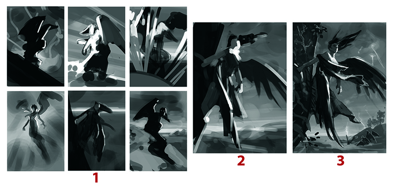
I always start my illustrations by putting down tonal masses and rhythms. I quickly create several compositional drafts using spots and rhythms.
Sign up to Creative Bloq's daily newsletter, which brings you the latest news and inspiration from the worlds of art, design and technology.
At the second stage, I refine one of the preferred options with minor adjustments, and at the third stage I go on to develop the overall vision and idea of the illustration in black and white.
02. Moving into colour

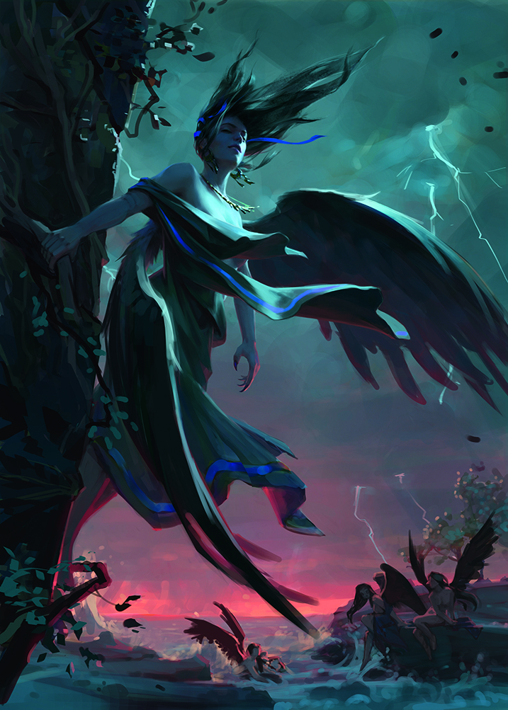
I create several colour variations using the black-and-white sketch and layer blending modes to select colours. I settle on a cooler option because it adds more tension and better suits the character’s design.
I place the colour contrast at the periphery, near the horizon line, so that the colour contrast opposes the tonal contrast in the upper part of the composition.
03. Rendering the scene

Now it’s just a matter of rendering everything. I work on the entire illustration as a whole, starting from the compositional centre and gradually moving to the surroundings.
During the process, I work on the entire illustration at once. This prevents me getting stuck on one section and helps maintain cohesion, preserving the hierarchy toward the compositional centre.
Breaking down the light

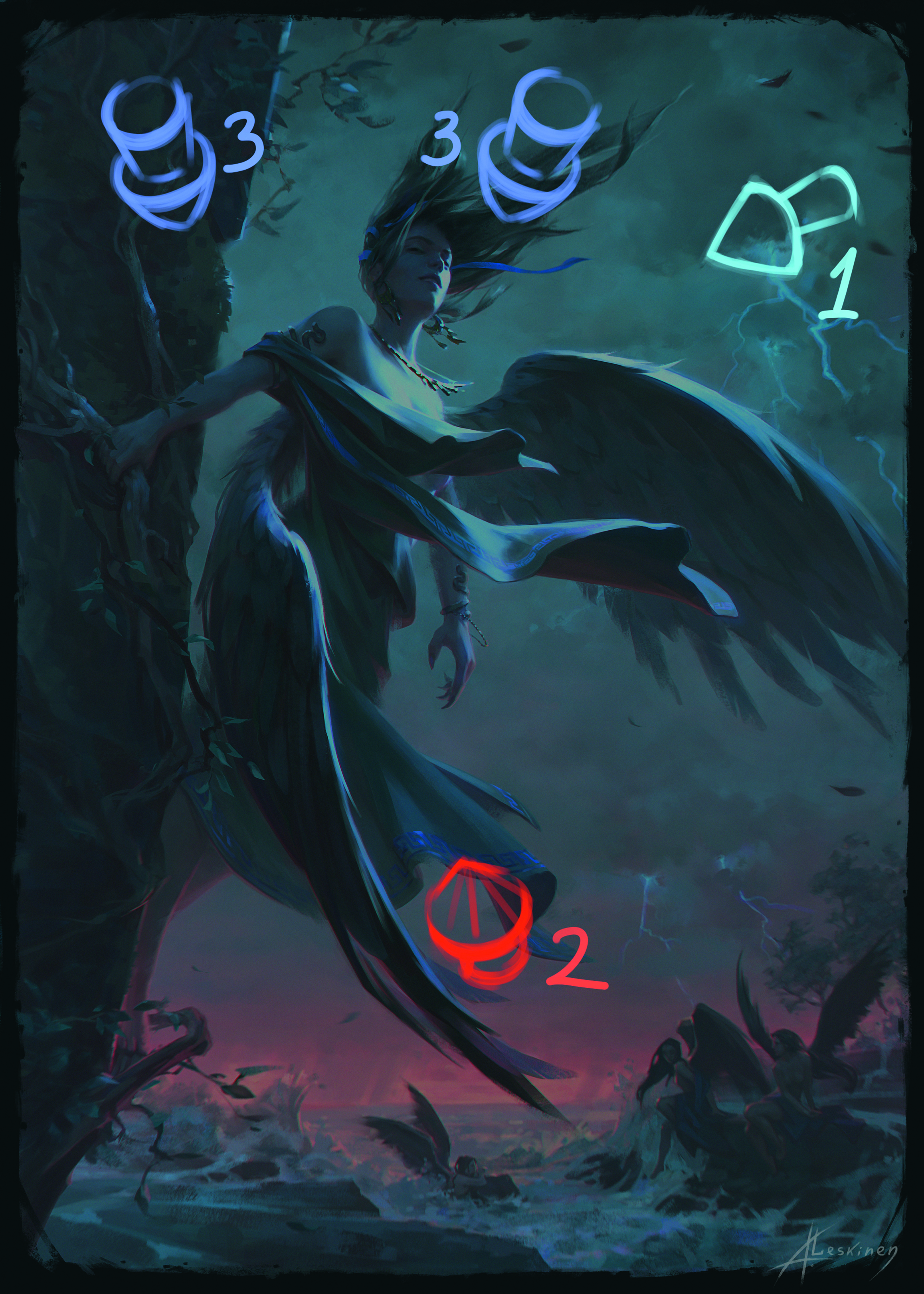
Breaking down the light This illustration uses three light sources that are arranged in a hierarchy: primary, secondary and tertiary. The first and strongest, sharpest light source is the lightning flash, with the main light flow directed at the compositional centre.
The second light source is the glow of the sunset. It’s directional and warm, but much weaker than the first, creating a warm-cool contrast and adding a painterly quality.
The third, minor light source is the light from the twilight sky – a diffused light source. Always establish a hierarchy in lighting. It will make your illustration appear more interesting and expressive.
Work smarter
This illustration features deep shadows, so I don’t add much detail there, even though it’s the compositional centre. Never over-detail areas where the detail won’t be visible – this helps maintain cohesion in your work and saves time.
Strike the right tone
Always work with tonal values first during the process. Tone is the foundation of your illustration. Without proper tonal structure, it’s impossible to select colours correctly since tonal value is an integral part of colour.
Without well-established tonal relationships, your composition, accents, depth, spatial arrangement, mood and atmosphere won’t function effectively. Simply put, nothing in the illustration will work if the tonal values are incorrect.
Establish depth
To create spatial depth in the figure, I use differences in edge contrast. The silhouette of the far shoulder is softer than the near one, which visually pushes the near shoulder toward the viewer.
The start of the near wing recedes behind the shoulder in space, emphasised by a more contrasting line of the fabric on the shoulder and the soft silhouette of the feathers.
The silhouette of the far arm is softer than the fabrics overlapping it, which are closer. Always use contrasts in illustrations – it makes the image more expressive and interesting. Here, the contrast between soft and hard works in the silhouettes.
Colour temperature
When using multiple light sources, try to differentiate between them not only in intensity but also in colour temperature. In this illustration, I’m using a warm red orange light – the complementary colour on the colour wheel to the cool blue tones of the primary lightning flash.
Because the main lighting in this illustration is cool, I make all the deep shadows warm in colour temperature. This enables the piece to remain within a cool colour scheme while retaining a painterly quality.
The warm sunset also helps maintain the warm-cool contrast. It’s important to preserve the overall lighting temperature principle across the entire illustration – this makes it cohesive and believable.
Secondary characters
To convey scale and a sense of space, I place other bathing harpies in the background. Without them, the illustration would lack small elements to complement the large figure, as well as a sense of space, since the upper part only contains the character and the sky.
Aim for at least three planes in an illustration to create a comfortable sense of space.
This article originally appeared in ImagineFX. Subscribe to ImagineFX to never miss an issue. Print and digital subscriptions are available.

Alexander has been a part of the CG industry for over 15 years. He’s currently freelancing, creating promotional art and illustrations for various game projects and working on Magic: The Gathering and other card games.
You must confirm your public display name before commenting
Please logout and then login again, you will then be prompted to enter your display name.
