CSS tricks to shake up your web layouts
Revolutionise your designs with these CSS tricks.

Sign up to Creative Bloq's daily newsletter, which brings you the latest news and inspiration from the worlds of art, design and technology.
You are now subscribed
Your newsletter sign-up was successful
Want to add more newsletters?
Learning new CSS tricks is one of the best ways to shake up your website design. If you've been working in the web industry for a while, you may feel you're always coding or designing the same layouts. Trends come and go but the majority of sites look the same – using the 12-column grid, two and three-column boxed layouts and similar shapes. Not only is it getting a little boring to look at, but the user experience isn't that great.
One way to change it up is to draw inspiration from fields or areas that go beyond digital design. Why not use print or editorial designs for your website? You can break old habits with new CSS properties that open a new world of possibilities. You can utilise a decent website builder to inspire you.
If you'd like more web design advice, see our guide to the perfect website layout, or brush up on Atomic Design. Plus, here are the user experience tips you need to know.
Article continues belowA CSS revolution is underway – tools like Flexbox or CSS Grid offer easy ways to build interesting layouts. Using CSS, you can create in visual styles that go way beyond the ones you may be familiar with.
In this article, we'll share some CSS tips that will help you break the mould in your website layouts, with just a couple of lines of code.
01. Explore CSS blend modes
Duotone imagery and colouriser effects are some of the hottest web design trends. They are widely popular across the web thanks to Spotify, which implements them cohesively. Now you can finally stop creating multiple different coloured versions of your assets, and apply the effects directly in the browser.
Using CSS blend modes is not only a great way to unify the look of the content across websites, it also enables you to set different colour versions of an image, changing only one value in CSS: the colour. There are 15 possible blend mode values, including screen, overlay, lighten and darken.
Sign up to Creative Bloq's daily newsletter, which brings you the latest news and inspiration from the worlds of art, design and technology.

There are a couple of implementation methods, depending on the type of element you would like to apply the effect to. For example, you can use background-image and background-colour set on the container background-blend-mode: darken;, or create an overlay with pseudo-elements (i.e. :before and :after) on the image wrapper in order to get a colourising effect.
To achieve a satisfying duotone effect, it’s recommended that you use a high-contrast black and white image. You can do this by applying CSS filters to set greyscale and a high contrast level.
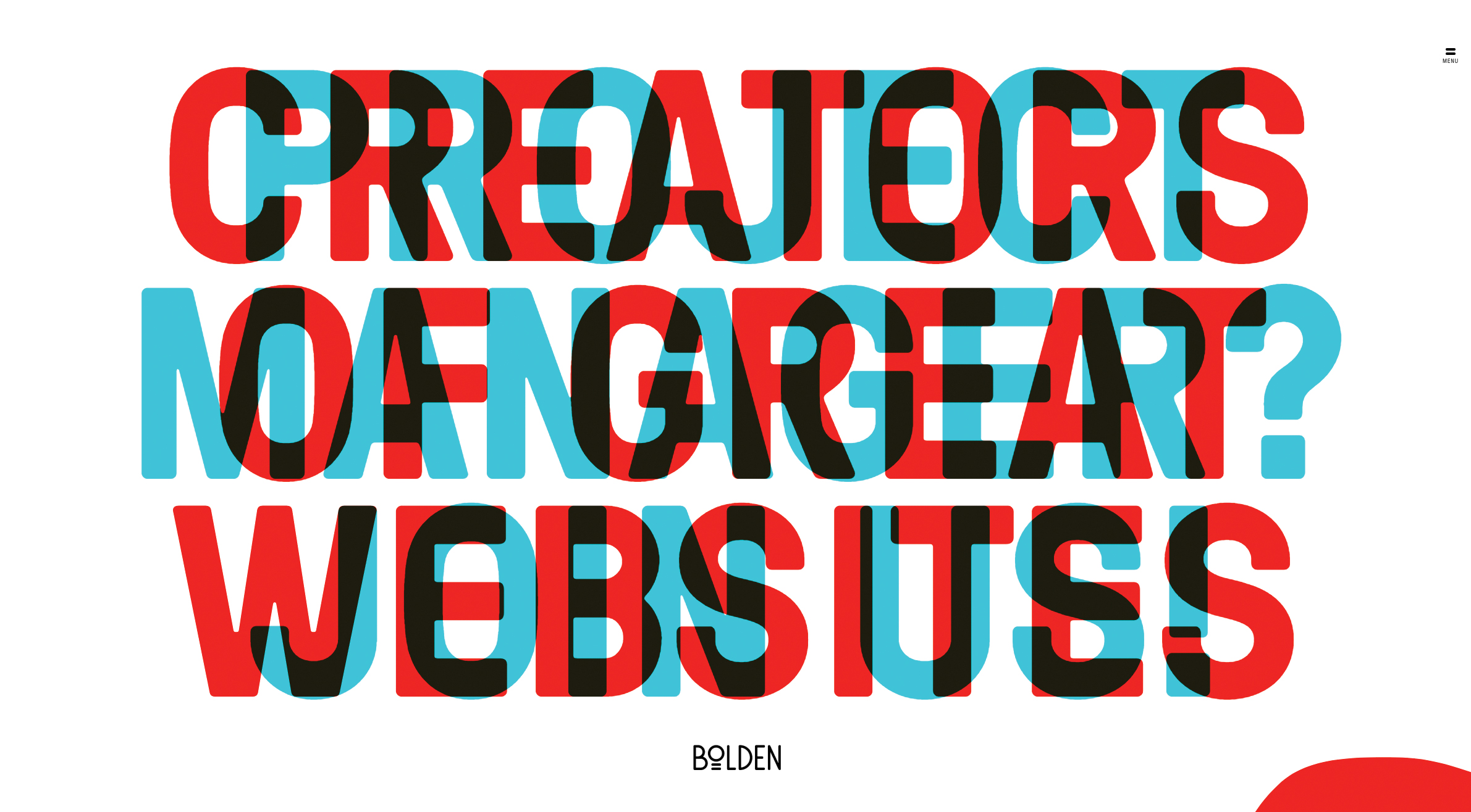
Another cool property is mix-blend-mode, which lets you blend content of the element with the content or background of its direct parent. This works especially well on overlapped lettering. You may ask why in this case we don’t just adjust opacity – the answer is simple: we can easily lose the colour vividness using transparency only.
The era of images that can be edited directly in your web browser is coming, but we can’t forget about browser compatibility – support is limited for blend modes at the moment. And for keeping those images safe, make sure you explore your cloud storage options.
02. Add a mask
Masking tells your browser which asset elements should be visible, and is very useful for building creative shapes and layouts. Masking can be done in three ways: using a raster image (eg PNG format with transparency parts), CSS gradients or SVG elements.
Note that unlike a typical raster image, SVG can be scaled or transformed without a significant loss of quality.
img {
  mask-image: url(‘mask.png’) linear-gradient(-45deg,
                        rgba(0,0,0,1) 20%, rgba(0,0,0,0) 50%);
  mask-image: url(#masking); /*referencing to the element generated and defined in SVG code*/
}
It’s important to mention that Firefox supports only the latest one, so we need to use an inline SVG mask element. What if we use a raster image with transparency levels? The transparent parts of the image won’t be seen – so in other words, the opaque fragments will be displayed, hiding other pieces.
Masking is particularly powerful because it enables you to apply the same properties to background images, defining their position, size and repetition.

One great use case for CSS masking is in articles that combine text and images. Irregular containers and images are very popular in print, but tedious and time-consuming to implement on the web. But thanks to masking, not any more!
You can also have fun using transparency levels to cut out part of animated images (eg. GIF files). However, when using these properties, don’t forget about cross-browser support, and add vendor prefixes.
03. Don’t be afraid of clipping
Another great feature is CSS clipping. A shape’s boundary is called the clip-path (not to be confused with the deprecated clip property), and clipping defines which image area should be visible. Clipping is similar to cutting out a piece of paper – anything outside the path will be hidden, while anything inside the path will be visible.
clip-path: circle(radius at x, y);
clip-path: url(#clipping); /*referencing to SVG element*/
For example, if a circle function sets a clipping mask over the top of an image, you will only see the part of the image within this circle.
The cool thing is that we can use shape functions and SVG as clip paths, which gives us a lot of opportunities – for instance, we could animate them into morphing shapes. Check out this article from Chris Coyier about creating transparent JPG using SVG clip path.
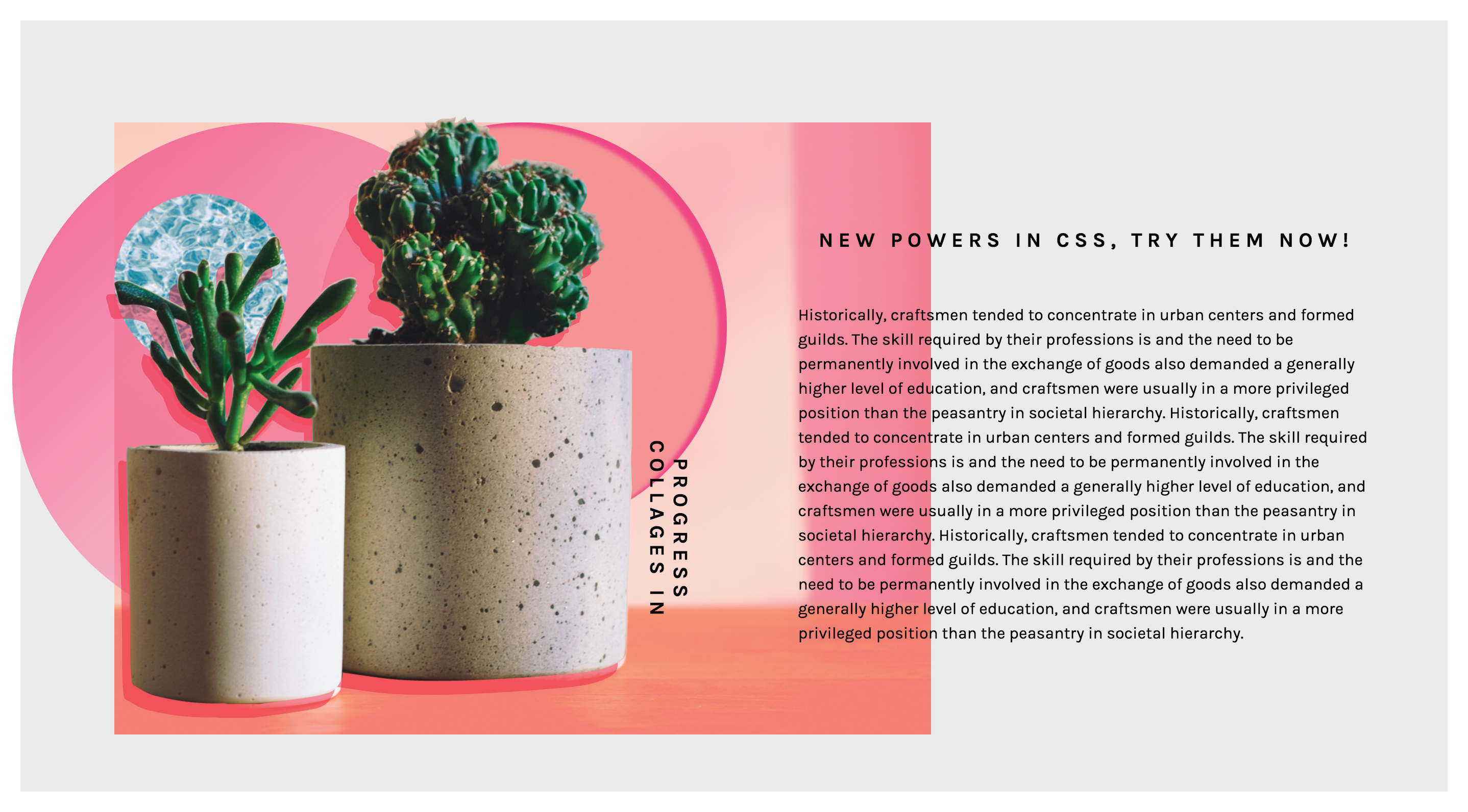
If you are wondering what the difference between clipping and masking is, then remember that masks are images and clips are only vector paths. It's worth mentioning that masking will consume more memory, as you're working with a full image so everything has to be done pixel by pixel.
This is why it’s recommended that you use masks when you want a partial transparency effect; if you want crisp edges, it’s best to use the clip paths.
04. Think outside the box
Shape-outside and shape-inside to the rescue! Who said that text containers always need to be rectangular? Let’s step out of the box, literally, and discover new forms making our page layouts richer and less boxy. shape-outside and shape-inside properties allow you to wrap your content around custom paths in CSS.
So how does it work? Simply apply the following code to the given floating image or container:
shape-outside: circle(50%); /* content will flow around the circle*/It is important to note that the float property and the dimensions of the element – height and width – have to be defined, otherwise this won't work. For the shape you can go with circle(), polygon(), inset() or ellipse().
Another possible value is the url() function. In this case, this enables the shape-outside property to define an element shape based on the image. You might choose to use the url() function instead of the polygon() when you have a particularly sophisticated graphic with many curves and points, and you want the content to wrap around it smoothly.
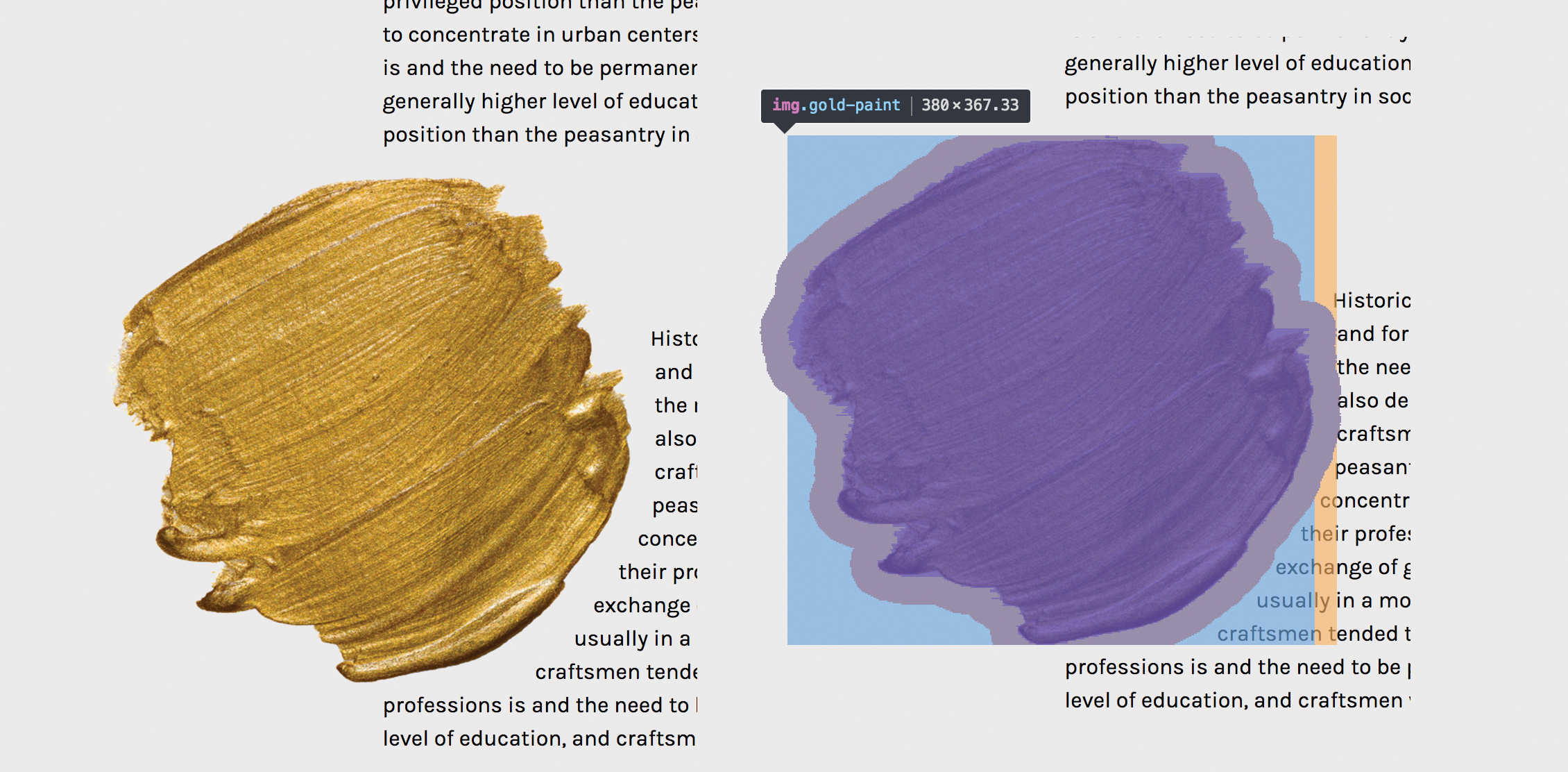
If you’d like to create more room between your element and the content, use the shape-margin property, which will act just like a margin. Shape functions can be animated, but only for defined polygons – the url() function unfortunately is not able to be animated.
Browser support for shape-outside is limited at the moment, but keep your fingers crossed for its fast implementation in other browsers.
05. Try SVG for animation
To be honest, I cannot imagine today’s web without SVG (scalable vector graphics). Its name speaks for itself – it scales, so it answers all concerns regarding responsive web design. The SVG graphic will be crisp no matter the screen resolution of the device it’s viewed on.
Aside from scalability, there is another feature that should encourage you to play with SVG: the ability to manipulate SVG with CSS. If you have never tried dabbling in CSS animations and SVG code, you must try it now – it’s unbelievable how quickly you can achieve amazing effects.

You may think that in some cases it’s easier to use raster images, however, SVG has one big advantage over ordinary images. Words included in SVG are kept in the <text> tag and so remain text, which makes it searchable, selectable and accessible. It also means you can edit it directly in the code. However, we have to remember to embed the font face to be sure that the font will be rendered.
Animating SVG with CSS is like animating any other element in HTML – it can be done with transitions, transforms and keyframe animations. Once you’re familiar with the SVG code, the rest is straightforward and very intuitive, because you basically do it just like you would in HTML.
The coolest thing about SVG is that you can grab whatever part you want and make it come alive with CSS animations. This means we can create some very interesting dynamic effects, not necessarily using JavaScript. SVG has its own DOM API, so as a matter of fact the whole SVG code can be easily inspected using DevTools, which I strongly recommend using while exploring this topic.
06. Make some noise
The 1980s and 1990s are back! Glitch – the aesthetics of chaos, noise and jamming – is becoming a popular design trend this year. The celebration of glitches, failures and errors can be seen on the web as well. If you’d like to play with perspective and be more visually chaotic, you can do so easily by transforming and skewing your site’s elements.
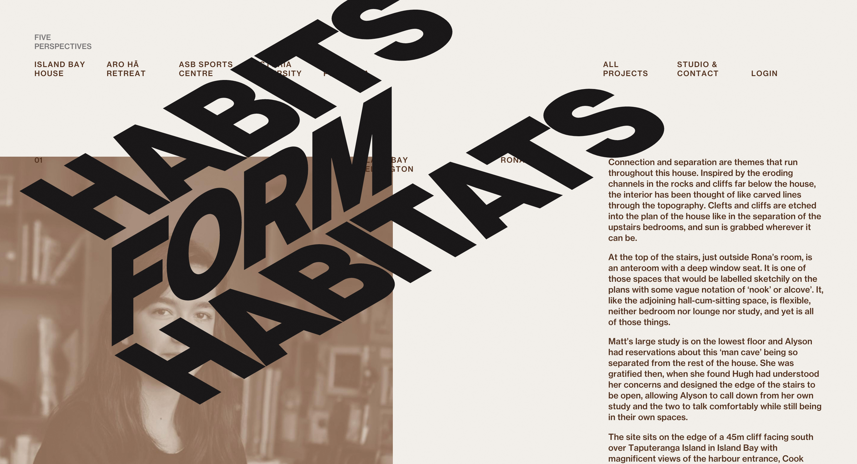
The perfect example of how to do it in CSS only can be found on Captain Anonymous' CodePen, which presents skewed, animated text. One line of code does the magic:
transform:skew(60deg, -30deg) scaleY(.66667);07. Get creative with collage
Collage-inspired designs are enjoying their moment in visual arts – while researching this article, the work of Rosanna Webster and Barrakuz immediately stole my heart – and even on the web they’re getting more and more attention. If you are in doubt, check out the MailChimp homepage (below). Did you notice the collage?

The traditional approach is to simply attach raster images that have been prepared in a graphics editor, but with the techniques I've discussed in this article, it is possible to create similar effects by using CSS properties. You can even prepare collages that truly adjust to the web’s requirements – and are scalable, animated and interactive.
I've prepared some examples using all these cool CSS properties, so you can see how they can be combined to achieve a collage-like style on the web. Take a look at my examples.
08. Don't forget browser support
If you feel held back when you want to use CSS properties that you suspect are not supported by all browsers, the @supports rule is there to help you. @supports allows you to check the browser support for CSS property:value pairs.
The code that is included in the @supports block will be rendered only if these conditions are true, otherwise the code has not been read by the browser. In a case where the browser doesn’t understand @supports, it doesn’t generate a given part of the code either.
@supports (mix-blend-mode: overlay) {
  .example {
    mix-blend-mode: overlay;
  }
}
Combining features such as blending modes, masking, clipping, CSS shapes and the power of SVG gives us a great set of tools to boost our creativity and break from the norm. With these tools we have an opportunity to create a web version of things we currently see in print.
Although some properties may still experience problems with browsers’ compatibility (if you're having a lot of problems, consider a more robust web hosting service), don’t hesitate to play with them. Although browser support may be limited now, this will likely not be the case in the future. It is just a matter of time.
This article was originally published in net magazine.
Related articles:
