You are now subscribed
Your newsletter sign-up was successful
Want to add more newsletters?

Five times a week
CreativeBloq
Sign up to Creative Bloq's daily newsletter, which brings you the latest news and inspiration from the worlds of art, design and technology.

Once a week
By Design
Sign up to Creative Bloq's daily newsletter, which brings you the latest news and inspiration from the worlds of art, design and technology.

Once a week
State of the Art
Sign up to Creative Bloq's daily newsletter, which brings you the latest news and inspiration from the worlds of art, design and technology.

Seasonal (around events)
Brand Impact Awards
Sign up to Creative Bloq's daily newsletter, which brings you the latest news and inspiration from the worlds of art, design and technology.
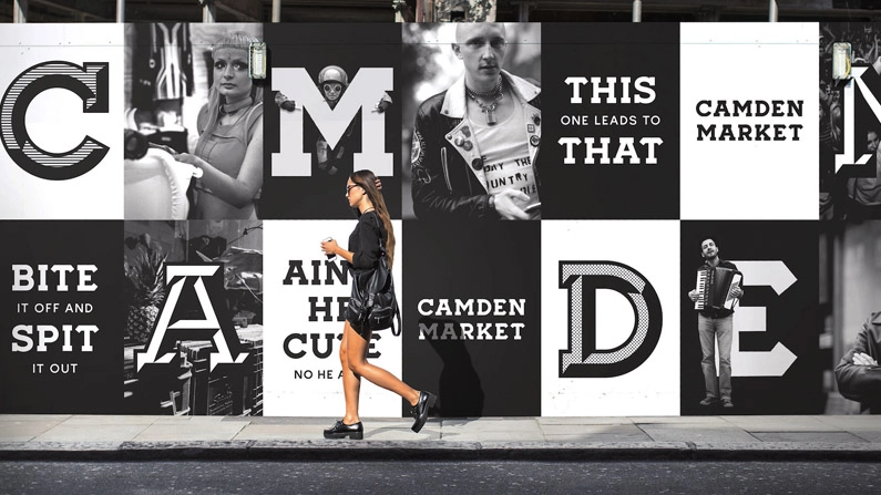
London's Camden Market has long been celebrated for its anarchic spirit and commitment to creativity, and this was the message that specialist branding studio Ragged Edge worked to capture when it was tasked with putting together a new identity.
"Instead of a corporate brand system, we set out to create a toolkit for self-expression; a kind of 'unbrand'," smiles the studio's co-founder Max Ottignon.
The solution the team came up with was a flexible set of tools, comprising two custom fonts, a brand frame, a geometric pattern based on the negative spaces within the typeface, and a black and white colour palette. It was presented to the Camden Market team with strict instructions: "If you’re not experimenting with our brand, pushing its boundaries, you're not doing it right."


This article originally appeared in Computer Arts issue 261; buy it here.
Related articles:

