
It's always the quiet ones, isn't it? Dropbox has just unveiled its new design system and it's nothing short of staggering. We're struggling to think of the right comparison for it. Like, it's a bit like that time in the 1980s when amiable, dependable and thoroughly unexciting BBC presenter Frank Bough was revealed to be into cocaine and S&M.
Dropbox is similarly dependable, and that's a good thing. You want it to just be there, holding onto some of your files so you can grab them when you need them. It's not really a brand that you even associate with design – more of a functional utilitarianism – and while you're aware it has a blue, sort of box-like logo, you'd struggle to draw it.

So to go from that to this new system, Dropbox Design, overnight, is a bit much to process. It's sort of like seeing an old friend or colleague suddenly go through the most epic midlife crisis ever; maybe not the full Frank Bough, but close. Without warning they're riding a fixie, sucking down bubble tea and buying their clothes from ASOS and Boohoo rather than Marks & Spencer.
The new Dropbox design reminds me of when old people try wearing the same thing teenagers wear.October 3, 2017
It's disconcerting, and maybe it's not the best look, and yet you know what? Fair play to them. They're not hurting anyone, and sooner or later they'll tire of squeezing their fortysomething frame into those skintight wet-look jeans and adjust back into something more comfortable, and they'll end up looking a lot better than they did beforehand, so yeah, well done.

Dropbox Design has all the echoes of a full-on midlife crisis, and yet we can't help but love it. Because right now it's at the initial blasting-out-of-the-closet phase, brimming with mad ideas and aspirations and totally into its new mission in life.
It's all, hey guys, check out the new Dropbox! It wants to be vibrant and expressive and dynamic and playful, and to prove this it's brought with it an immense colour scheme that, it says, juxtaposes colour pairs in bold, unexpected ways and is designed to work with the the new logo.
"We've evolved it from a literal box to a collection of surfaces to show that Dropbox is an open platform, and a place for creation," says the company, which worked on the redesign with brand experience firm Collins. "And along with the colours and the new logo design – which is also designed to be changed around depending on the situation – Dropbox is also pulling out all the stops with its typography.
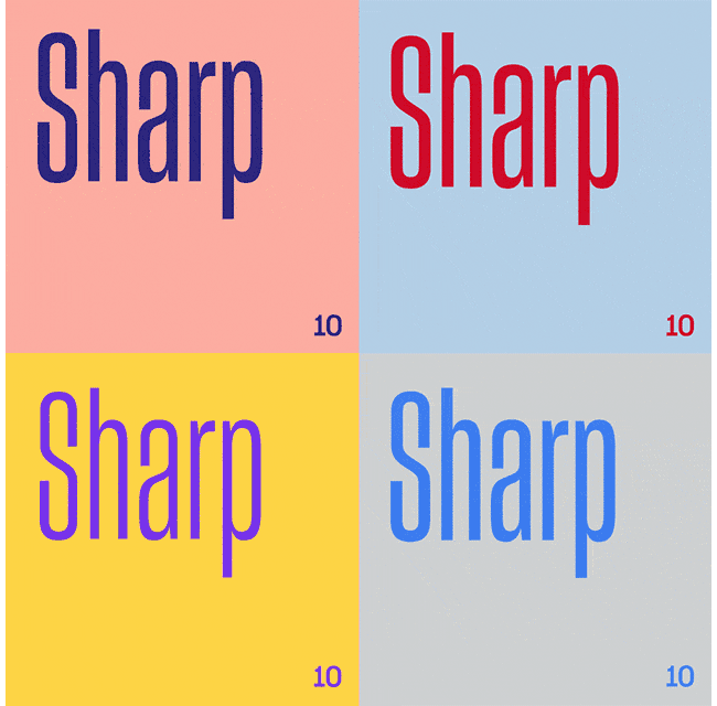
The company makes it very clear that it's not just using a new font – it's using a new typeface, as per the correct definition of a typeface. Sharp Grotesk is made up of 259 fonts in every conceivable weight, and Dropbox jolly well intends to use every single one of them, stating that it enables it to speak in a variety of tones.
Add to that a collection of eye-catching imagery created along with a group of hot young artists and illustrators, and a new feature, Dropbox Paper, intended as a new kind of collaborative online document for creating and sharing ideas, and it all adds up to quite the entrance. And naturally, the internet is ready to point and laugh.
pic.twitter.com/UXhz76fbqWOctober 4, 2017
still baffled that we've regressed to frozen yogurt meets baby poop color schemes in an attempt to reach millennials. (@DropboxDesign) pic.twitter.com/MA1RKf4HImOctober 3, 2017
There are of course more thoughtful responses; both Cennydd Bowles and Renato Valdés make useful points:
A company called “Drop box” will always have a primary value prop of storage, no matter how much edgy design and PR you put around it. https://t.co/z5Z2d1lThPOctober 4, 2017
Digging the new @DropboxDesign's brand aesthetic, but feels divorced from product. Wonder how much we'll see it coming back in UI.October 3, 2017
And they're right, of course. Beyond the design, Dropbox is always going to be about storage (although we'll see how Dropbox Paper does in a world where everyone's trying to come up with the perfect collaborative solution).
If you stop for a second and see what the actual Dropbox site looks like today, it's all pretty restrained and business-like. But the thing about this new system is that it gives Dropbox a lot of room to breathe creatively, similar to how WeTransfer brightened up its system with a collection of cool imagery.

So that's why we're happy to throw in our lot with the vocal minority who absolutely love Dropbox's new design system:
The @Dropbox brand evolution is extreme and I love it; the most radical progression of a brand I’ve seen in years. https://t.co/I9GDgRK3vbOctober 4, 2017
https://t.co/vCk50YRgu2 pic.twitter.com/syIM932AyYOctober 3, 2017
Dropbox rebrand is 👌October 3, 2017
Because yeah, maybe the company's having a bit of a midlife crisis, and okay, perhaps some of those wardrobe choices don't quite go together. But it's got people talking about and paying attention to a service that was previously just there, quietly and dependably doing its thing. And as Scott Mackenzie says:
Good on ya @DropboxDesign and @Dropbox! As long as all my files stay in sync you can do what ever f**k you wanna do. 👊October 4, 2017
We'll drink to that.
Related articles:

