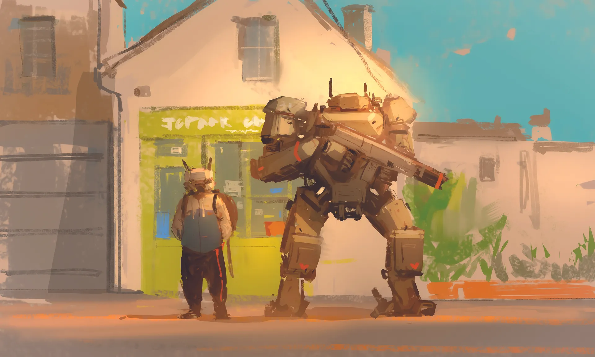
Creating a sense of overwhelming scale and believable mechanical design is one of the most rewarding challenges in digital concept art. In this tutorial, I invite you to join me as I break down the entire creative process behind my latest piece, Robot Standing.
My goal is to show you how a strategic approach to composition and lighting can transform a simple idea into a powerful visual narrative. For the core concept, the heart of this session lies in mastering scale contrast.
We will explore how to achieve a perfectly balanced composition by juxtaposing a colossal, towering mech against a human-scale character. You will learn how to use these size differences not just for visual impact, but to establish a grounded sense of reality while integrating supporting environmental elements that tie the whole scene together.
For the process and technical workflow, our journey begins with an initial silhouette exploration, where we focus on establishing a strong commanding presence and a clear, readable form. Once the foundation is set, we transition into a dedicated phase of refining details and calibrating light to give the concept a tangible, realistic feel.
Throughout the tutorial, I pull back the curtain on my personal Photoshop workflow. I'll share the specific brush sets I rely on, my step by-step layering techniques, and my professional know-how for fine tuning colour and lighting. By the end, you will have a deep understanding of how to orchestrate these elements to breathe life into your own mechanical concepts (see our roundup of Photoshop tutorials for more inspiration).
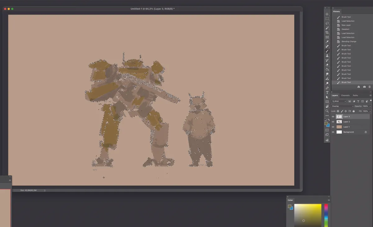
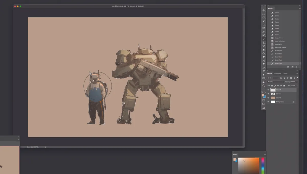
01. Silhouettes

Focus on the silhouettes to build the overall shape. Use a tone slightly darker than the background, avoiding too much contrast. Don’t worry about specific details for now – just quickly capture the silhouettes of the two characters. To avoid the added stress of colour, stay in monotone and focus purely on form.
Pay close attention to the size difference between the characters and focus on creating a harmonious standing pose. Another important point is to create the silhouette on a separate layer from the background; this makes it much easier to edit later.
02. Try out colours
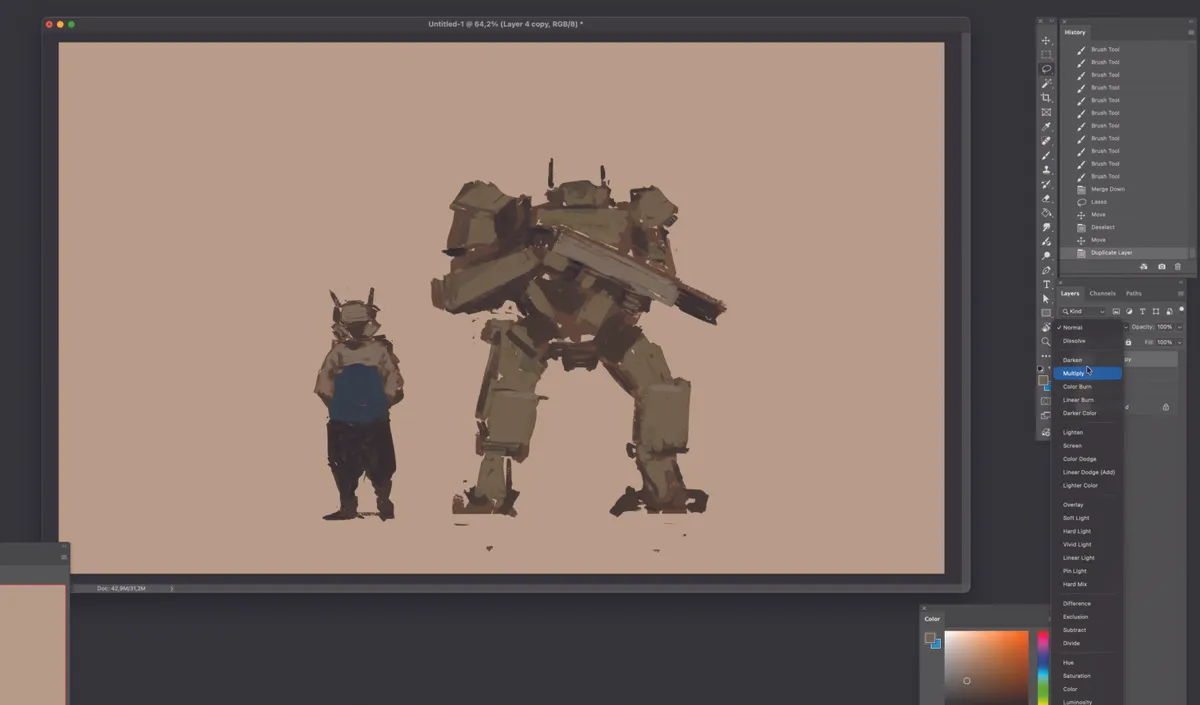
With only the character layer selected, try out various base colours for the large robot on the left. Set this up on a separate layer so you can easily switch between blending modes like Overlay later.
Feel free to experiment with different colours, as you can always adjust the hue or value by selecting the colour layer separately later on. Instead of colouring individual parts in detail, focus on establishing the primary overall colour for the robot first. Detailed colour separation will be handled later; for now, concentrate only on the overall colour flow
03. Subtle shading
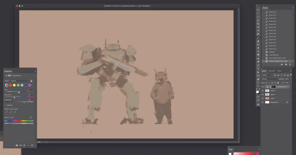
With only the colour layer selected, use the Hue/Saturation settings to aim for a slightly lighter grey tone. Avoid creating sharp contrasts to maintain overall colour flow.
Roughly mark the areas to be darkened, such as joints, and apply the colour while excluding those sections. I recommend keeping the saturation low for now while you work
04. Composition adjustment
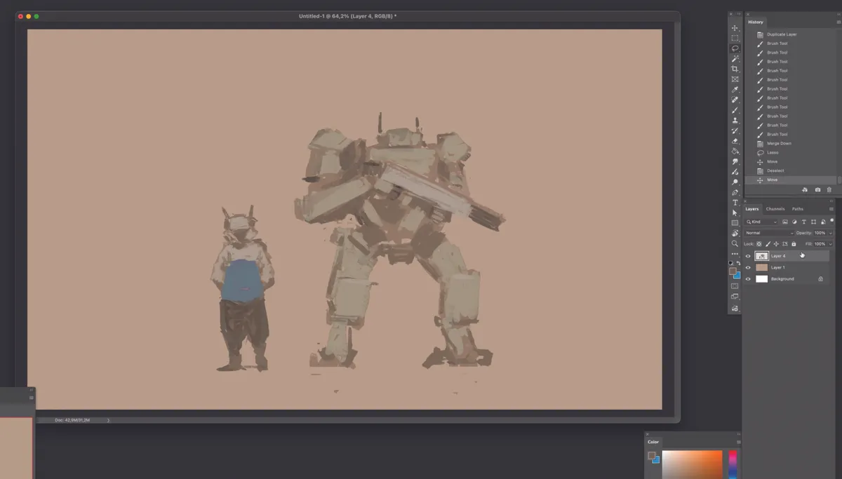
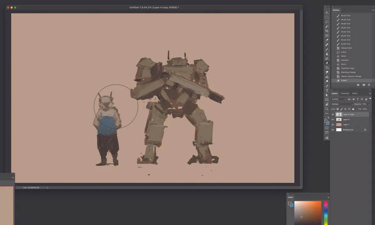
Since the large robot seems to be pointing its gun at the smaller character, I swap their left-right positions. By arranging the characters from small to large (left to right), the composition is now easier to read and eliminates any awkward confrontation.
This adjustment makes them feel more like allies or partners, which is a better direction for the piece. I also apply a touch of blue as a point colour to the character on the left, adding a bit of vitality to what was an all-monotone look.
05. A darker tone
After duplicating the character layer, setting it to Multiply will unify the overall volume in a darker tone and give the result a stronger sense of mass. At the same time, this significantly increases the contrast against the background, so there’s no need to work with dark sketches on a light background during the initial sketching stage.
If there are any messy sketch marks around the silhouette, this is the perfect time to clean them up.
06. Erasing a lighting gradient
Using an airbrush-style eraser, start erasing parts of the darkened Multiply layer according to the light source. Since the light is intended to flow from right to left, begin erasing from the right side of the characters to create a rough gradient that gets darker towards the left.
To achieve this smooth transition of light, choose a soft-edged airbrush eraser rather than a hard-edged, angular brush.
07. Apply the lighting.
Now it’s time to apply the lighting in earnest. The light should flow from right to left; apply a soft, flowing light to the clothing of the character on the left while accentuating the surface angles of the robot on the right.
Set the layer mode to Overlay and choose a warm, slightly desaturated bright-yellow tone to represent the light. By working with the character layer selected, as shown in the image, you can apply the lighting cleanly without it bleeding outside the character’s silhouette.
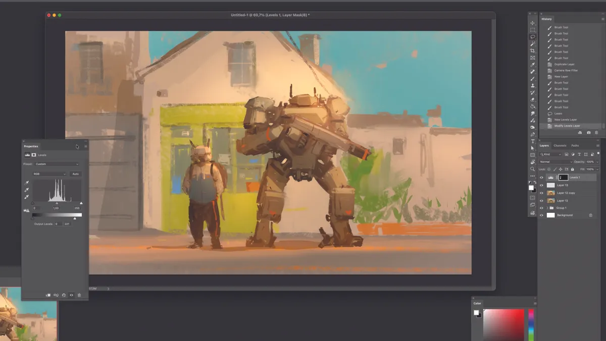
08. Balance light and shadow
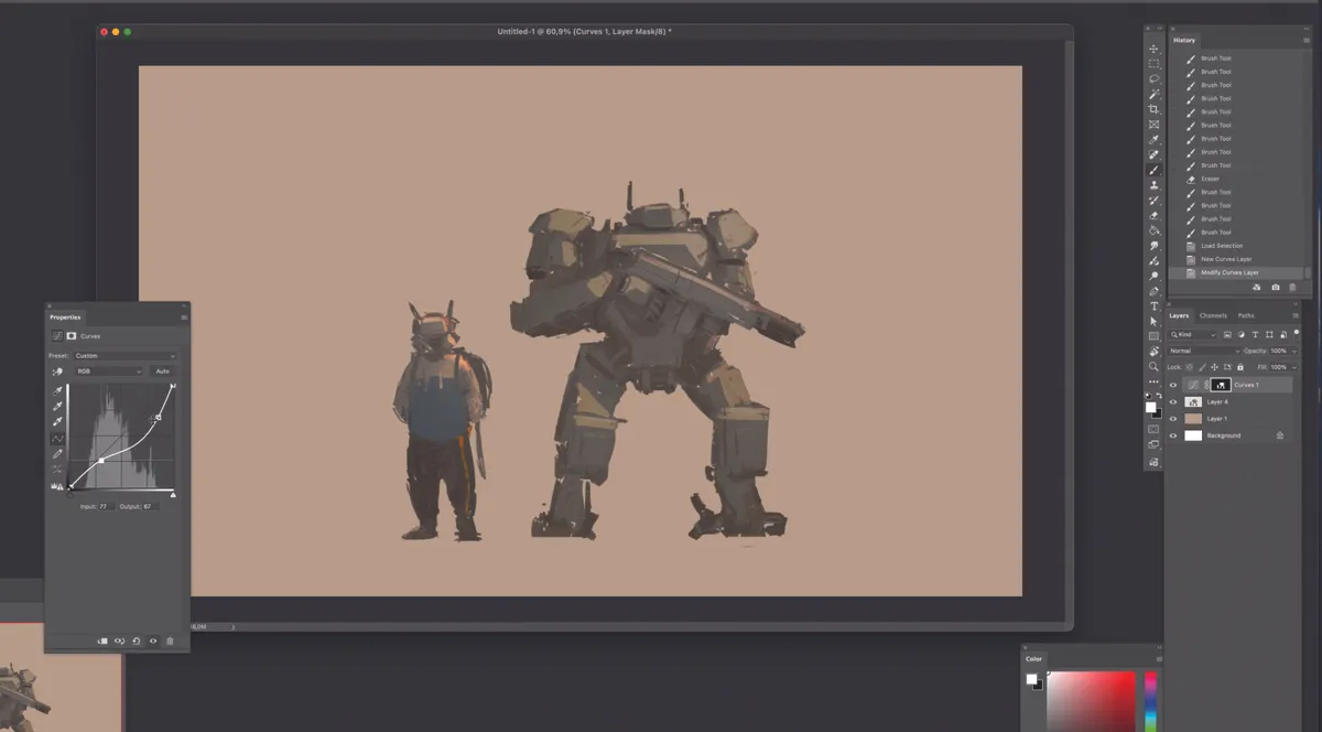
Click on Adjustment Layer from the options at the bottom of the layer panel, and select Curves from the menu to balance the overall light and shadow. The key to this step is achieving a well-balanced distribution of highlights and shadows.
Don’t worry if the bright areas become a bit darker; just focus on the overall balance, as we will reapply the highlights in the next step.
09. Reapply lighting
Merge the Curves adjustment layer from the previous step with the character layer, then create a new layer on top and set it to Overlay to reapply the lighting. This time, use a warmer, brighter colour overall.
Since the sharp edges and faceted areas have already been defined, use a soft-edged brush like an airbrush to apply the light smoothly.
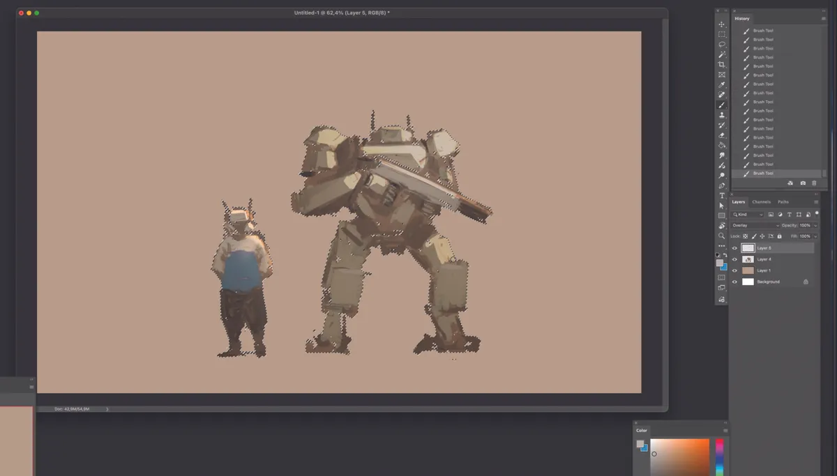
10. Start on the background
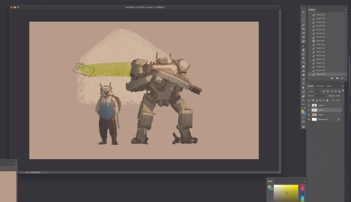
Now, let’s put the characters aside for a moment and move on to the background. Since the characters and the background are on separate layers anyway, create a new layer between the character and background layers to begin your background sketch.
The contrast of the background should be less intense than that of the characters, and it’s perfectly fine to start working with colour right away. Work with a light-hearted, rough approach compared to the detail you put into the characters.
11. Add interest to the background
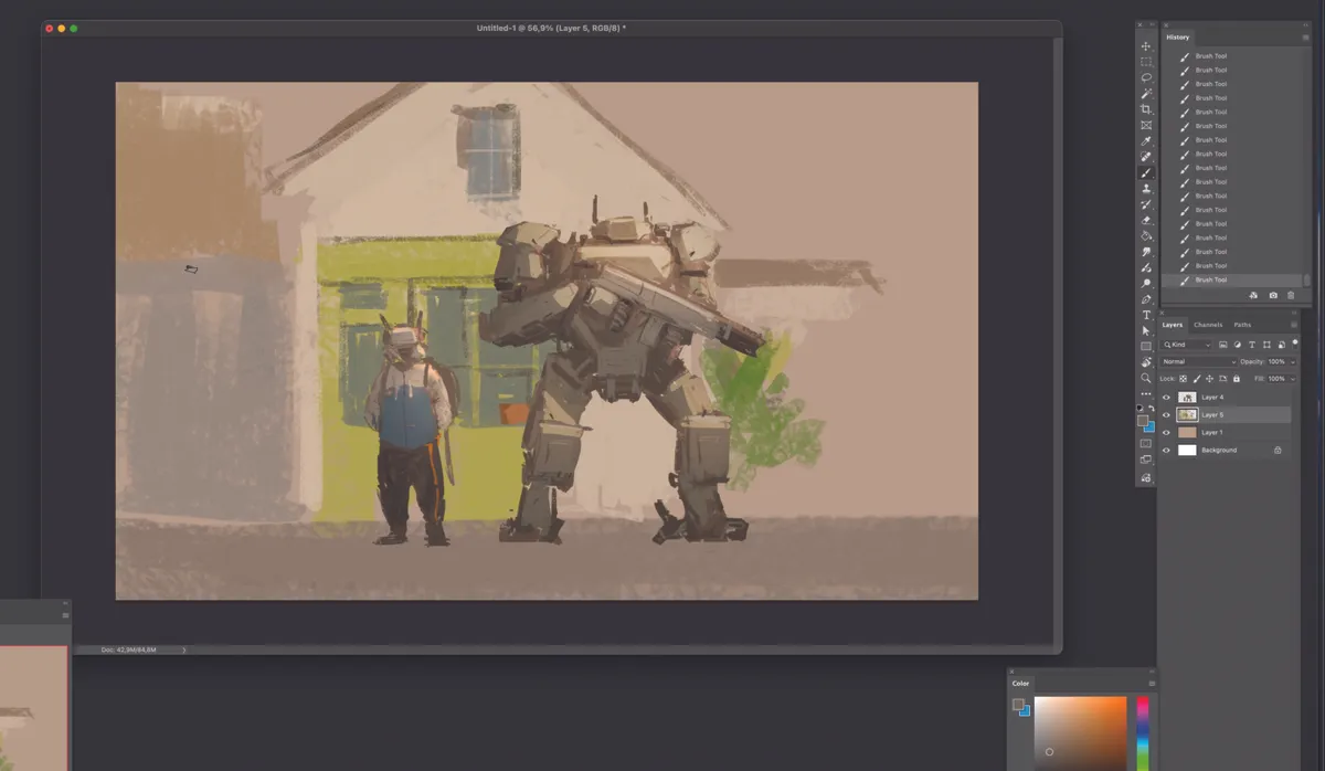
You have complete freedom in what you choose to place in the background. The most important point to keep in mind is that it should not distract from the characters; therefore, the contrast must be less intense than that of the characters.
Also, ensure the lighting aligns with the characters by keeping in mind the light source flowing from right to left.
12. Light and shadow
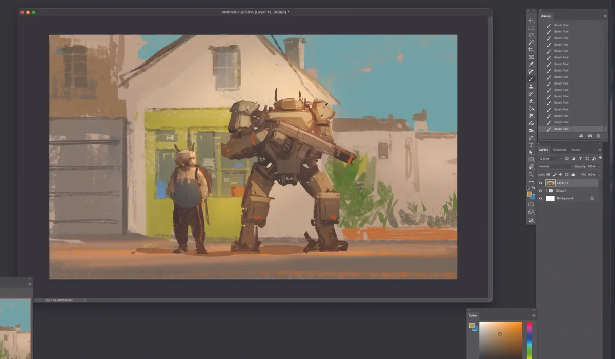
From the adjustment layer menu at the bottom of the layer panel, use Levels to enhance the overall contrast, saturation, and brightness. Just like with the characters, create warm-toned light in the background using the Overlay mode.
Gradually add details such as stickers on the window, flower pots, door shutters, and window frames. Then, apply the same process to create the characters’ shadows. Since the light is coming from the right, the shadows should cast towards the left of the characters
13. Adjust settings
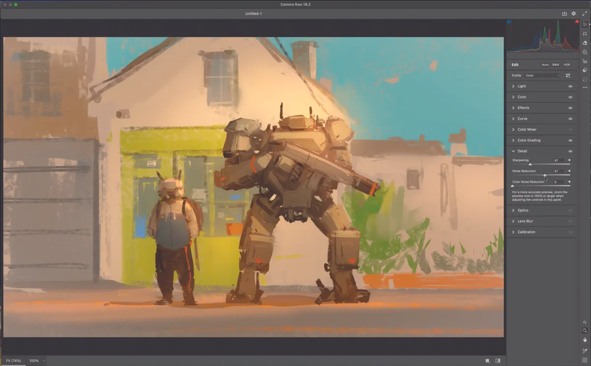
Go to Filter in the top menu of Photoshop and select Camera Raw Filter to open the settings window. Explore various categories such as Light, Color, and Effects by moving the sliders left and right to find the look that works best.
Since these adjustments vary entirely depending on the art style, lighting direction, intensity, applied colours, and contrast, there is no single ‘correct’ numerical value that works for everyone. You must evaluate the balance of colour and light reflected in real-time as you adjust the sliders to achieve the final result
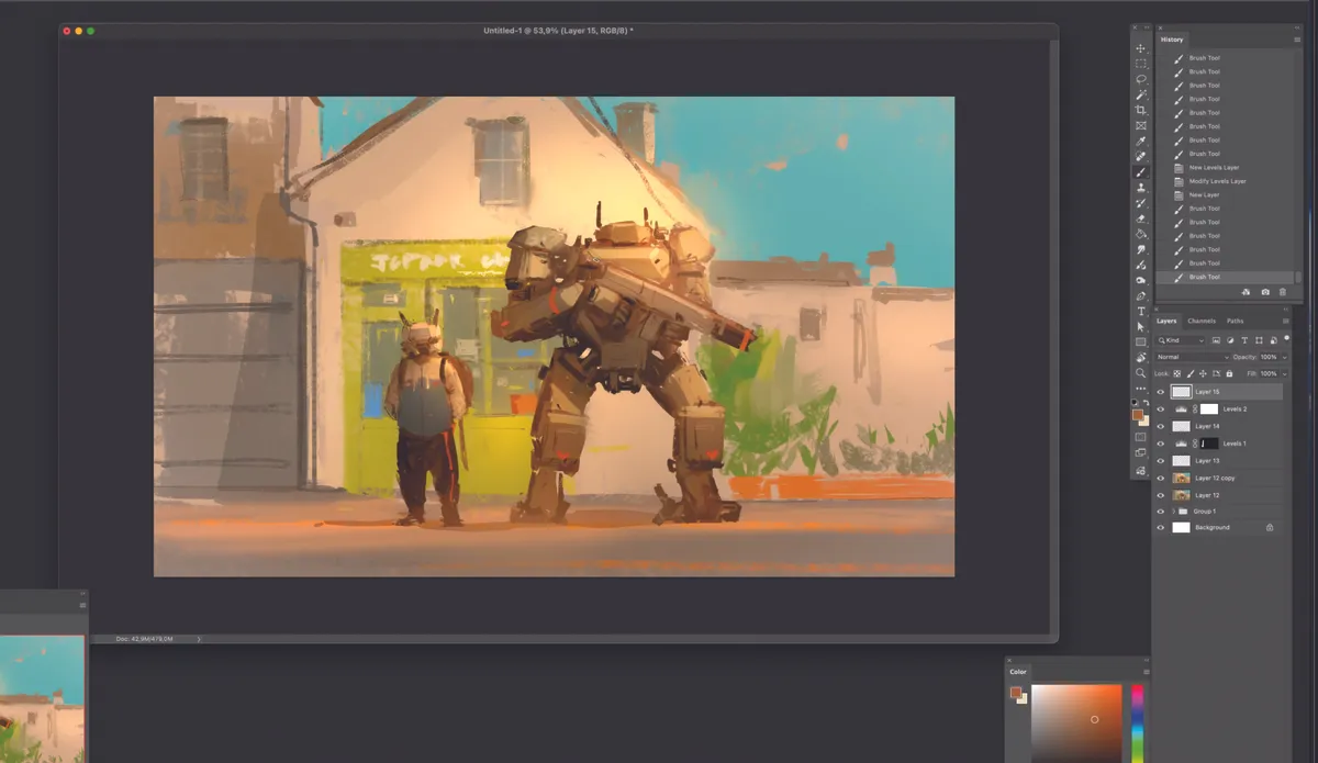
14. Finishing touches
Adjust the Levels once more to fine-tune the overall balance. As we’re now approaching the final stages, take extra care in balancing the elements. Additionally, go through the piece one last time to apply any missing highlights or shadows that you may have overlooked.
15. Make it your own
The overall process is now complete. Since this piece was created specifically to demonstrate the initial workflow, it may lack fine detail. However, by repeating the process of adding details and balancing elements within this framework, you can further incorporate all the specific features and refinements you desire.
The brushes

Soft Round brush
Image credit: JC Jongwon Park

Oil Pastel brush
Image credit: JC Jongwon Park
I use these two brushes for over 90% of my work. The Oil Pastel brush is great for quickly capturing forms and silhouettes, while the Soft Round brush is used to represent lighting and to smoothly blend angular sections.
You can download these brushes with the rest of the resources from ImagineFX Issue 266.
This article originally appeared in ImagineFX. Subscribe to ImagineFX to never miss an issue. Print and digital subscriptions are available.
Need a new setup for your digital art? See our picks of the best drawing tablets and the best laptops for Photoshop.