Is the Doomsday Clock the most important design of our time?
Sign up to Creative Bloq's daily newsletter, which brings you the latest news and inspiration from the worlds of art, design and technology.
You are now subscribed
Your newsletter sign-up was successful
Want to add more newsletters?
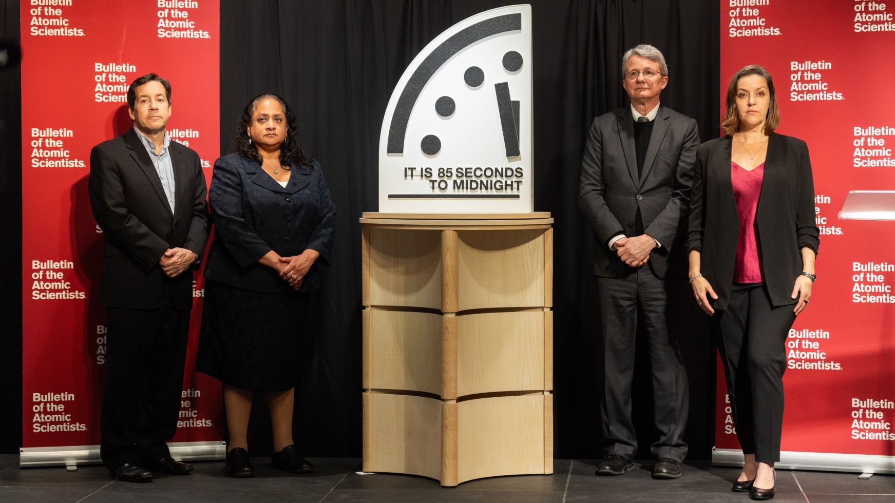
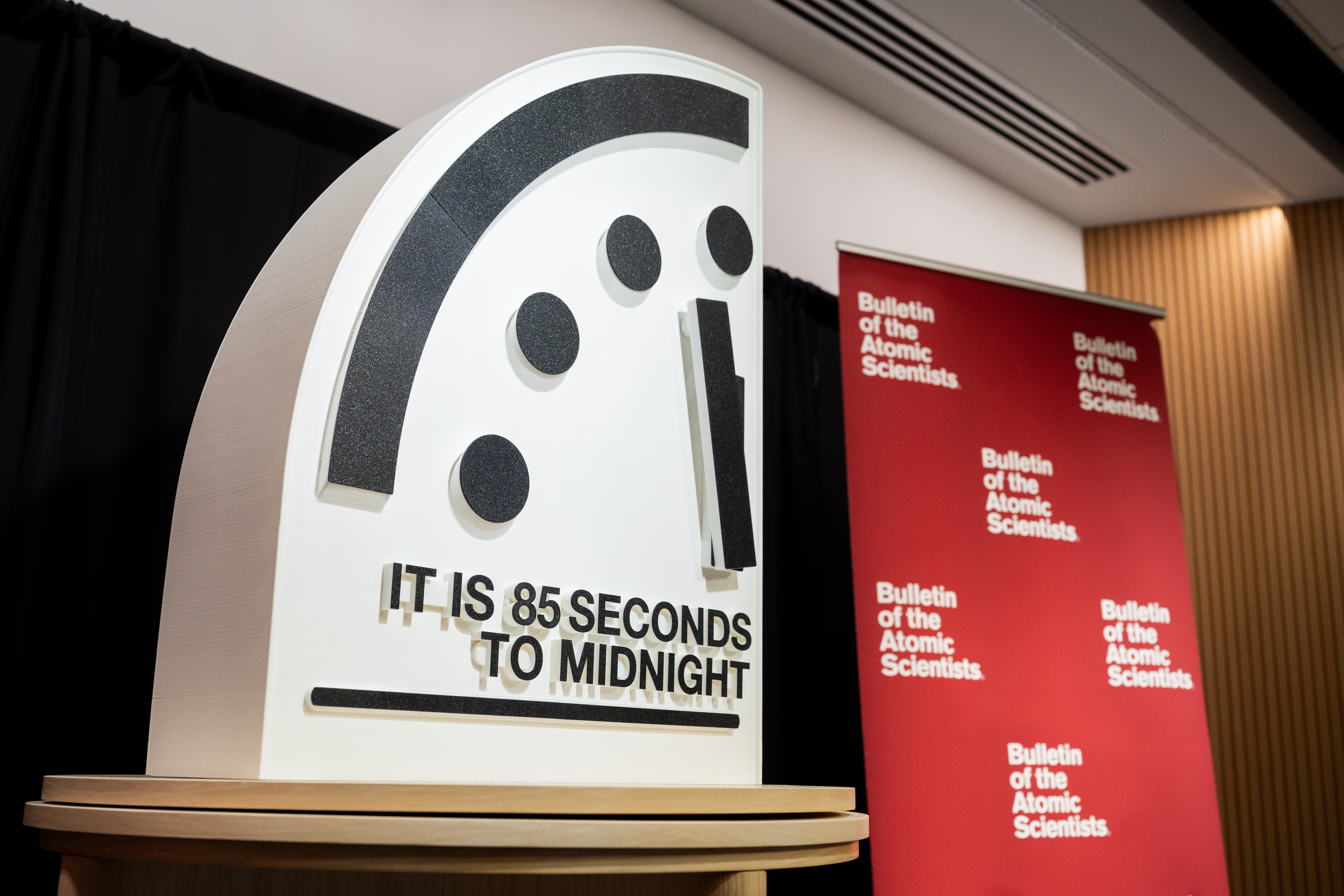
This month, the Bulletin of the Atomic Scientists moved the hands of the Doomsday Clock to 85 seconds before midnight. This symbolically marks the closest our planet has ever been to annihilation.
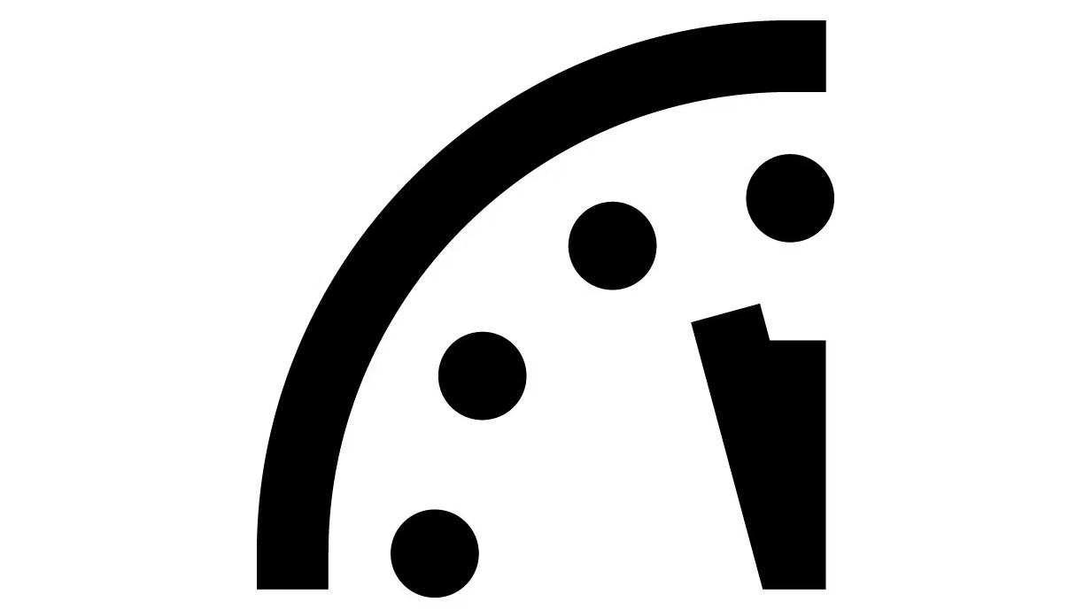
As Russia's war in Ukraine grinds on, nuclear tensions simmer, climate chaos accelerates and AI races ahead without guardrails, this simple image of a clock face – four dots marking five minute intervals, a stark hand creeping toward 12 – has become one of the most universally recognised symbols on Earth.
For nearly eight decades, one piece of graphic design has served as humanity's threat barometer, translating complex geopolitical dangers into an instantly comprehensible visual metaphor. It's appeared in everything from Iron Maiden songs to Watchmen comics, from academic papers to countless news headlines.
Article continues belowBut does it actually work? Can a piece of graphic design – even a very clever one by a famous graphic designer – make any difference to the existential threats bearing down on us?
How it began
To answer that question, let's start with the origin story. Originally, the Doomsday Clock emerged from panic.
In 1947, landscape artist Martyl Langsdorf was commissioned to design a cover for the newly minted Bulletin of the Atomic Scientists magazine. Her husband, Alexander Langsdorf Jr., had worked on the Manhattan Project, and she'd witnessed first-hand the desperation among scientists who'd helped create the atomic bomb. They were desperate to communicate the dangers of this deadly new technology.
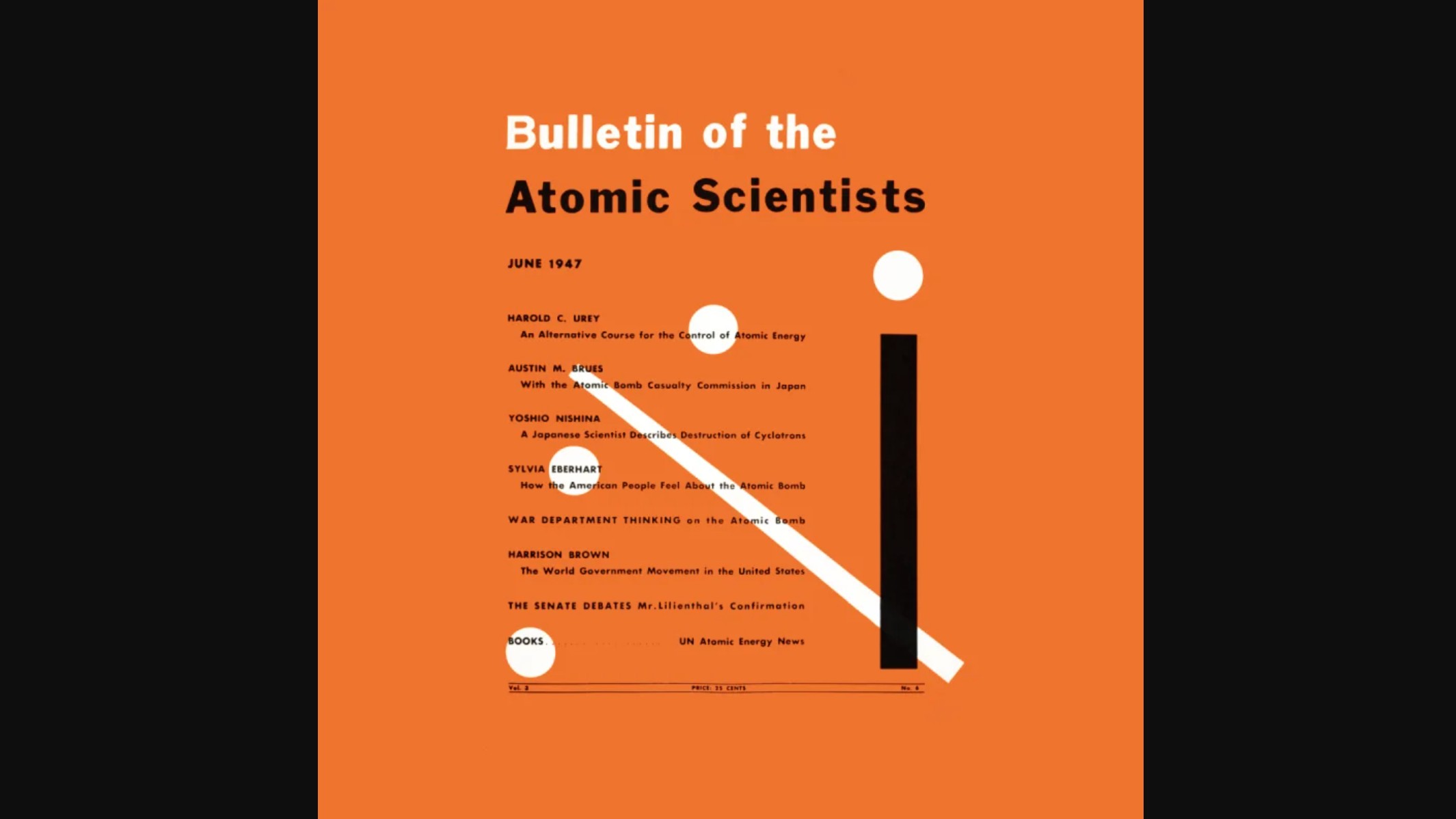
"It was a panicky time," Langsdorf recalled decades later. "The scientists wanted to inform the public." She landed on a clock because it perfectly captured that sense of urgency: the countdown, the race against time, the finite window before catastrophe. She set it at seven minutes to midnight: not through a formally calculated metric, but as an editorial choice rather than, because "it seemed the right time on the page... it suited my eye."
Sign up to Creative Bloq's daily newsletter, which brings you the latest news and inspiration from the worlds of art, design and technology.
That aesthetic choice proved inspired. The clock made its debut on the June 1947 issue and never left. When the Soviet Union tested its first atomic bomb in 1949, the Bulletin's editor moved the hands forward to three minutes to midnight.
Why it works
From a design perspective, the Doomsday Clock is remarkably economical. Four dots. Two hands. The universal language of time-telling. It requires no explanation, transcends language barriers, and delivers its message with brutal clarity: time is running out.
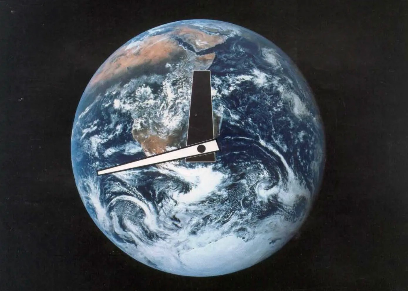
But its real genius lies in what it doesn't show. There's no dial reading "safe" or "dangerous," no complex infographic attempting to quantify nuclear megatonnage or carbon emissions. Just that relentless movement toward twelve o'clock. Midnight. The end. This ambiguity has proven surprisingly durable. In 2007, the Bulletin expanded the Clock's remit beyond nuclear weapons to include climate change, biological threats and AI.
Around this period, the symbol was redesigned by Pentagram led by Michael Beirut. The update was intended to make the clock more prominent and relevant in the digital age, as the Bulletin of the Atomic Scientists shifted away from print. The redesigned, minimalist, and bolder graphic has been used in various capacities since then including as part of the Bulletin's digital logo. Pentagram has continued to collaborate with the Bulletin on further projects, including data visualisations in 2021.
For most of its existence, the Doomsday Clock lived primarily as a 2D graphic on magazine covers and websites. The physical prop used at press conferences was, by all accounts, rather underwhelming; essentially a wobbly whiteboard with paper elements stuck to it. That changed in 2024, when Juan Noguera, assistant professor of Industrial Design at the Rochester Institute of Technology and Tom Weiss of Altimeter Design Group created a new physical version of the Doomsday Clock.
The result, unveiled at the 2025 press conference, is a 6.5-foot-tall imposing presence: a 3D-printed clock face embedded with nearly 100 magnets to hold interchangeable numbers, mounted on a handcrafted wooden pedestal with hand-turned legs. "We wanted that dichotomy of the handmade traditional and the 3D printed object," Noguera explained. "A deliberate juxtaposition of modern technology and traditional craftsmanship."
The redesign worked. Whereas previous press conferences featured photos of people talking, the new clock dominated every shot. It commanded attention in a way the flimsy predecessor never could. For a symbol meant to inspire action, physical presence matters.
Common criticisms
Not everyone is convinced. Critics argue that the methodology is opaque and subjective, more "vibes" than rigorous analysis. How can we be at greater risk today, they argue, than during the Cuban Missile Crisis, when nuclear war seemed genuinely imminent but the Clock stood at seven minutes to midnight?
Cognitive psychologist Steven Pinker has called it a "political stunt," arguing it's "inconsistent and not based on any objective indicators of security." Conservative outlets regularly accuse the Bulletin of pushing a political agenda. Commenters on Reddit dismiss it as anxiety-inducing theatre that the average person can do nothing about.
They all have a point. The Clock isn't a risk assessment in any scientific sense. The Bulletin's Science and Security Board makes entirely subjective judgments about global threats, filtered through their expertise but also their worldviews. The time is somewhat arbitrary: what exactly does "85 seconds to midnight" mean? How do you convert nuclear tensions, climate data and AI advancement into seconds?
Metaphor, not precision
Here's the thing, though: the Doomsday Clock was never meant to be a precise scientific instrument. It's not trying to predict when catastrophe will strike or calculate exact probabilities. As the Bulletin's statements make clear, it conveys something else entirely: how well humanity is responding to existential threats.
When the Clock moved backward by five minutes in 1963, it was because the US and Soviet Union had just signed the Partial Nuclear Test Ban Treaty; evidence of meaningful action. When it jumped forward in recent years, it reflected not individual crises but systemic failures: collapsing arms control treaties, inadequate climate agreements, the erosion of international cooperation.
This is design as alarm bell. Its job isn't to tell us the exact time of doom, but to jolt us into awareness, to create a visceral response to the nuclear threat. And by that measure, it undeniably works.
Every January, the Clock's setting generates global headlines, prompting discussions about nuclear policy, climate action and technological risk. It gives journalists a hook, activists a rallying point, and the public an accessible entry point to otherwise overwhelming topics.
Could it be better? Certainly. More transparency about methodology would help. So would clearer guidance on what actions might turn back the hands. But these are refinements, not fundamental flaws.
Design that matters
Ultimately, the Doomsday Clock reminds us of something design often forgets: simplicity can be radical. In an age of data visualisations and complex infographics, sometimes the most powerful message is the simplest one. Time's up. Act now.
Whether it will actually help save the world remains an open question. But for 78 years, Martyl Langsdorf's elegant design has kept humanity's existential threats in our peripheral vision, never letting us fully forget the dangers we've created. And right now, that feels more valuable than ever.

Tom May is an award-winning journalist specialising in art, design, photography and technology. His latest book, The 50 Greatest Designers (Arcturus Publishing), was published this June. He's also author of Great TED Talks: Creativity (Pavilion Books). Tom was previously editor of Professional Photography magazine, associate editor at Creative Bloq, and deputy editor at net magazine.
You must confirm your public display name before commenting
Please logout and then login again, you will then be prompted to enter your display name.
