9 great examples of customized typefaces
A customized typeface can make your design sing. Check out these examples for a burst of inspiration.
05. Cornelia
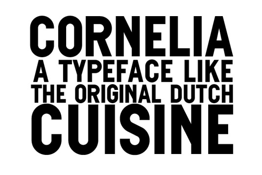
The Cornelia typeface was specifically created for Wannée, a traditional Dutch cookbook and is used in headings and promotional designs. "Cornelia is what we call a 'undesigned' typeface," explains van Wageningen. "In other words, it's just as straight and blunt as the
original Dutch cuisine itself."
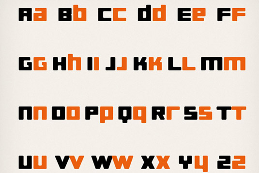
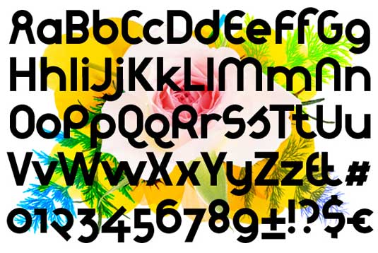
06. Theo
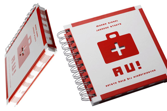
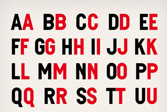
Theo was created for a series of children's books. "This typeface plays with the idea of mixing uppercase and lowercase type," says van Wageningen. "The basic shape of this typeface is inspired by wooden blocks childeren like to play with."
07. Therese
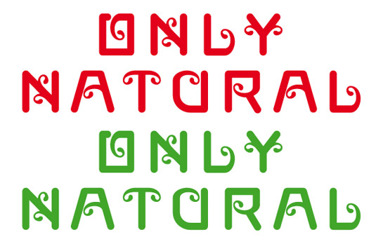
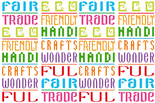
Novo Typo designed this set of typefaces to illustrate the brand-values of Only Natural, a company that produces stationary, notebooks on a
eco-friendly, fair trade way. The colourful, typographic wallpaper forms the basis of the corporate identity.
08. Sjiq
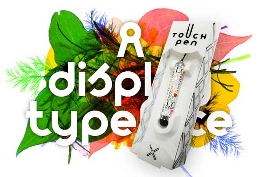
Sjiq was originally designed for the packaging of Only Natural's touch pen. "The logo was created first," explains van Wageningen. "Then it became necessary to make a complete font for the standard packaging, several in-store displays, posters and advertising were created with this typeface." The modular based typeface was espacially created for use in large display sizes.
09. Sonia
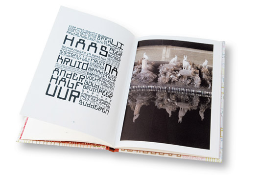
Part of the eclectic Gagarin family, Sonia was specially created for an art-cookbook called Kook. "This typeface is an invitation to designers to stretch and modify the basic shapes of the characters," adds van Wageningen.
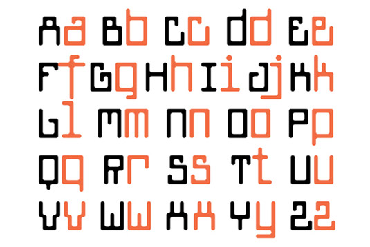
Some of these typefaces shown here are available to buy via the Novo Typo web shop.
Liked this? Read these!
Sign up to Creative Bloq's daily newsletter, which brings you the latest news and inspiration from the worlds of art, design and technology.
- Download the best free fonts
- Free graffiti font selection
- Free tattoo fonts for designers
Have you seen a great example of a customised typeface? Tell us about it in the comments!

The Creative Bloq team is made up of a group of art and design enthusiasts, and has changed and evolved since Creative Bloq began back in 2012. The current website team consists of eight full-time members of staff: Editor Georgia Coggan, Deputy Editor Rosie Hilder, Ecommerce Editor Beren Neale, Senior News Editor Daniel Piper, Editor, Digital Art and 3D Ian Dean, Tech Reviews Editor Erlingur Einarsson, Ecommerce Writer Beth Nicholls and Staff Writer Natalie Fear, as well as a roster of freelancers from around the world. The ImagineFX magazine team also pitch in, ensuring that content from leading digital art publication ImagineFX is represented on Creative Bloq.
