The 20 biggest logo design trends
You don't have to follow them, but you need to be aware of them. We reveal the latest trends in branding, identity and logo design.
Sign up to Creative Bloq's daily newsletter, which brings you the latest news and inspiration from the worlds of art, design and technology.
You are now subscribed
Your newsletter sign-up was successful
Want to add more newsletters?
Five times a week
CreativeBloq
Sign up to Creative Bloq's daily newsletter, which brings you the latest news and inspiration from the worlds of art, design and technology.
Once a week
By Design
Sign up to Creative Bloq's daily newsletter, which brings you the latest news and inspiration from the worlds of art, design and technology.
Once a week
State of the Art
Sign up to Creative Bloq's daily newsletter, which brings you the latest news and inspiration from the worlds of art, design and technology.
Seasonal (around events)
Brand Impact Awards
Sign up to Creative Bloq's daily newsletter, which brings you the latest news and inspiration from the worlds of art, design and technology.
Logo design is one of many areas of design that looks easy but is damned difficult to pull off successfully. Last year's aborted University of California rebrand shows just how difficult it is to please all of the people, all of the time - especially when remaking an existing much-loved identity. But even when you're designing a logo for a new company or brand, it's a huge challenge to create something that will grab attention - in the right way - in a crowded marketplace (these free script fonts might help).
Part of the challenge is looking current and contemporary without shortening your logo's shelf-life. In other words, you don't want it to look old-fashioned, but neither do you want it to look so 'of the moment' that it will quickly date.
To help guide you through, we've rounded up 20 of the biggest logo trends at time of writing. Don't blindly follow them, but being aware of them can help you strike that perfect balance that will lead to a logo that's memorable and impactful without needing a redesign come 2014...
- Read all our logo related posts here
01. Black & White
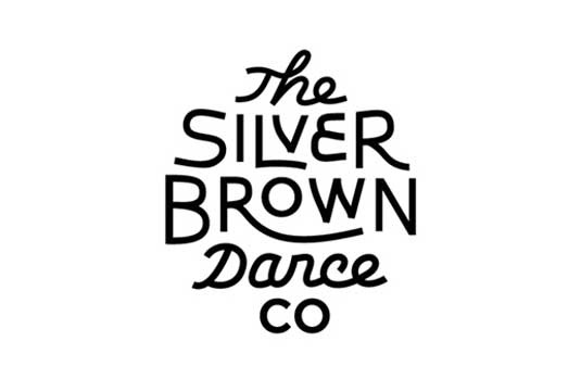
A sufficient logo should always hold its own in black and white. And sometimes that's all you need. The classic combo of black and white will be a big trend throughout 2013 as designers stray from vibrant colours to stand out with bold typographic treatment. The commanding use of black and white may be one of the oldest traditions but done in the right way, it's far from boring and out-dated.
02. Simplification
From Microsoft to Harvard University, many re-brands have appeared lately baring their bones. It could be argued that logo design has always followed this path - simplify a well-known logo over time as it becomes more familiar. But it certainly seems to have intensified recently, with more and more logos paring their design down to almost nothing.
03. Mosaic patterns
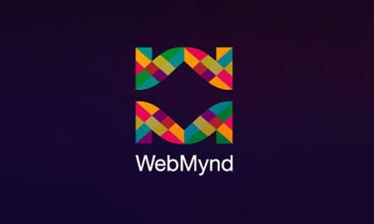
Mosaic patterns are becoming more popular in logos, used to represent such concepts as 'growth', 'values', 'coming together', 'strength in numbers' and 'multicultural'. Logos are incorporating a mosaic pattern in an increasingly sophisticated manner, using only a small number of elements to structure the arrangement. This allows the logo to work in multiple size formats and does not become blurred once at a smaller scale.
The colour palette makes a considerable impact on the mosaic itself; organic colours, from sky blues to grassy greens to muted browns, are becoming increasingly popular.
Sign up to Creative Bloq's daily newsletter, which brings you the latest news and inspiration from the worlds of art, design and technology.
04. Energetic
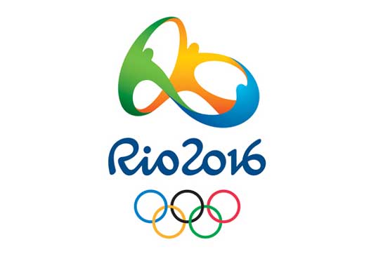
In contrast to trends 01 and 02, there's a parallel surge of energetic logo designs. The Olympic Rio 2016 logo's vibrant and charismatic identity is a great example - but this kind of visual impact isn't easy to create. To learn more, check out the video below, showing the immense level of research, thought and passion that went into its development.
05. Serrated edges
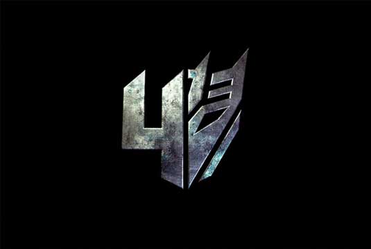
If you thought it was a relief to finally shake off the Olympic London 2012 logo, be well prepared for abstracted geometric shapes in 2013. Take this unofficial logo for next year's Transformers 4 movie; whatever you may think of the franchise, the harsh serrated edges of the logo work brilliantly here to grab the attention.
06. App Store influence

App design has become so popular, it's not surprising that the highly crafted, slick icons that dominate the app store and populate your digital devices have moved into branding and, specifically, logo design.
07. Airline/international
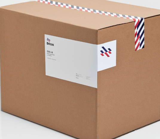
Timeless and clear is one way to describe this trend. Specifically, 'Airline' refers to an international aesthetic, a truly modern look, and simple designs with bold colours. Take Anagrama's work for Bricos - a hardware store rebranding as a global construction material supplier - as an example. Bold red, white and blue stripes makes the brand feel very international and is a strong corporate identity.
08. Transparent overlaps
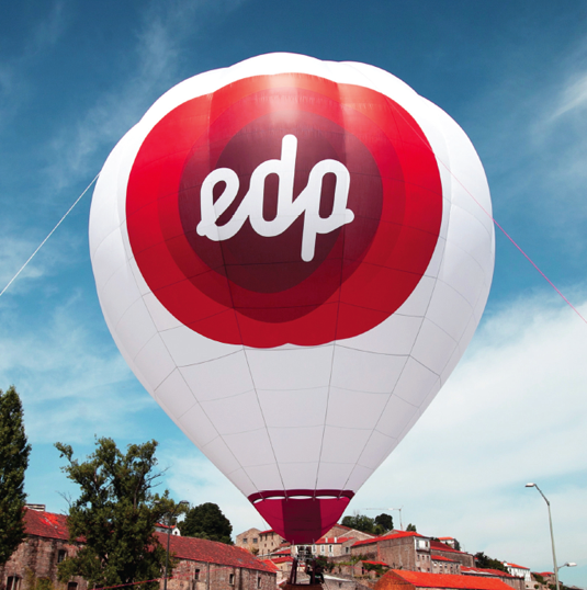
Transparent links, or overlaps, is a new technique that's become very prevalent over the last year or so. You can see this in Jessica Walsh's - of Sagmeister Walsh fame - identity for EDP, where shapes are expertly fused together using subtle gradients to produce a slick logo for the leading renewable energy supplier.
09. Honest and simple

Homemade and thrifty is very in - just look at popular lifestyle magazine The Simple Things for instance. & Smith - a studio describing itself as 'dedicated to the craft of design' created this identity for Honestly Healthy: a badge approach which sums up this trend in logo design perfectly.
10. Focus
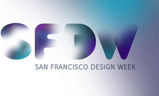
Who says logos have to be crisp and sharp? Selective focus can be used to create subtle misty qualities that bring a logo to attention by fading it into the background. The example here shows the soft edges of the mark appear to vanish into the surface, creating a gorgeous dream-like quality.
11. The reveal
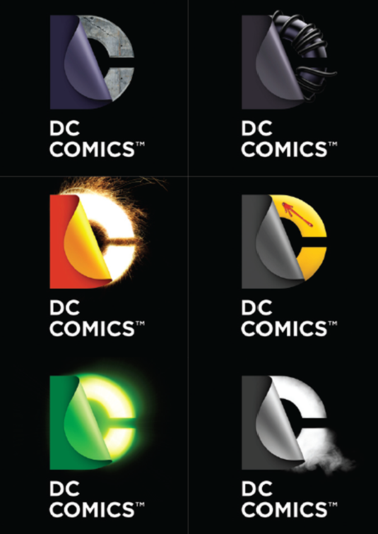
Rebranding a huge company such as DC is no mean feat - and one that Landor Associates were brave enough to tackle. The beauty of this method is that it reveals the C from a D - a clever and simple mark that you immediately get.
The logo - or the 'reveal' - could be applied to multiple DC properties, such as The Green Lantern, Watchmen and more, with the 'D' peeling back to reveal hints at the different superheroes.
"We were looking for a living, breathing identity that could celebrate everything that DC Entertainment is about, but which could also be forward-looking, bold, provocative and allow us to celebrate the owe of our stories and characters," says Amit Desai, SVP of Franchise Management at DC.
12. Tessellation
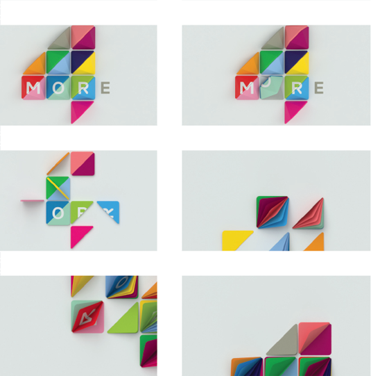
Tessellation essentially involves mosaic-like patterns. A good example is the rebranding of Channel 4's sister station More4 by ManvsMachine. A particularly nice use is in the More4 idents where the triangles flip to reveal different colours (see 'The reveal', above).
13. Incomplete
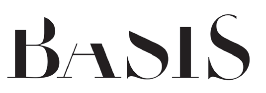
Missing links and simple illusions can result in very sophisticated branding solutions. A good example is Johnson Banks' logo for market research company Basis (above). Another example of logo design like this is Anagrama's subtle branding for architectural firm MTLL – in which the studio removed many elements for the branding in order to communicate the firm's dedication to finding simple solutions. Also check out Founded's work for SKIRT.
14. Splatters and watercolor
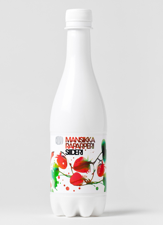
Watercolor is one of the big logo design trends of the moment. A great example is Helsinki based studio Bond's work for Oivi, a Finnish independent brewery. Working with Stina Persson it created a beautiful, stylish identity for one of Oivi's ciders. See this excellent blog for more details.
15. Moiré
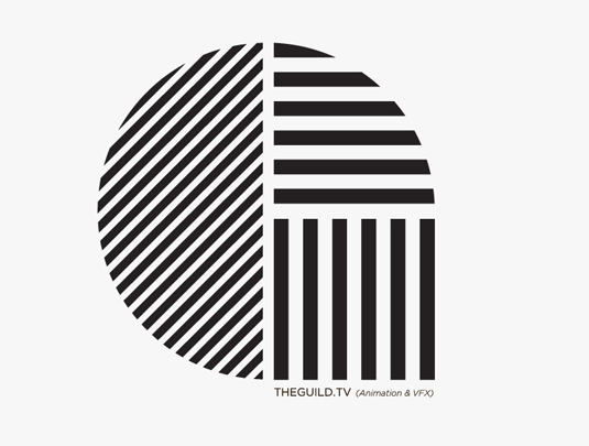
Moiré patterns - the kind of optical illusions created by converging and colliding grid-like patterns - are becoming more and more popular within branding and identity design. Good examples include Mexican design agency Burocrata's work for ABO and Daniel Feytag's stunning work for motion studio The Guild.
16. Basic shapes

Basic shapes can create incredible impact in logo design. Simple silhouette-like identities can pore to be extremely stylish. Take the Red de Cátedras Cerámicas logo by BOSCO for ASCER. The simple geometric 'AS' shape standing alone without text is striking and efficient.
17. Abstract and sharp type
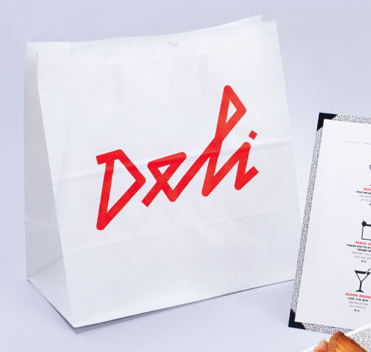
There's something about modern, sharp, handcrafted typographic logos that really hit the spot. This identity work for a café and restaurant in Tel Aviv by Morey Talmor is the perfect example of how to brand a logo in an eye-catching design that is immediately legible but extremely fresh at the same time.
18. Word search
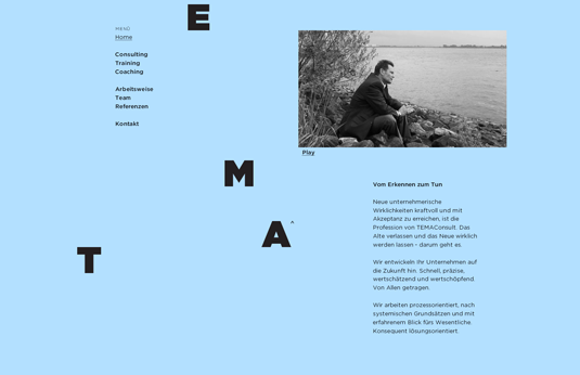
'Word Search' is about having fun with logos, turning them into codes or puzzles by cutting them up, inverting them or hiding parts of the identity. Hort's work for TEMAConsult is a prime example of how to brand a logo using this trend.
19. Script/retro
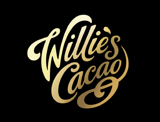
Retro/script fonts always have a certain appeal due to their air of fun combined with classic aesthetic. One fantastic example is BrandOpus' work for Willie's Cacao chocolate. Sketched on paper before being finalized in Illustrator CS6 and Photoshop CS6, the result is a beautiful script logo that accentuates the tastiness of the goods inside the packaging.
20. Grown up
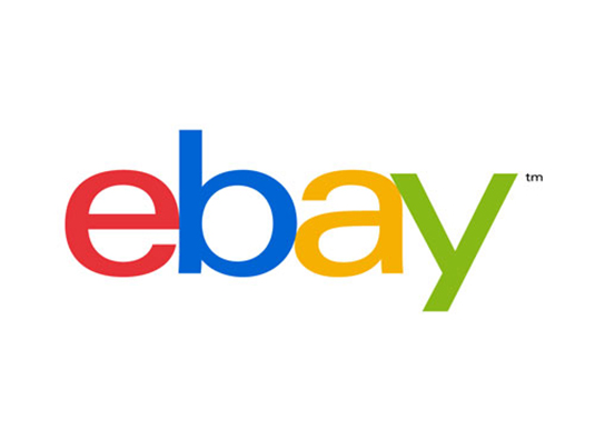
With eBay's new logo, many are saying that designers are taking the fun out of tech companies. The new eBay logo is, admittedly, a rather bland logo design compared to its old, very recognizable quirky marque. But that was probably the point.
Words: Rob Carney and Aaron Kitney
Liked this? Read these!
- Download the best free fonts
- Free graffiti font selection
- Illustrator tutorials: amazing ideas to try today!
- The ultimate guide to designing the best logos
Have we missed a big trend in logo design? Tell us about it in the comments...

The Creative Bloq team is made up of a group of art and design enthusiasts, and has changed and evolved since Creative Bloq began back in 2012. The current website team consists of eight full-time members of staff: Editor Georgia Coggan, Deputy Editor Rosie Hilder, Ecommerce Editor Beren Neale, Senior News Editor Daniel Piper, Editor, Digital Art and 3D Ian Dean, Tech Reviews Editor Erlingur Einarsson, Ecommerce Writer Beth Nicholls and Staff Writer Natalie Fear, as well as a roster of freelancers from around the world. The ImagineFX magazine team also pitch in, ensuring that content from leading digital art publication ImagineFX is represented on Creative Bloq.
