Fanta unveils new logo... and wonky bottle

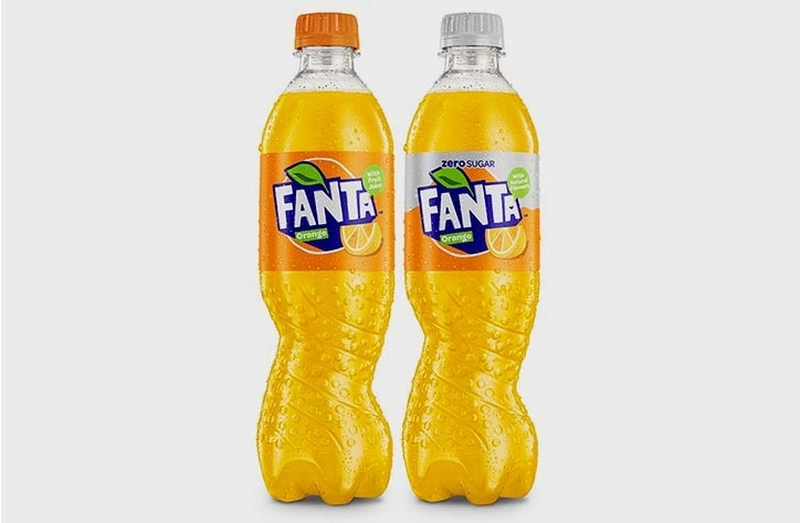
Orange soft drink Fanta has just unveiled a new logo design and industry-first bottle shape. Described by the brand as "fresh and exciting", the new visual identity better reflects "Fanta's irreverent and fun brand personality" than ever before.

Heading up the rebrand is a logo created out of hand-cut paper, complete with a hidden smile worked into the design. This is accompanied by an updated colour palette on the labels and lids.

The old Fanta logo had more of a fluid shape

The old Fanta logo had more of a fluid shape

The most striking part of the redesign though is the warped, asymmetrical bottle. Designed by Drink Works, the unusual design took almost two years to complete. The brand describes the bottle as "a revolutionary spiral version which twists plastic to form a unique, eye-catching shape."

This new bottle puts a creative twist on the traditional design

This new bottle puts a creative twist on the traditional design

The new Fanta bottle will be available from the beginning of April, and will be followed by the launch of a new recipe in May that contains a third less sugar. “This year looks set to be the biggest in Fanta’s history, with a fresh new look inside and out," explains marketing director Aedamar Howlett. "The new look will be supported by a multi-million-pound integrated communications campaign for the brand.”

Related articles:

Thank you for reading 5 articles this month* Join now for unlimited access

Enjoy your first month for just £1 / $1 / €1

*Read 5 free articles per month without a subscription

Join now for unlimited access

Try first month for just £1 / $1 / €1

Dom Carter

Dom Carter is a freelance writer who specialises in art and design. Formerly a staff writer for Creative Bloq, his work has also appeared on Creative Boom and in the pages of ImagineFX, Computer Arts, 3D World, and .net. He has been a D&AD New Blood judge, and has a particular interest in picture books.