Durex rebrand hits the spot with a sexy new logo
New identity includes a delightfully appropriate typeface name.

Durex, one of the world's biggest condom manufacturers, has revealed a new brand identity designed by Havas London, in a bid to position itself as an activist championing the "positive reality" of sex.
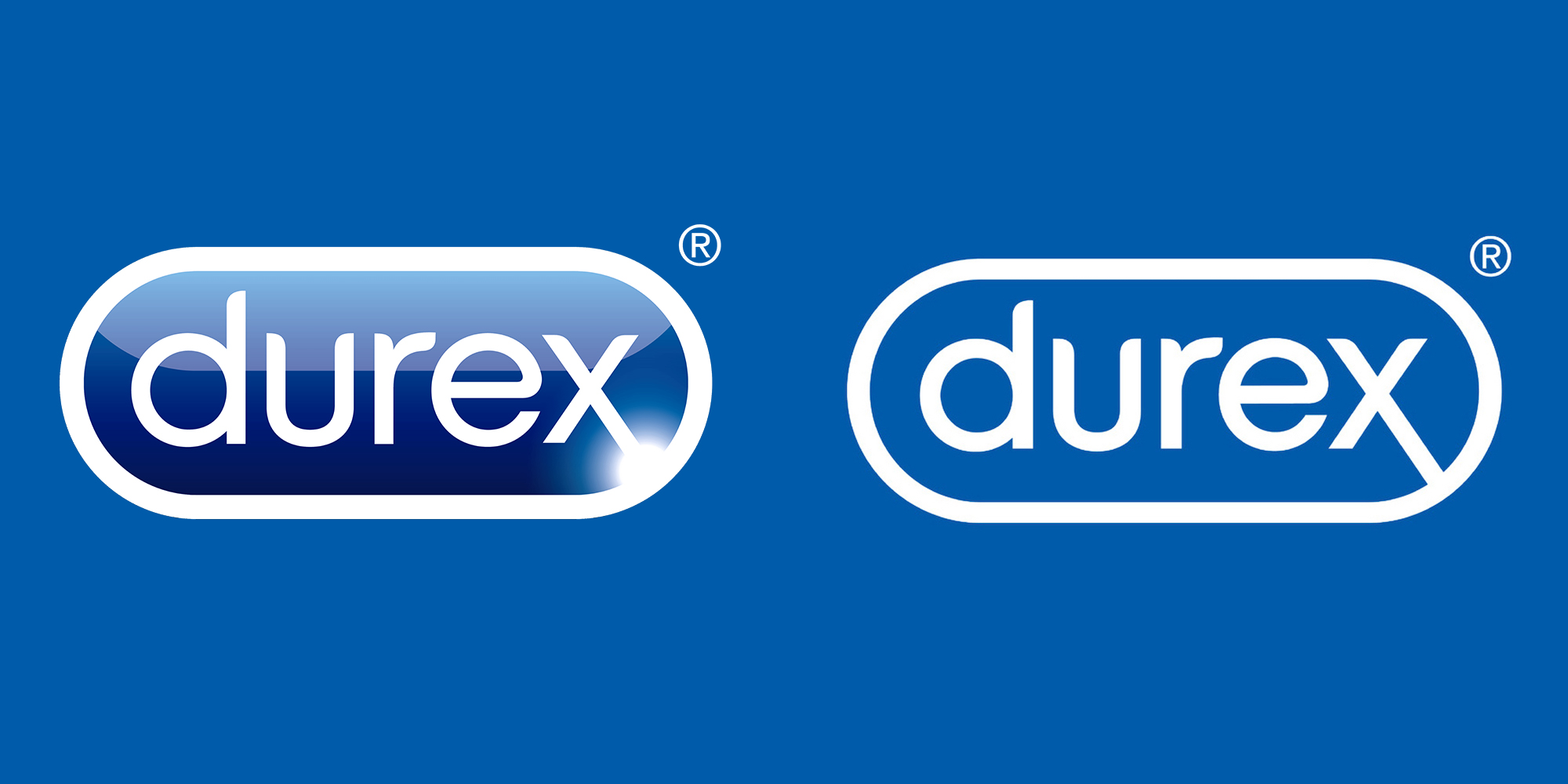
Another new addition to the flat design movement, Durex's new logo does away with the original's convex, reflective style while maintaining the lozenge shape. It's got rid of the light flare so that the 'x' of its name is more prominent, which feels appropriate, given that this only emphasises the X-rated nature of its products. This more modern, simplified mark is another trend we're seeing more and more of (and something you can read all about in our logo design guide).

Havas' rebrand also includes a new bespoke typeface by Colophon Foundry, with an ingeniously simple yet effective name: One Night Sans. This delightful play on the phrase 'one night stand' is certainly Twitter's most appreciated element of the new identity. If you're inspired to switch up your fonts, take a look at our list of the best (but admittedly less pun-tastic) free fonts.
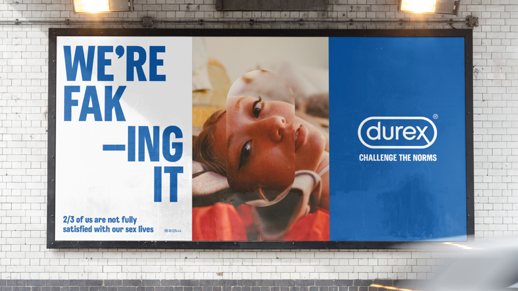
Article continues belowBut despite the fun typeface name, Durex isn't screwing around. Elliot Harris, RB global executive creative director at Havas says the rebrand, "could be the most important piece of work we ever do", positioning the 91 year-old brand as an activist against sexual stigmas and taboos. A series of posters declaring 'porn's not the norm', and 'STD's are kinda real' (all based on the findings of Durex's 2017 Global Sex Survey) accompany the new look.

We love the cleaner look. Havas says it "needed a brand mark that behaved like a stamp of authenticity and trust", and the new, less glossy logo certainly makes us feel nice and safe (pun intended).

It's great to see a new sense of brand activism from Durex (we certainly like to think it's possible for design to change the world). "Make no mistake, this is a proper commitment," says Harris. We applaud Durex for its ambition – and for making us laugh with that typeface name.
Related articles:
Sign up to Creative Bloq's daily newsletter, which brings you the latest news and inspiration from the worlds of art, design and technology.

Daniel John is Design Editor at Creative Bloq. He reports on the worlds of design, branding and lifestyle tech, and has covered several industry events including Milan Design Week, OFFF Barcelona and Adobe Max in Los Angeles. He has interviewed leaders and designers at brands including Apple, Microsoft and Adobe. Daniel's debut book of short stories and poems was published in 2018, and his comedy newsletter is a Substack Bestseller.
