How to choose fonts for book illustrations
Good typography is key to a successful book illustration. Illustrator and designer Fitz Fitzpatrick explains how to go about creating it.
Sign up to Creative Bloq's daily newsletter, which brings you the latest news and inspiration from the worlds of art, design and technology.
You are now subscribed
Your newsletter sign-up was successful
Want to add more newsletters?
Whilst I was researching children’s books, in preparation for my own Timmy Tompkins’ Awesome Fantasy Comic Book Superhero Adventure (my next book’s title is going to be a lot shorter I assure you), I was a pretty disappointed by the sheer lack of variety, and in essence creativity when it came to the typography.
The vast majority of it looked like an afterthought. Just slapped in there, smack bang over an illustration, with no thought given to its placement, styling, or just making it plain interesting to look at.
It’s a kid’s book. The typography should have just as much importance as the illustrations themselves, they should work together. Hence, it’s fair to say that I really wanted to go to town with the typography when it came to doing my own book, and hopefully I did. So here are a few general tips and that to help when incorporating typography into your illustration, whether it be for a one off piece or a children’s book.
Article continues below- Read all our illustration-related articles here
01. Do your research
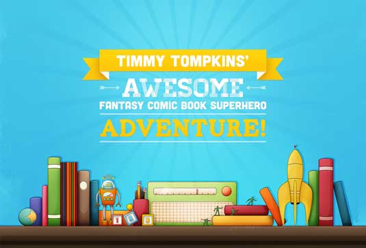
This is one of the first things I did when starting my book, and I think it’s super important and applicable to any project. Researching helps you get a good idea of what’s been done before, what’s out there currently, and to get your creative juices flowing (gross) so to speak. This is really important if you’re an illustrator that hasn’t done a lot of typographic work, or you’re about to tackle a style you’re unfamiliar with.
Fortunately, I’ve been lucky enough to work at a whole bunch of different agencies, where I’ve learnt a good mix of illustration and design, and that really helps when it comes to incorporating typography into my illustrations.
If you’re looking for a starting point, always check out Dribbble or even Behance. There are a lot of really talented typographical illustrators out there, and that’s where I go a lot for a good old bit of inspiration.
02. Start drawing
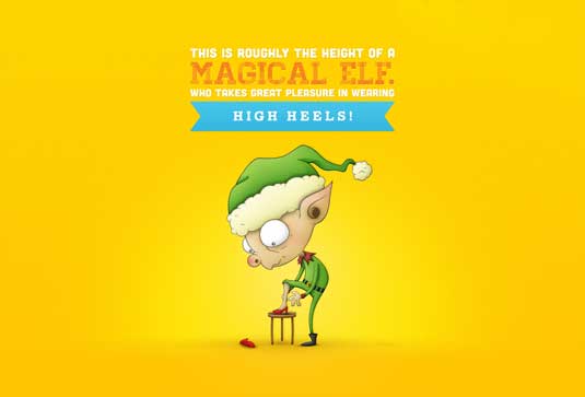
It’s also important, of course, not to get too bogged in just looking at other people's work for inspiration, to the point where you never actually create anything yourself. So just start sketching out some compositions, graphical elements to house your text, just have fun and experiment - you’ll never know what you’ll come up with.
Sign up to Creative Bloq's daily newsletter, which brings you the latest news and inspiration from the worlds of art, design and technology.
It can be best to just start drawing blind in a way, I’ve come up with what I think are some of my best stuff when just drawing from me braincase, but it’s not for all.
03. One font doesn't fit all
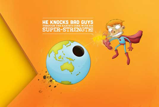
Don’t just go picking any random font just because you happen to like it or you always use it. Make sure it fits well and matches up with the style of your illustration.
I’ve seen this a lot in children’s books where they’ve just popped the text in as Helvetica or Garamond, thinking it will just go with any style of illustration. At the end of the day, though, it just looks rubbish; like it was made on the cheap and put together by a chimp using Gimp.
04. Where to find fonts
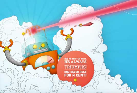
If you’re short on fonts have a look on The Lost Type Co-Op. There are some absolutely lovely fonts on there, which you can all pick up for free, but you should pay for them as they’re well worth it.
I've used quite a few fonts from that site for my book as well as other projects, and I have loads that I can’t wait throw into a project. For other places to find decent fonts, check out this collection of resources.
05. Create your own typography
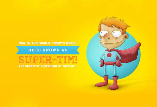
If you can’t find a font that suits your style, or the particular project you’re working on, have a go at creating one yourself. This is advice I should take myself, although it can be intimidating creating your own font, and hand lettering can be difficult if you don’t do it regularly.
06. Make sure it's legible
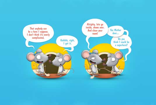
So you’ve got yourself some absolutely wizard fonts, or you’ve drawn up a rad composition with some lovely illustrated typography. Now the most important question needs to be asked - can other people read it?
It’s important to get another pair of eyes to look over your typography because at the end of the day if it isn’t readable then you’re buggered. It might look pretty and have some damn sexy curves, but you’ll hear rumblings of “that c looks like an e”, or, “is that word in French?”
07. Ask: is it needed?
This is a lovely little question that you should ask yourself fairly regularly. Don’t self-indulge and throw typography in there for the sake of it: it’ll end up just being utterly arbitrary.
I've done illustrations in the past where I’ve felt the need to pop some type in there because the illustration is weak. It's easy to do but it's ultimately futile - you need to be honest about why you're doing and consider starting again with a new illustration.
Words: Fitz Fitzpatrick
Fitz Fitzpatrick is an illustrator and designer based in Sydney, Australia. He's currently working as a senior designer at Holler.
Liked this? Read these!
- Illustrator tutorials: amazing ideas to try today!
- Great examples of doodle art
- Useful and inspiring flyer templates
Do you have any typography tips to add to Fitz's? Let us know in the comments below!

The Creative Bloq team is made up of a group of art and design enthusiasts, and has changed and evolved since Creative Bloq began back in 2012. The current website team consists of eight full-time members of staff: Editor Georgia Coggan, Deputy Editor Rosie Hilder, Ecommerce Editor Beren Neale, Senior News Editor Daniel Piper, Editor, Digital Art and 3D Ian Dean, Tech Reviews Editor Erlingur Einarsson, Ecommerce Writer Beth Nicholls and Staff Writer Natalie Fear, as well as a roster of freelancers from around the world. The ImagineFX magazine team also pitch in, ensuring that content from leading digital art publication ImagineFX is represented on Creative Bloq.
