The biggest colour trends in web design in 2013
Brandon Hill highlights five big colour trends that hit web design in 2013. Did they appear on your sites?
You could say that 2013 was a renaissance year when it comes to colour on the web. We saw a revival of the basic colour palette, but with a twist. Pantone Color Institute kicked things off by naming emerald green as its official 2013 colour. Fashion, interior design, graphic design and other industries followed suit by using the basic colour wheel as inspiration for 2013 colour trends.
Here I'll look at five of the biggest colour trends in web design in 2013. You don't have to be following them, but it's important to know what they were. Meanwhile, you might also want to see our guide to the biggest logo design trends too.
- Also read: The best tools for choosing a colour scheme
01. Dark colour tones with a touch of edginess
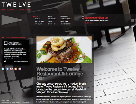
Typically, dark colours are reserved as accent colours in web design because it's tough to read something on a dark background. But in 2013, dark colours like black, dark brown, dark grey and dark blue were being used front and centre to draw attention to the content. While darker colours are often used to evoke luxury or sophistication, this 2013 website colour trend adds a bit of edginess using various design techniques.
Twelve Restaurant & Lounge Bar, shown above, used the angled juxtaposition of the background image to establish an edgy vibe, while the neon colours in the image in the forefront enhanced the look by pairing bright colours with a dark colour over a dark background. The technique sounds like it goes against all the rules of web design, yet it worked in setting a hip and edgy tone for the website.
02. Bright pastels paired with grey hues
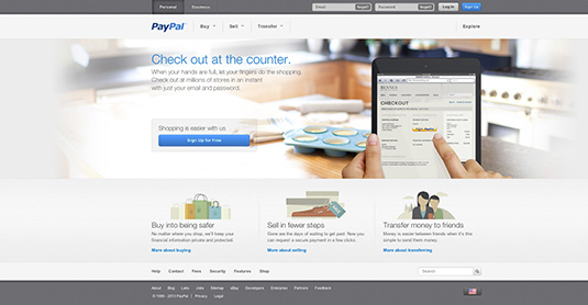
Web designers gave basic grey a facelift in 2013, adding a twist of pastel to make websites more interesting and inviting to read. Greys accented with bright pastel colours provided great contrast and gave a modern, practical look to sites.
In PayPal's redesign, for example, the greyscale background paired with soft pastels was used to draw attention to key elements and establish a hierarchy between the design and content. A darker, contrasting grey was used for the main site navigation.
03. Bright hues inspired by nature
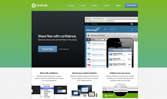
Known as a rejuvenation colour, basic green provides a sense of clarity to websites. Add the Pantone-promoted emerald green twist and it brings another dimension and liveliness to the design.
Daily design news, reviews, how-tos and more, as picked by the editors.
As seen above, cloud-based file sharing service Onehub made good use of emerald green, which pairs nicely with other basic colours, making the white and black sections pop.
The gradient tones of emerald green also make viewing easy on the eyes and prevent eye fatigue. Similar web designs have been using other bright nature colours, including blue and yellow, in 2013.
04. Monochromatic colours and tones
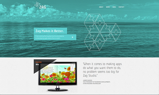
Keeping it simple was a major part of the 2013 renaissance of web design colour trends. The website design industry redefined minimalism by choosing one single colour as its design focus. The monochromatic trend creatively used various shades, tints and tones of one single colour to create intriguing web designs.
Zag Studio, a leading expert in Microsoft development technologies,
used a different singular colour in each panel of its homepage slideshow and used lighter or darker tones of the colour to accent text and other design elements. The monochromatic design brought a clean, vibrant and airy feel to the site.
05. Simplistic colour blocking
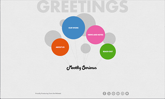
Although website designers had been using the blocking content technique for many years, 2013 saw the method carried through to block colour designs.
The key is clean and simple usage so as not to create a dizzying array of colour schemes. The blocks can be any shape and any element, from images to shapes to text floating in a solid colour background.
On their homepage (shown above), interactive app creators Mostlyserious used geometric shapes as its colour blocking design to categorize sections of their website and encourage interaction among each blocked element.
Words: Brandon Hill
Brandon Hill is a self-proclaimed nerd of all things tech. He is the Director of Client Services, specializing in helping companies successfully re-brand themselves. In his spare time he is teaching himself how to code and avidly enjoys video games.
Liked this? Read these!
- Brilliant Wordpress tutorial selection
- Our favourite web fonts - and they don't cost a penny
- Discover what's next for Augmented Reality
Did we include your favourite website colour trend from 2013? If not, let us know about it in the comments below!

The Creative Bloq team is made up of a group of art and design enthusiasts, and has changed and evolved since Creative Bloq began back in 2012. The current website team consists of eight full-time members of staff: Editor Georgia Coggan, Deputy Editor Rosie Hilder, Ecommerce Editor Beren Neale, Senior News Editor Daniel Piper, Editor, Digital Art and 3D Ian Dean, Tech Reviews Editor Erlingur Einarsson, Ecommerce Writer Beth Nicholls and Staff Writer Natalie Fear, as well as a roster of freelancers from around the world. The ImagineFX magazine team also pitch in, ensuring that content from leading digital art publication ImagineFX is represented on Creative Bloq.
