Design fails can have us in stitches, but they also serve as lessons for all designers. Good design takes a lot of skill, time and energy, and never happens by chance. That means it's very, very easy to get it wrong. Unintended results occur with quite some frequency, even from experienced designs, but every designer's mistake is another designer's potential lesson on what to beware of.
Some of the biggest design fails seem so obvious that onlookers outside the process wonder how the design got signed off. They often occur due to oversights, a lack of feedback, or failing to take the time to look carefully at the finished piece in different contexts.
Below we round up 12 ginormous design fails, covering packaging, UI, logo design and UX, all of which offer us all something to learn from. If you'd like to see more on what you should do, see our guide to logo design. Of course, design fails don't only come in graphic design and UI. We've also seen a lot of interior design fails.
14 design fails that were so bad they were good
01. Anal Malaysia

The first example in our selection of design fails hit a real bum note, rolling together two huge blunders with unintentionally comical results. The Chinese streaming service iQIY was forced to apologise for this embarrassing Malaysia Day poster.
The design is supposed to read 'Anak Malaysia' (which translates as 'Child of Malaysia') to promote shows available to stream during Malaysia Day 2020. But perhaps in a case of a designer thinking they were too clever to make a mistake, the phrase was stylised to incorporate the crescent and star of the Malaysian flag, resulting in legibility issues that still have us on our bottoms laughing.
Not only does the design make it look like the phrase says 'Anal Malaysia', it also looks like there's a figure squatting down between the two words. Quite how this made it through rounds of approval we're not sure. It leaves us asking whether anyone gave it a look over other than the original designer.
02. The OGC logo

But the potential pitfalls of typography go further than the example above. It's sometimes not enough to only check that your design reads well on a horizontal plane. It's best to check how it looks when turned in other directions too.
The UK Office of Government Commerce existed from 2000 to 2011 with the objective of improving efficiency in public spending. In 2007 it commissioned FHD to design a new logo that would show the body's bold commitment to driving up standards. The problem was that the logo was printed on pens, mouse mats, and all manner of other stationery items that would be viewed from different orientations.
It took the government department's employees mere seconds to notice something that the logo's designers hadn't. Rotated 90 degrees the logo looks rather rude. Incredibly, the OGC decided to stick with the new logo. A spokesperson even quipped: "It is not inappropriate to an organisation that's looking to have a firm grip on Government spend."
03. Flickering Lights
Oh my! These days, there’s a graphics department out there that might not have meant to get its lighting decoration go viral... The fact is that #kerning/spacing isn't just a #designer's nitpick! Enjoy a little giggle with this one 🤪🤣 #DesignFail #MarketingFail pic.twitter.com/Uf4qqGG9m8December 6, 2019
Choosing the right font is only the start when it comes to ensuring the typography is right for a design, and that applies to packaging as well as anything else. A little kerning to add space between the 'L' and the 'I' would have been a good idea to prevent misreadings of the product name in the case above.
Always run your design by several people and ask them what they see. Chances are they might have a very different interpretation from those who know what the message is intended to be. And tread very carefully when the word you're designing has any similarity at all to a word you want to avoid.
04. Lisa Jackson Deserves to Die

"As he watches, her body drifts below the water's surface, forever altered. Before he disposes of each victim, he takes a trophy. It's a sign of his power, and a warning…" We're not sure that this novel sounds like the best read out there, but we would never go so far as to demand this fate for the author.
There are many ways to establish text hierarchy – through font, weight, colour, location of text – and sometimes tweaking more than one of these is necessary. In this case, switching from all caps to title case was not enough to prevent an unintended reading of this design, with title placed directly under the author's name. Remember that as a designer, you're not only responsible for how things look but also for their context and how they'll be read.
05. Tesco buttermilk

Perhaps one of the most notorious packaging blunders in history came from this own-brand buttermilk sold by Tesco in Ireland. This shot with crease in the right place went viral and was even picked up by several newspapers after it was taken at a supermarket in Dublin.
Shopper Andy Burdens wrote on Reddit at the time: "They really made a cock and balls of this branding." Tesco changed the design after the media coverage of the blunder. The lesson here? No design is too small or routine to merit making a mockup – designer Oisín Hurst told Creative Bloq he designed the piece on a flat keyline and didn't mock it up, thinking, "it was buttermilk – what could go wrong?"
06. Mama's Baking

Logos often combine ideas taken from a brand's name or function. It makes sense then that this bakery in Greece would consider combining a representation of the eponymous 'mama' and the oven in which she presumably bakes her exquisite cakes and breads. The problem is that the position of the flame in the oven makes it look like something else.
It's hard to imagine the designers weren't aware of how it looked and the design may have paid off, the bakery and cafe still proudly using the logo that has taken it to international internet fame.

In general, designers need to be careful with employing the human figure in logos as so many decisions can be misinterpreted, as is demonstrated very well by this 1970s logo for the Catholic Church Archdiocesan Youth Commission. We can perhaps ascribe it to more naive times. And after all, designers can't be expected to predict all future associations that will emerge related to their clients.
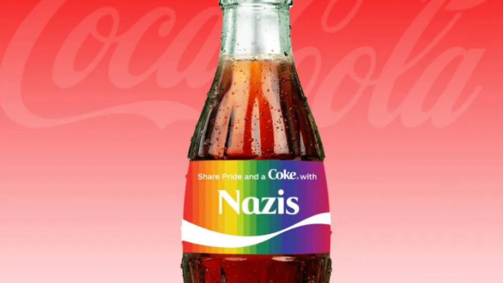
07. The Coca-Cola bottle creator

The design of marketing campaigns has grown now to encompass a lot more than graphic design. Campaigns often now also include elements of UI and the whole user experience involved in what more interactive initiatives aimed at promoting customer engagement. This kind of marketing has to be well thought through though.
Coca-Cola's custom bottle creator campaign for Pride Month resulted in embarrassment for the company when it turned out the programme would reject certain words from inclusion in the bottles, as well as swear words, the list of banned words seemed to include LGBT, transgender, black lives matter (but not white lives matter) and Palestine.
08. Thomson Reuters' values
Presented without comment. cc Venn Diagram enthusiast @LadyFOHF pic.twitter.com/RjYAUjlJaVAugust 14, 2014
This one was a bit of a clanger for the media conglomerate Thomson Reuters. The idea was presumably to suggest that the concepts on the left are the group's core values, but the image looks like a Venn diagram, a type of diagram used to show logical relations between different sets through overlapping curves. Read this way, the graphic appears to show that there is very little overlap between the values on the left and the comparably minute values of Thomson Reuters.
The Washington Post even picked up on the slip and praised the company for its honesty in the ironic headline, "In refreshing change of pace, company admits it's not innovative." The lesson here is to always step back and consider whether design elements you have chosen for purely aesthetic purposes may resemble any other visual language in common use.
09. Where Milan

Well-heeled travellers will have been a little taken aback when they saw this edition of Where Milan, which is published by Proedi and distributed at many of the city's most exclusive hotels. Placement of the photo cutout layered over the title makes it seem that the publishers are calling into question the reputation of their own cover model.
It's an Italian publication, so the designers could perhaps be forgiven for overlooking an error when working in a foreign language, but if you're aiming at a foreign language market, you need to be able to spot a howler like this.
10. CVS chewable hair, skin and nails

Another packaging delight, this nutritional supplement from CVS appears to be marketed for Hannibal Lecter. The problem here stems from making assumptions about what the customer knows and following the format of other items in a range of products rather than adapting the design.
For other supplements in this range at US pharmacy chain there's no confusion. The text can read Chewable Vitamin C and no unintentionally comic meaning arises, but with this product it may have been better to clarify in an appropriately sized type that the products inside are tablets avoid skin-crawling misinterpretations.
11. Graduate photography

This is apparently an advert for a graduation day photography service. Getting on the career track maybe? The light at the end of the tract representing a new dawn? Whatever the original intention, there's no getting over the fact that this graduate does not come across as overjoyed about her prospects on the modern job market. In fact, it looks like she's about to end it all by walking straight into an oncoming train.
The colour tones and even the choice of font seem to only back up the impression that the intended message is more about bereavement than celebrating graduation, with the light of the oncoming train perhaps also representing some hope that there may be some better world in the next life. Always consider the mood you want to convey and ensure colours, imagery and type are on message.
It's vital to remember that design is ultimately about clear communication. Just as a writer or speaker needs to choose the perfect words to deliver their message, designers must communicate theirs by selecting the correct visual elements, which convey exactly what they want to say.
12. The magic selfie stick

Graphic designers producing promotional material and visuals for technical instructions can benefit from having a clear understanding themselves of how the product they're depicting actually works.
When it comes to technology, if the visual material produced for the product doesn't get it right, what chance do the digital immigrants among the customer base have? Just as an aside, we love how retro this design for selfie stick packaging already looks.
13. Outon breathable shorts

These cycling shorts let you fart while riding a bike. It's a neat feature, right? But really who decided it was a good idea to communicate the breathability of these padded shorts by overlaying some gas emerging from the padded rear end?
Sometimes designers have to accept that no designing is needed at all and that conveying a message can be better accomplished by the accompanying text, with no need for added visual clarification.
14. Date formats
Looks like I picked a bad day to set this app up pic.twitter.com/R11M7RNU86December 12, 2019
A little UI blooper to finish with. We're not sure why different parts of the world adopted different standard formats for expressing something as straightforward as the date and it is a phenomenon that causes problems for designers everywhere working on UI forms, but this is something that the designer should have foreseen. When you're working with dates or with any other variable content think through all of the possible scenarios that could arise.
Related articles:
- Best logos: Examples of the best logo design ever
- The ultimate UI design guide
- 8 ways to fail at logo design

