Creative Bloq at 10 Awards: Winners
We celebrate a decade of design and tech.
Sign up to Creative Bloq's daily newsletter, which brings you the latest news and inspiration from the worlds of art, design and technology.
You are now subscribed
Your newsletter sign-up was successful
Want to add more newsletters?
CB at 10 Awards: Rebrand of the Decade

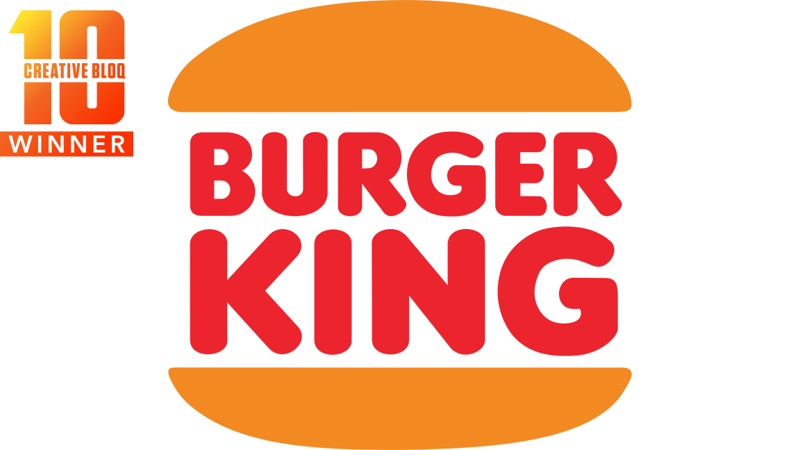
Winner: Burger King
Burger King wins with 35.48 per cent. Rebrands are a tricky thing that can alienate fans and customers if done badly. But the Burger King rebrand from 2021 is one of the most successful in recent memory, and you voted it the best of the last 10 years.
The Burger King rebrand was about more than simply reworking the restaurant chain's logo in line with the on-trend flat, simple design. Attention was paid by agency Jones Knowles Ritchie to pick elements from BK's menu items and replicate these shapes in the typeface. The resulting curves give the new logo a '70s retro feel that takes us back to where it all began. It recalls the original 1969 design – which is certainly a contender for the best logos ever – as well as the previous 1999 design. And where flat design has been boring, BK's take brought to vibrant life.
But BK's rebrand was so much more than a new logo – it included a complete makeover of menus, packaging, merchandising, social media messaging and even a new irreverent approach to marketing that gave us the moldy burger ad. Everything is tied to a new colour palette and plays on nostalgia, and you certainly love it.
If you want to achieve the success of the Burger King rebrand for yourself we'd recommend reading our feature on the '7 thirngs to consider when planning a rebrand'. We'd also suggest reading our one-stop feature '15 essential tools for graphic designers' that offers guidance on everything you need to get started.
Rebrand of the Decade: Runners-up
- Premiere League – 33.87 per cent
- Google – 13.71 per cent
- Airbnb – 11.29 per cent
- Instagram – 5.65 per cent
Next page: Design Innovation of the Decade
Sign up to Creative Bloq's daily newsletter, which brings you the latest news and inspiration from the worlds of art, design and technology.
Current page: CB at 10 Awards: Rebrand of the Decade
Prev Page CB at 10 Awards: Phone Design of the Decade Next Page CB at 10 Awards: Design Innovation of the Decade
Ian Dean is Editor, Digital Arts & 3D at Creative Bloq, and the former editor of many leading magazines. These titles included ImagineFX, 3D World and video game titles Play and Official PlayStation Magazine. Ian launched Xbox magazine X360 and edited PlayStation World. For Creative Bloq, Ian combines his experiences to bring the latest news on digital art, VFX and video games and tech, and in his spare time he doodles in Procreate, ArtRage, and Rebelle while finding time to play Xbox and PS5.
- Georgia CogganEditor
